

What does jquery.parallax do?
jParallax turns nodes into absolutely positioned layers that move in response to the mouse. Depending on their dimensions these layers move in a parallaxy kind of way.
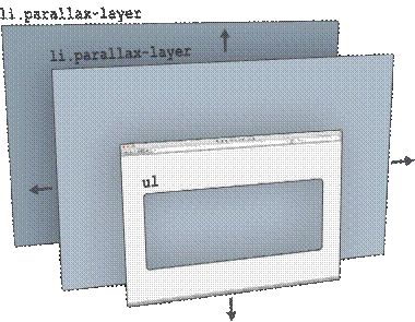
To see layers through a viewport, wrap them in a container with the style,
- <ul>
- <li class=” parallax-layer”></li>
- <li class=” parallax-layer”></li>
- </ul>
CSS:
- #content
- {
- background - color: #FFFFFF;
- text - align: left;
- padding: 0 px;
- }
- h1
- {
- padding: 20 px;
- background - color: gray;
- color: white;
- margin: 0;
- text - shadow: #9E9B9B 2px 2px 2px;
- text-align: center;
- filter: progid:DXImageTransform.Microsoft.gradient(startColorstr= '#E3E1E1',
- endColorstr = '#CCCACA'); /* for IE */
- background: -webkit - gradient(linear, left top, left bottom, from(#E3E1E1), to(#CCCACA)); /* for webkit browsers */
- background: -moz - linear - gradient(top, #E3E1E1, #CCCACA); /* for firefox 3.6+ */
- }
- .large
- {
- font - size: 22 px;
- }
- .orange
- {
- color: orange;
- }
- .italic
- {
- font - style: italic;
- }
- .textmiddle
- {
- vertical - align: middle;
- }
- .padout
- {
- padding - left: 25 px;
- padding - right: 25 px;
- }
- .rounded - corners
- {
- -moz - border - radius: 40 px; - webkit - border - radius: 40 px; - khtml - border - radius: 40 px;
- border - radius: 40 px;
- }
- .rounded - corners - top
- {
- -moz - border - top - radius: 40 px; - webkit - border - radius: 40 px; - khtml - border - radius: 40 px;
- border - radius: 40 px;
- }
- h2
- {
- color: blue;
- font - size: 22 px;
- color: white;
- background - color: gray;
- padding: 10 px 10 px 10 px 20 px; - moz - border - radius: 40 px; - webkit - border - radius: 40 px; - khtml - border - radius: 40 px;
- border - radius: 40 px;
- text - shadow: #9E9B9B 2px 2px 2px;
- filter: progid:DXImageTransform.Microsoft.gradient(startColorstr= '#E3E1E1',
- endColorstr = '#CCCACA'); /* for IE */
- background: -webkit - gradient(linear, left top, left bottom, from(#E3E1E1), to(#CCCACA)); /* for webkit browsers */
- background: -moz - linear - gradient(top, #E3E1E1, #CCCACA); /* for firefox 3.6+ */
- }
- p {
- margin: 20 px!important;
- }
- .scrolldown
- {
- padding - left: 20 px;
- color: #EDECE8;
- font - size: 40 px;
- font - weight: bold;
- vertical - align: middle;
- text - shadow: #6374AB 2px 2px 2px;
- }
- # page - wrap
- {
- border: 1 px solid orange;
- margin: 10 px auto;
- /*width: 950px;*/
- }
- #parallax - header
- {
- height: 200 px;
- background - color: gray;
- }
- #parallax
- {
- position: relative;
- overflow: hidden;
- height: 506 px;
- width: 1348 px;
- background - image: url('images/1.jpg');
- }
- .parallax - viewport
- {
- position: relative; /* relative, absolute, fixed */
- overflow: hidden;
- }
- .parallax - layer
- {
- position: absolute;
- }
HTML:
Put different slices of images in different containers. Set height and width of them accordingly.
- <div id="parallax" class="clear">
- <div class="parallax-layer" style="width:1002px; height:509px;">
- <img src="images/2.png" alt="" style="width:1002px; height:509px;" />
- </div>
- </div>
JQuery:
Code for detecting mouse moment. According to mouse moment picture moves.
- <script type="text/javascript">
- jQuery(document).ready(function()
- {
- $('#parallax .parallax-layer')
- .parallax
- ({
- mouseport: $('#parallax')
- });
- });
- </script>
Herewith I am attaching source code. Please refer it for further reference.
Amit Kumar SinghPosted Feb 6, 2016, 8:06 AM
Nice One