

Introduction
This article demonstrates the various views for displaying and entering text available in Xamarin.Forms.The app consists of several pages, demonstrating each of the text controls and a few common text entry scenarios.
This article demonstrates the various views for displaying and entering text available in Xamarin.Forms.The app consists of several pages, demonstrating each of the text controls and a few common text entry scenarios.
It has three views for working with text
- Label - single or multiple line text
- Entry - only one line input
- Editor - more than one line input.
Let's start :)
Step 1
You can create Xamarin.Forms App by going to File >>New >> Visual C# >> Cross Platform >> Cross Platform App (Xamarin.Native or Xamarin.Forms), enter desired name for your project and press ok.
(ProjectName = TextApp)
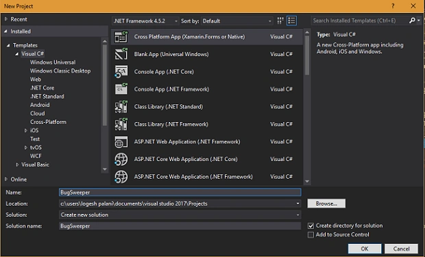
You can create Xamarin.Forms App by going to File >>New >> Visual C# >> Cross Platform >> Cross Platform App (Xamarin.Native or Xamarin.Forms), enter desired name for your project and press ok.
(ProjectName = TextApp)
Step 2
Open Solution Explorer >> TextApp(PCL) >> right click and select Add >> New Item. In the popup window select Cross Platform >> Empty content page Xaml.
In this way, you can add new Xaml page.Create a new Xaml page named LabePage.Xaml and double click to open its design view and insert the code is given below.
Open Solution Explorer >> TextApp(PCL) >> right click and select Add >> New Item. In the popup window select Cross Platform >> Empty content page Xaml.
In this way, you can add new Xaml page.Create a new Xaml page named LabePage.Xaml and double click to open its design view and insert the code is given below.
Label
The Label have cutom fonts and color text.
- Truncating and Wrapping.
- Font .
- Color - set to use a custom text color.
- Formatted Text.
Formatted Text
- BackgroundColor - set a background color
- FontAttributes - set to Bold, italic or none
- FontFamily - Sets the Font to be used
- FontSize - Sets the size of the font
- Text - Display a text
Fonts
- FontFamily - sets font to be used
- FontSize
- Micro
- Small
- Medium
- Large
- FontAttributes
- None
- Italic
- Bold
- FormattedString
- Text
- FontFamily
- FontSize
- FontAttributes
- ForGroundColor
- BackgroundColor
Label Page
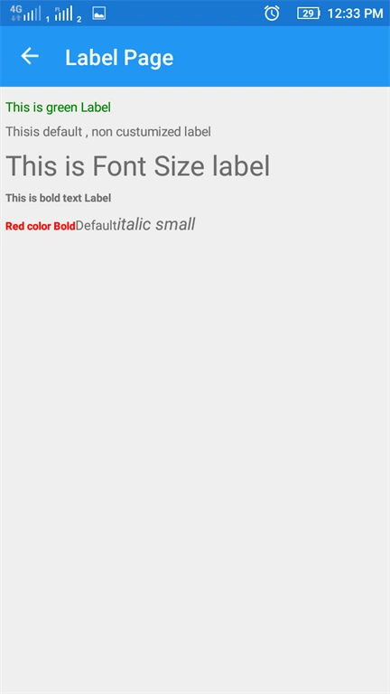
The label is used to display text and it displays mulitiple or singleline text. The label view can truncate text when it can't fit on one line.
Used ToolBox Items
- Label - color label
- Label - This is default, non customized label
- Label - FontSize label
- Label - FontAttributes label
- Label - FormattedString label
Xaml Code
- <?xml version="1.0" encoding="utf-8" ?>
- <ContentPage xmlns="http://xamarin.com/schemas/2014/forms"
- xmlns:x="http://schemas.microsoft.com/winfx/2009/xaml"
- x:Class="TextApp.LabePage"
- Title="Label Page">
- <ContentPage.Content>
- <StackLayout Padding="5,10" x:Name="layout">
- <Label TextColor="Green" Text="This is green Label"/>
- <Label Text="This is default , non custumized label"/>
- <Label FontSize="30" Text="This is Font Size label"/>
- <Label FontAttributes="Bold" Text="This is bold text Label"/>
- <Label>
- <Label.FormattedText>
- <FormattedString>
- <Span Text="Red color Bold" ForegroundColor="Red" FontAttributes="Bold"/>
- <Span Text="Default"/>
- <Span Text="italic small" FontAttributes="Italic" FontSize="Large"/>
- </FormattedString>
- </Label.FormattedText>
- </Label>
- </StackLayout>
- </ContentPage.Content>
- </ContentPage>
Step 3 - Editor Page
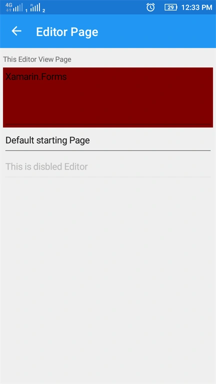
This page demonstrates the editor view.The Editor is used for collecting text that is expected to take more than one line.
In this step, Add another a Xaml page named Editor page. Here the code for this page.
In this step, Add another a Xaml page named Editor page. Here the code for this page.
Xaml Code
used Toolbox items
used Toolbox items
- Label - Display text
- Editor - Background and HeightRequest Editor
- Editor - Default editor
- Editor - Disbled editor
- <?xml version="1.0" encoding="utf-8" ?>
- <ContentPage xmlns="http://xamarin.com/schemas/2014/forms"
- xmlns:x="http://schemas.microsoft.com/winfx/2009/xaml"
- x:Class="TextApp.EditorPage"
- Title="Editor Page">
- <ContentPage.Content>
- <StackLayout Padding="5,10">
- <Label Text="This Editor View Page"/>
- <Editor Text="Xamarin.Forms" BackgroundColor="Maroon" HeightRequest="100"/>
- <Editor Text="Default starting Page"/>
- <Editor IsEnabled="False" Text="This is disbled Editor"/>
- </StackLayout>
- </ContentPage.Content>
- </ContentPage>
Step 4 - Entry
Entry is used to accept single line text input but cannot have customized fonts.The Entry has a password mode and can show placeholder text until text is entered.
Entry Page
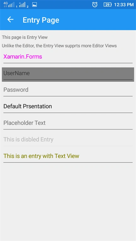
This page demonstrates the Entry view. The Entry is used for collecting text that is expected to take one line. Unlike the Editor, the Entry view supports more advanced formatting and customization.
Entry is used to accept single line text input but cannot have customized fonts.The Entry has a password mode and can show placeholder text until text is entered.
Entry Page
This page demonstrates the Entry view. The Entry is used for collecting text that is expected to take one line. Unlike the Editor, the Entry view supports more advanced formatting and customization.
Now, Create a Xaml page named Entrypage.Xaml and here is the code
Xaml Code
Xaml Code
- Entry - Textcolor entry
- Entry - Placeholder and Background color entry
- Entry - Password entry
- Entry - default entry
- Entry - Placeholder entry
- Entry - Disbled entry
- Entry - Textcolor entry
- StackLayout
- ScrollView
- <?xml version="1.0" encoding="utf-8" ?>
- <ContentPage xmlns="http://xamarin.com/schemas/2014/forms"
- xmlns:x="http://schemas.microsoft.com/winfx/2009/xaml"
- x:Class="TextApp.EntryPage"
- Title="Entry Page">
- <ContentPage.Content>
- <StackLayout Padding="5,10">
- <Label Text="This page is Entry View"/>
- <Label Text="Unlike the Editor, the Entry View supprts more Editor Views"/>
- <ScrollView VerticalOptions="StartAndExpand">
- <StackLayout>
- <Entry Text="Xamarin.Forms" TextColor="Fuchsia"/>
- <Entry Placeholder="UserName" BackgroundColor="Gray"/>
- <Entry Placeholder="Password" IsPassword="True"/>
- <Entry Text="Default Prsentation"/>
- <Entry Placeholder="Placeholder Text"/>
- <Entry IsEnabled="False" Text="This is disbled Entry"/>
- <Entry TextColor="Olive" Text="This is an entry with Text View"/>
- </StackLayout>
- </ScrollView>
- </StackLayout>
- </ContentPage.Content>
- </ContentPage>
Step 5 - Login Page
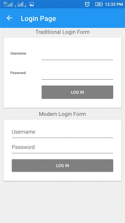
This login page has two types of login frame.
This login page has two types of login frame.
- Treditional login form
- Modern login form
Xaml Code
- Grid
- Label
- Frame
- StackLayout
- Button
- Entry
- <?xml version="1.0" encoding="utf-8" ?>
- <ContentPage xmlns="http://xamarin.com/schemas/2014/forms"
- xmlns:x="http://schemas.microsoft.com/winfx/2009/xaml"
- x:Class="TextApp.LoginPage"
- Title="Login Page">
- <ContentPage.Content>
- <StackLayout Padding="10,0">
- <Label FontSize="Large" HorizontalOptions="Center" Text="Traditional Login Form" />
- <Frame>
- <Grid HorizontalOptions="FillAndExpand" VerticalOptions="FillAndExpand">
- <Grid.RowDefinitions>
- <RowDefinition Height="50" />
- <RowDefinition Height="50" />
- <RowDefinition Height="50" />
- </Grid.RowDefinitions>
- <Grid.ColumnDefinitions>
- <ColumnDefinition Width="80" />
- <ColumnDefinition Width="*" />
- </Grid.ColumnDefinitions>
- <Label Text="Username" FontSize="Small" FontAttributes="Bold" Grid.Row="0" Grid.Column="0" VerticalOptions="Center" />
- <Label Text="Password" FontSize="Small" FontAttributes="Bold" Grid.Row="1" Grid.Column="0" VerticalOptions="Center" />
- <Entry Grid.Row="0" Grid.Column="1" />
- <Entry Grid.Row="1" Grid.Column="1" IsPassword="true" />
- <Button Text="Log In" TextColor="White" Grid.Row="2" Grid.Column="1" BackgroundColor="Gray" />
- </Grid>
- </Frame>
- <Label FontSize="Large" HorizontalOptions="Center" Text="Modern Login Form" />
- <Frame>
- <StackLayout>
- <Entry Placeholder="Username" HorizontalOptions="Fill" />
- <Entry Placeholder="Password" IsPassword="true" HorizontalOptions="Fill" />
- <Button Text="Log In" TextColor="White" BackgroundColor="Gray" HorizontalOptions="Fill" />
- </StackLayout>
- </Frame>
- </StackLayout>
- </ContentPage.Content>
- </ContentPage>
Step 6 - Order Page
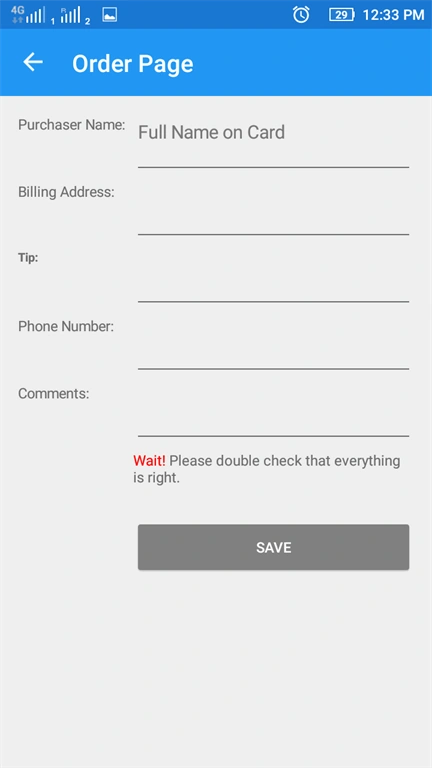
This page demonstrates order system view.
Next, add a new Xaml page named Orderpage.xaml and click open OrderPage.xaml and This page code is here.
This page demonstrates order system view.
Next, add a new Xaml page named Orderpage.xaml and click open OrderPage.xaml and This page code is here.
Xaml Code
Used toolbox items
Used toolbox items
- Button
- Entry
- Editor
- Label
- Grid
- FormattingText
- <?xml version="1.0" encoding="utf-8" ?>
- <ContentPage xmlns="http://xamarin.com/schemas/2014/forms"
- xmlns:x="http://schemas.microsoft.com/winfx/2009/xaml"
- x:Class="TextApp.OrderPage"
- Title="Order Page">
- <ContentPage.Content>
- <ScrollView>
- <Grid HorizontalOptions="FillAndExpand" VerticalOptions="FillAndExpand" Padding="15">
- <Grid.RowDefinitions>
- <RowDefinition Height="50" />
- <RowDefinition Height="50" />
- <RowDefinition Height="50" />
- <RowDefinition Height="50" />
- <RowDefinition Height="50" />
- <RowDefinition Height="50" />
- <RowDefinition Height="50" />
- </Grid.RowDefinitions>
- <Grid.ColumnDefinitions>
- <ColumnDefinition Width="90" />
- <ColumnDefinition Width="*" />
- </Grid.ColumnDefinitions>
- <Label Text="Purchaser Name:" Grid.Column="0" Grid.Row="0" />
- <Entry Placeholder="Full Name on Card" Grid.Column="1" Grid.Row="0" />
- <Label Text="Billing Address:" Grid.Column="0" Grid.Row="1" />
- <Editor Grid.Column="1" Grid.Row="1" />
- <Label Text="Tip:" FontAttributes="Bold" Grid.Column="0" Grid.Row="2" />
- <Entry Keyboard="Numeric" Grid.Row="2" Grid.Column="1" />
- <Label Text="Phone Number:" Grid.Column="0" Grid.Row="3" />
- <Entry Keyboard="Telephone" Grid.Row="3" Grid.Column="1" />
- <Label Text="Comments:" Grid.Column="0" Grid.Row="4" />
- <Editor Grid.Column="1" Grid.Row = "4" />
- <Label Grid.Column="1" Grid.Row="5">
- <Label.FormattedText>
- <FormattedString>
- <FormattedString.Spans>
- <Span Text="Wait! " ForegroundColor="Red" />
- <Span Text="Please double check that everything is right." />
- </FormattedString.Spans>
- </FormattedString>
- </Label.FormattedText>
- </Label>
- <Button Text="Save" TextColor="White" Grid.Row="6" Grid.Column="1" BackgroundColor="Gray" />
- </Grid>
- </ScrollView>
- </ContentPage.Content>
- </ContentPage>
Result
Step 7 - Style
- Built in style
- Built in style for common scenarios
- BodyStyle
- CaptionStyle
- ListItemDetailTextStyle
- ListItemTextStyle
- SubtitleStyle
- TitleStyle
- Custom Style
- The style consist of setter and setters consist of properties
- Applying Style
- "TargetType" - once the style has been created, it can be applied to any view
- AccessiblitY
Built in style page
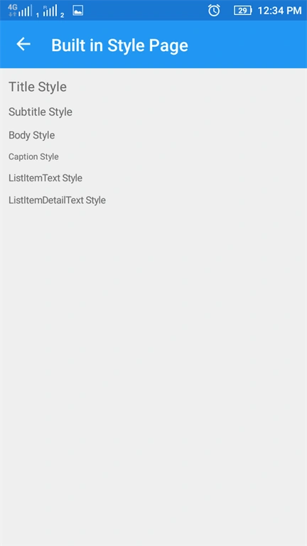
This page demonstrates the Built in Style view. The Built in Style is used to display text in already built styles.
It use DynamicResources for display style text.
Now,Add another Xaml Page named Builtinstylepage.xaml and double click open Builtinstylepage.xaml and here the code.
It use DynamicResources for display style text.
Now,Add another Xaml Page named Builtinstylepage.xaml and double click open Builtinstylepage.xaml and here the code.
Xaml page
- Label
- TitleStyle
- SubtitleStyle
- BodyStyle
- CaptionStyle
- ListItemStyle
- ListItemDetailTextStyle
- StackLayout
- <?xml version="1.0" encoding="utf-8" ?>
- <ContentPage xmlns="http://xamarin.com/schemas/2014/forms"
- xmlns:x="http://schemas.microsoft.com/winfx/2009/xaml"
- x:Class="TextApp.BuiltinStyle"
- Title="Built in Style Page ">
- <ContentPage.Content>
- <StackLayout Spacing="10" Padding="10">
- <Label Text="Title Style" Style="{DynamicResource TitleStyle}" />
- <Label Text="Subtitle Style" Style="{DynamicResource SubtitleStyle}" />
- <Label Text="Body Style" Style="{DynamicResource BodyStyle}" />
- <Label Text="Caption Style" Style = "{DynamicResource CaptionStyle}" />
- <Label Text="ListItemText Style" Style="{DynamicResource ListItemTextStyle}" />
- <Label Text="ListItemDetailText Style" Style="{DynamicResource ListItemDetailTextStyle}" />
- </StackLayout>
- </ContentPage.Content>
- </ContentPage>
Step 8 - Custom style page
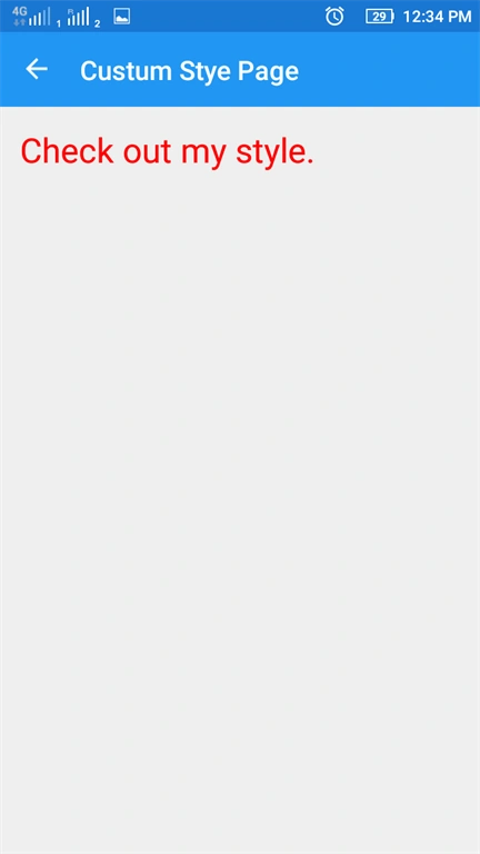
This page demonstrates the Custom Style view. The custom style is used to display text in different custom styles. It uses StaticResources and Setter Properties.
In this step, add new Xaml page named CustomStylePage and this page code is given below.
Xaml Code
Used toolbox items
This page demonstrates the Custom Style view. The custom style is used to display text in different custom styles. It uses StaticResources and Setter Properties.
In this step, add new Xaml page named CustomStylePage and this page code is given below.
Xaml Code
Used toolbox items
- Style
- Setter and properties
- StackLayout
- Label
- <?xml version="1.0" encoding="utf-8" ?>
- <ContentPage xmlns="http://xamarin.com/schemas/2014/forms"
- 9/xaml"
- x:Class="TextApp.CustumStyle"
- Title="Custum Stye Page">
- <ContentPage.Resources>
- xmlns:x="http://schemas.microsoft.com/winfx/200
- <ResourceDictionary>
- <Style x:Key="LabelStyle" TargetType="Label">
- <Setter Property="TextColor" Value="Red"/>
- <Setter Property="FontSize" Value="30"/>
- </Style>
- </ResourceDictionary>
- </ContentPage.Resources>
- <ContentPage.Content>
- <StackLayout Padding="15" Spacing="15">
- <Label Text="Check out my style." Style="{StaticResource LabelStyle}" />
- </StackLayout>
- </ContentPage.Content>
- </ContentPage>
Step 9 - Editor
The editor is used to accept multiple line text input. It has custom background color, but text color and font cannot be changed.
- Customization - color and keyboard options
- Default keyboard
- Chat Keyboard
- Email Keyboard
- Numeric Keyboard
- Telephone Keyboard
- Url - web addresses
- Interactivity - it exposes two events
- TextChanged - when the text changes in the Editor
- Complated - when the user ended input by pressing the return key on the keyboard
In this step, add new Xaml page named Editorpage.xaml and double click to get it's design view and here the code for this page
Xaml Code
Used toolbox items
Used toolbox items
- Label
- Editor - Backgroundcolor and Heightreguest editor
- Editor - default editor
- Editor - Disabled editor
- <?xml version="1.0" encoding="utf-8" ?>
- <ContentPage xmlns="http://xamarin.com/schemas/2014/forms"
- xmlns:x="http://schemas.microsoft.com/winfx/2009/xaml"
- x:Class="TextApp.EditorPage"
- Title="Editor Page">
- <ContentPage.Content>
- <StackLayout Padding="5,10">
- <Label Text="This Editor View Page"/>
- <Editor Text="Xamarin.Forms" BackgroundColor="Maroon" HeightRequest="100"/>
- <Editor Text="Default starting Page"/>
- <Editor IsEnabled="False" Text="This is disbled Editor"/>
- </StackLayout>
- </ContentPage.Content>
- </ContentPage>
Result
Step 10
In this step, go to Solution Explorer >>TextApp (PCL) >> click open MainPage.xaml page and find the code.
Xaml Code
Used toolbox items
In this step, go to Solution Explorer >>TextApp (PCL) >> click open MainPage.xaml page and find the code.
Xaml Code
Used toolbox items
- ListView
- DataTemplate
- TextCell
- Binding property
- <?xml version="1.0" encoding="utf-8" ?>
- <ContentPage xmlns="http://xamarin.com/schemas/2014/forms"
- xmlns:x="http://schemas.microsoft.com/winfx/2009/xaml"
- xmlns:local="clr-namespace:TextApp"
- x:Class="TextApp.MainPage"
- Title="MainPage">
- <ContentPage.Content>
- <ListView x:Name="ListOfPages" ItemSelected="ListOfPages_ItemSelected">
- <ListView.ItemTemplate>
- <DataTemplate>
- <TextCell Text="{Binding Title}" TextColor="Navy"/>
- </DataTemplate>
- </ListView.ItemTemplate>
- </ListView>
- </ContentPage.Content>
- </ContentPage>
cs code
- using System;
- using System.Collections.Generic;
- using System.Linq;
- using System.Text;
- using System.Threading.Tasks;
- using Xamarin.Forms;
- namespace TextApp
- {
- public partial class MainPage : ContentPage
- {
- public MainPage()
- {
- InitializeComponent();
- List<Page> pages = new List<Page>();
- pages.Add(new EditorPage());
- pages.Add(new EntryPage());
- pages.Add(new LabePage());
- pages.Add(new LoginPage());
- pages.Add(new OrderPage());
- pages.Add(new BuiltinStyle());
- pages.Add(new CustumStyle());
- ListOfPages.ItemsSource = pages;
- }
- private void ListOfPages_ItemSelected(object sender, SelectedItemChangedEventArgs e)
- {
- if (e.SelectedItem != null)
- {
- this.Navigation.PushAsync((Page)e.SelectedItem);
- }
- ListOfPages.SelectedItem = null;
- }
- }
- }
Step 11
After the design view, go to Solution Explorer >> TextApp(PCL) >> click open App.xaml.cs and this page code is given below.
cs code
After the design view, go to Solution Explorer >> TextApp(PCL) >> click open App.xaml.cs and this page code is given below.
cs code
- using System;
- using System.Collections.Generic;
- using System.Linq;
- using System.Text;
- using Xamarin.Forms;
- namespace TextApp
- {
- public partial class App : Application
- {
- public App()
- {
- InitializeComponent();
- MainPage = new NavigationPage();
- MainPage.Navigation.PushAsync(new MainPage());
- }
- protected override void OnStart()
- {
- // Handle when your app starts
- }
- protected override void OnSleep()
- {
- // Handle when your app sleeps
- }
- protected override void OnResume()
- {
- // Handle when your app resumes
- }
- }
- }
Step 12
Click F5 or Build to Run your projects.Running this project, you will have the results like below.
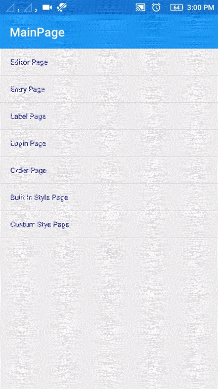
Click F5 or Build to Run your projects.Running this project, you will have the results like below.
Finally, we have successfully created a Xamarin.Forms TextApp Application.
Vijay PalvePosted Aug 16, 2018, 1:12 AM
What is the default font, font size and text color of the label
Pankaj NikamPosted Dec 5, 2017, 4:52 AM
Please fix the images.
Ahsan SiddiquePosted Dec 5, 2017, 1:58 AM
Every step have same result??
Ahsan SiddiquePosted Dec 5, 2017, 1:52 AM
What are you displaying in result??