

Custom Renderers
Xamarin.Forms user interfaces are rendered using the native controls of the target platform, allowing Xamarin.Forms applications to retain the appropriate look and feel for each platform. Custom Renderers let developers override this process to customize the appearance and behavior of Xamarin.Forms controls on each platform.
Prerequisites- Visual Studio 2017(Windows or Mac)
Start by creating a new Xamarin.Forms project. You’ll learn more by going through the steps yourself.
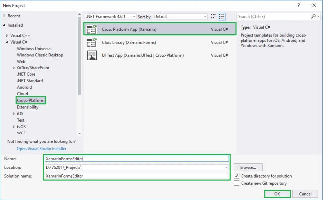
Choose the Cross-platform App project under Visual C#-->Cross-platform in the New Project dialog.
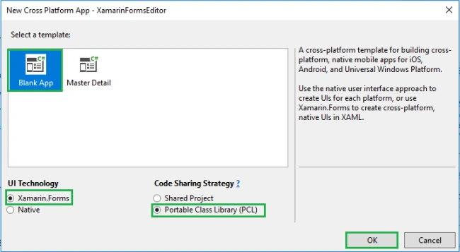
Now Select the Blank App and Choose Portable Class Library(PCL).
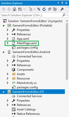
Subsequently, go to the solution. In there, you get all the files and sources of your project (PCL). Now, select XAML page and double-click to open the MainPage.Xaml page.
You now have a basic Xamarin.Forms app. Click the Play button to try it out.
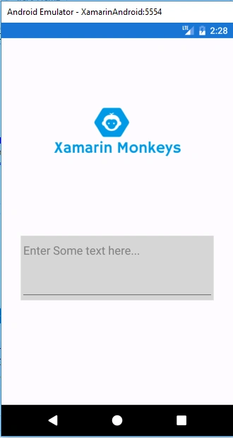
In this step, create a default Editor control with border. You can see there is no placeholder property. Now, write the following code.
MainPage.xaml
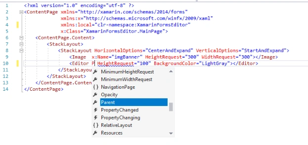
- <?xml version="1.0" encoding="utf-8" ?>
- <ContentPage xmlns="http://xamarin.com/schemas/2014/forms"
- xmlns:x="http://schemas.microsoft.com/winfx/2009/xaml"
- xmlns:local="clr-namespace:XamarinFormsEditor"
- x:Class="XamarinFormsEditor.MainPage">
- <ContentPage.Content>
- <StackLayout>
- <StackLayout HorizontalOptions="CenterAndExpand" VerticalOptions="StartAndExpand">
- <Image x:Name="imgBanner" HeightRequest="300" WidthRequest="300"></Image>
- <Editor Text="Enter Some text here..." HeightRequest="100" BackgroundColor="LightGray"></Editor>
- </StackLayout>
- </StackLayout>
- </ContentPage.Content>
- </ContentPage>
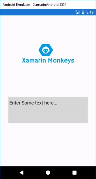
Click the Play button to try it out.
Create a Custom Editor
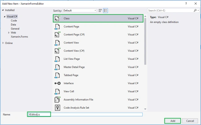
Now, create an Inherit class form Editor for customizing the Editor control.
Go to Solution—>PCL—>Right click—>New—>Class—>XEditor.cs.
Add the following Bindable Property to the Editor.
- Placeholder
- PlaceholderColor
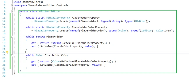
XEditor.cs
- using Xamarin.Forms;
- namespace XamarinFormsEditor.Controls
- {
- public class XEditor:Editor
- {
- public static BindableProperty PlaceholderProperty
- = BindableProperty.Create(nameof(Placeholder), typeof(string), typeof(XEditor));
- public static BindableProperty PlaceholderColorProperty
- = BindableProperty.Create(nameof(PlaceholderColor), typeof(Color), typeof(XEditor), Color.Gray);
- public string Placeholder
- {
- get { return (string)GetValue(PlaceholderProperty); }
- set { SetValue(PlaceholderProperty, value); }
- }
- public Color PlaceholderColor
- {
- get { return (Color)GetValue(PlaceholderColorProperty); }
- set { SetValue(PlaceholderColorProperty, value); }
- }
- }
- }
In this step, create an inherit Class form, EditorRenderer for customizing the Editor control.
Go to Solution.Droid—>Class—> XEditorRenderer.cs.
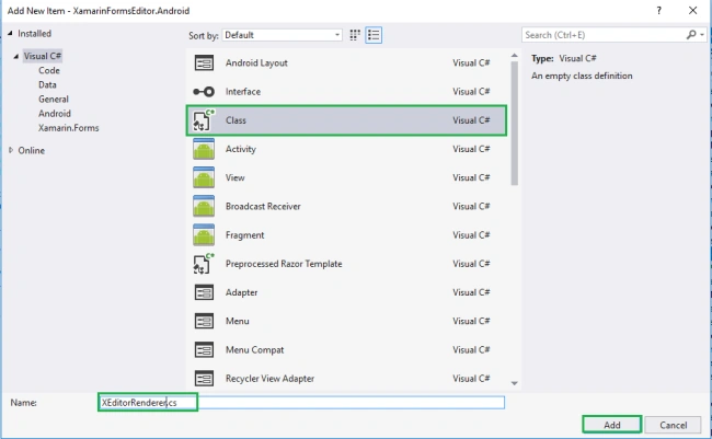
Now, write the code given below.
XEditorRenderer.cs
- using Xamarin.Forms;
- using XamarinFormsEditor.Controls;
- using XamarinFormsEditor.Droid.Helpers;
- using Xamarin.Forms.Platform.Android;
- using Android.Graphics.Drawables;
- [assembly: ExportRenderer(typeof(XEditor), typeof(XEditorRenderer))]
- namespace XamarinFormsEditor.Droid.Helpers
- {
- public class XEditorRenderer: EditorRenderer
- {
- protected override void OnElementChanged(ElementChangedEventArgs<Editor> e)
- {
- base.OnElementChanged(e);
- if (Control != null)
- {
- if (Element == null)
- return;
- var element = (XEditor)Element;
- Control.Hint = element.Placeholder;
- Control.SetHintTextColor(element.PlaceholderColor.ToAndroid());
- }
- }
- }
- }
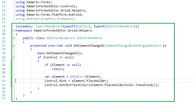
Now, add a customized Editor control to your app. Go to MainPage.Xaml and write the following code.
MainPage.Xaml
- <?xml version="1.0" encoding="utf-8" ?>
- <ContentPage xmlns="http://xamarin.com/schemas/2014/forms"
- xmlns:x="http://schemas.microsoft.com/winfx/2009/xaml"
- xmlns:local="clr-namespace:XamarinFormsEditor"
- xmlns:Controls="clr-namespace:XamarinFormsEditor.Controls"
- x:Class="XamarinFormsEditor.MainPage">
- <ContentPage.Content>
- <StackLayout>
- <StackLayout HorizontalOptions="CenterAndExpand" VerticalOptions="StartAndExpand">
- <Image x:Name="imgBanner" HeightRequest="300" WidthRequest="300"></Image>
- <Controls:XEditor Placeholder="Enter Some text here..." HeightRequest="100" BackgroundColor="LightGray"></Controls:XEditor>
- </StackLayout>
- </StackLayout>
- </ContentPage.Content>
- </ContentPage>
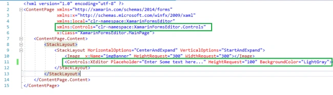
Go to MainPage.Xaml.cs and write the following code (optional).
MainPage.Xaml.cs
- using Xamarin.Forms;
- namespace XamarinFormsEditor
- {
- public partial class MainPage : ContentPage
- {
- public MainPage()
- {
- InitializeComponent();
- imgBanner.Source = ImageSource.FromResource("XamarinFormsEditor.images.banner.png");
- }
- }
- }

Click the Play button to try it out.
I hope you have understood how to create a Placeholder Editor using Custom Renderer.
Join the conversation! Your thoughts help the community grow.