

Proper layout and positioning are a vital part of interactive, high-performance and user-friendly Windows applications. This article of this series of articles explains the StackPanel in WPF. The series starts with an understanding of the WPF layout process. The next part of this series will cover the basics of layout and positioning such as size, margin, padding and alignment of elements. Later in this series, I will cover various panels and related parent controls available in WPF.
Table of Contents
- WPF Layout System: An Introduction
- WPF Layout: Size, Width and Height
- WPF Layout: Margins
- WPF Layout: Horizontal and Vertical Alignment
- WPF Layout: Content Alignments
- WPF Layout: Dealing with Percentage Size in WPF
- WPF Layout: Panels
- WPF Layout: Canvas
- WPF Layout: DockPanel
- WPF Layout: Grid
- WPF Layout: StackPanel
- WPF Layout: WrapPanel
- WPF Layout: Border
- WPF Layout: VirtualizingStackPanel
Introduction
In the previous article, WPF Layout: GridPanel, I discussed the GridPanel. This article focuses on the StackPanel in details.
StackPanel
A StackPanel arranges child elements in a single line that can be oriented horizontally or vertically. The StackPanel element in XAML represents a StackPanel. The following code snippet creates a StackPanel at design-time using XAML.
- <StackPanel Width="300" Height="200" Background="LightBlue" />
- <StackPanel Width="300" Height="200" Background="LightBlue" Orientation="Horizontal" />
Let's see an example. The code listed in Listing 1 places five ellipse elements in a Canvas.
- <Canvas >
- <Ellipse Width="100" Height="100" Fill="Red" />
- <Ellipse Width="80" Height="80" Fill="Orange" />
- <Ellipse Width="60" Height="60" Fill="Yellow" />
- <Ellipse Width="40" Height="40" Fill="Green" />
- <Ellipse Width="20" Height="20" Fill="Blue" />
- </Canvas>
Listing 1
Listing 1 generates Figure 1.
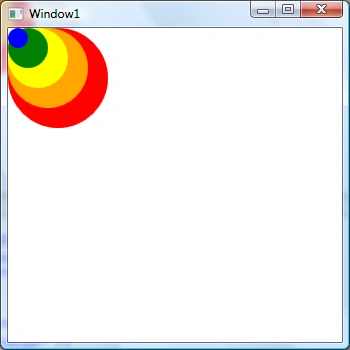
Figure 1
Now in Listing 2, let's replace Canvas with a StackPanel. The new code looks as in Listing 2.
- <StackPanel >
- <Ellipse Width="100" Height="100" Fill="Red" />
- <Ellipse Width="80" Height="80" Fill="Orange" />
- <Ellipse Width="60" Height="60" Fill="Yellow" />
- <Ellipse Width="40" Height="40" Fill="Green" />
- <Ellipse Width="20" Height="20" Fill="Blue" />
- </StackPanel>
Listing 2
The new output looks as in Figure 2, where you can see all the elements are stacked in the vertical direction.
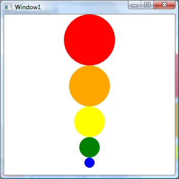
Figure 2
Now let's change the Orientation property to horizontal by changing the StackPanel code to the following.
- <StackPanel Orientation="Horizontal" >
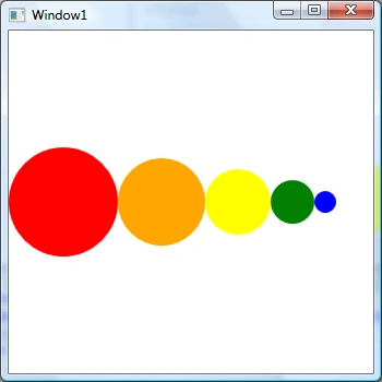
Figure 3
The StackPanel class in WPF represents a StackPanel. The code listed in Listing 3 creates a StackPanel dynamically, sets its properties and adds five ellipses.
- private void CreateDynamicStackPanel()
- {
- // Create a StackPanel and set its properties
- StackPanel dynamicStackPanel = new StackPanel();
- dynamicStackPanel.Width = 300;
- dynamicStackPanel.Height = 200;
- dynamicStackPanel.Background = new SolidColorBrush(Colors.LightBlue);
- dynamicStackPanel.Orientation = Orientation.Horizontal;
- // Create Ellipses and add to StackPanel
- Ellipse redCircle = new Ellipse();
- redCircle.Width = 100;
- redCircle.Height = 100;
- redCircle.Fill = new SolidColorBrush(Colors.Red);
- dynamicStackPanel.Children.Add(redCircle);
- Ellipse orangeCircle = new Ellipse();
- orangeCircle.Width = 80;
- orangeCircle.Height = 80;
- orangeCircle.Fill = new SolidColorBrush(Colors.Orange);
- dynamicStackPanel.Children.Add(orangeCircle);
- Ellipse yellowCircle = new Ellipse();
- yellowCircle.Width = 60;
- yellowCircle.Height = 60;
- yellowCircle.Fill = new SolidColorBrush(Colors.Yellow);
- dynamicStackPanel.Children.Add(yellowCircle);
- Ellipse greenCircle = new Ellipse();
- greenCircle.Width = 40;
- greenCircle.Height = 40;
- greenCircle.Fill = new SolidColorBrush(Colors.Green);
- dynamicStackPanel.Children.Add(greenCircle);
- Ellipse blueCircle = new Ellipse();
- blueCircle.Width = 20;
- blueCircle.Height = 20;
- blueCircle.Fill = new SolidColorBrush(Colors.Blue);
- dynamicStackPanel.Children.Add(blueCircle);
- // Display StackPanel into a Window
- RootWindow.Content = dynamicStackPanel;
- }
Listing 3
The output of Listing 3 generates Figure 4.
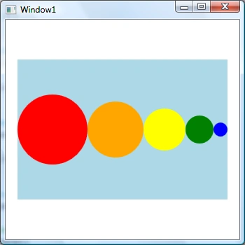
Figure 4
When there is not enough space on a StackPanel vertically or horizontally, you may add a scrolling feature to a StackPanel. The CanHorizontallyScroll and CanVerticallyScroll properties are used to add scrolling functionality to a StackPanel.
Summary
This article explained the StackPanel in WPF. In the next article of this series, I will focus on the WrapPanel in details.
Vithal WadjePosted Apr 6, 2015, 1:53 PM
nice one
Tom MohanPosted Mar 30, 2015, 11:44 AM
colorful one :)