

Introduction
The VisualStateManger has a collection of VisualStateGroups each one being a set of VisualStates that may apply in a given situation. Each of the groups are independent in the sense that one VisualState from each group might be active at any one time. For simplicity, let's just deal with one VisualStateGroup from which only one VisualState is active.

- <VisualStateManager.VisualStateGroups>
- <VisualStateGroup>
- list of visual states
- </VisualStateGroup>
- </VisualStateManager.VisualStateGroups>
An AdaptiveTrigger takes the simple form:
- <AdaptiveTrigger property=value />
The property is set to the value that you specify and this is usually used in a comparison with some other value to determine when the trigger fires.
Example
- <AdaptiveTrigger MinWindowsWidth=400 />
A Setter takes the form:
- <Setter Target="fully qualified property name"
- Value="value" />
- So for example:
- <Setter Target="Button1.Width"
- Value="200" />
Sets the Width of Button1 to 200 pixels if the state is active.
You can put multiple conditions and multiple setters into a single state.
Example
- <VisualState x:Name="Big">
- <VisualState.StateTriggers>
- <AdaptiveTrigger MinWindowWidth="600" /> </VisualState.StateTriggers>
- <VisualState.Setters>
- <Setter Target="Button1.Content" Value="Wide" /> </VisualState.Setters>
- </VisualState>
The simple answer is that whatever value the property had before is restored when the trigger isn't active. For example, if the Button's original definition was:
- <Button Name="Button1" Content="Narrow" />
The label on the Button would change to "Wide" as the window was resized to bigger than 600 pixels and to "Narrow" when it became smaller than 599 pixels. That is, when none of the VisualStates are active, the system restores the UI too as it was originally specified in the XAML.
If you would rather have the default state included as a part of the VisualStateManager you can include it as:
- <VisualState x:Name="Small">
- <VisualState.StateTriggers>
- <AdaptiveTrigger MinWindowWidth="0" /> </VisualState.StateTriggers>
- <VisualState.Setters>
- <Setter Target="Button1.Content" Value="Narrow" /> </VisualState.Setters>
- </VisualState>
Putting the whole thing together gives:
- <Page x:Class="App4.MainPage" xmlns="http://schemas.microsoft.com/
- winfx/2006/xaml/presentation" xmlns:x="http://schemas.microsoft.com/
- winfx/2006/xaml" xmlns:local="using:App4" xmlns:d="http://schemas.microsoft.com/
- expression/blend/2008" xmlns:mc="http://schemas.openxmlformats.org/
- markup-compatibility/2006" mc:Ignorable="d">
- <Grid Background="{ThemeResource
- ApplicationPageBackgroundThemeBrush}">
- <VisualStateManager.VisualStateGroups>
- <VisualStateGroup>
- <VisualState x:Name="Small">
- <VisualState.StateTriggers>
- <AdaptiveTrigger MinWindowWidth="0" /> </VisualState.StateTriggers>
- <VisualState.Setters>
- <Setter Target="Button1.Content" Value="Narrow" /> </VisualState.Setters>
- </VisualState>
- <VisualState x:Name="Big">
- <VisualState.StateTriggers>
- <AdaptiveTrigger MinWindowWidth="600" /> </VisualState.StateTriggers>
- <VisualState.Setters>
- <Setter Target="Button1.Content" Value="Wide" /> </VisualState.Setters>
- </VisualState>
- </VisualStateGroup>
- </VisualStateManager.VisualStateGroups>
- <Button x:Name="Button1" HorizontalAlignment="Left" VerticalAlignment="Top" Margin="196,172,0,0" /> </Grid>
- </Page>
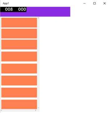
If you run this application and resize the width of the window you will see the label on the Button change as you cross the 600 pixel wide limit.

Summary
In this article, we learned about Windows 10 Universal Apps (UAD) - Adaptive Triggers.
Gowtham RajamanickamPosted Apr 20, 2016, 8:38 AM
good share
Imran Javed ZiaPosted Dec 5, 2015, 6:48 AM
Nice Work
Santhakumar MunuswamyPosted Oct 25, 2015, 11:15 AM
Good Article
Mukesh KumarPosted Oct 24, 2015, 12:04 PM
Great Job
Sibeesh VenuPosted Oct 24, 2015, 3:30 AM
Nice Share
Nilesh JadavPosted Oct 24, 2015, 2:56 AM
Good share sir !!
Harshad PansuriyaPosted Oct 24, 2015, 12:01 AM
Nice one