

A DataGrid is used as a placeholder/container to display a collection of data bound to it in a tabular format. When you are working with WPF or Silverlight, Expression Blend can be very handy when designing user interfaces. Blend is a designer tool that saves developers lots of time while building user interfaces. By using it's designer and drag and drop features, interfaces can be built in no time.
In this article, we will see how to use Expression Blend to use a DataGrid control.
Follow the steps below.
Step 1 : Open a WPF application in Expression blend and give it any name you wish.
- Now the design panel or the artboard opens up.
- Go to data panel.
- Click on the add new sample.
- Then select "new sample data".
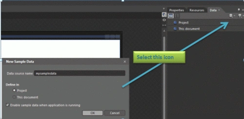
Step 2 : Now a window appears prompting you for the sample data name. Enter the sample data name, here I have named it as "mysampledata".
- Now a new sample data is created.
- Click on the Datasource option. you will
see following options.
- Reimport sample data from XML.
- Enable when running applicaion.
- Remove "your sample name".
- check the option "Enable when running applicaion".
- Enabling this option lets you see the sample data when the application is run otherwise it shows blank space in place of sample data.
Step 3 : You'll see that as soon as you name the sample data, the sample data is added to the data panel and it has another sub part named "Collection".
- By default few properties are added to the collection list.
- You can add more properties by clicking on the "+" in front of collection.
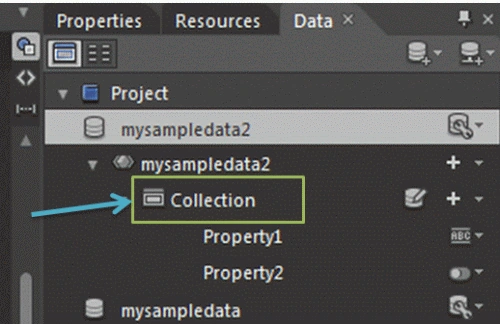
Step 4 : There are mainly three options in front of the collection folder.
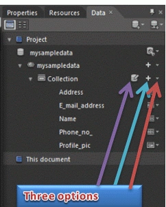
- Edit sample values : This option is used to edit the properties added so far.
- Add property : this option adds a new property to the collection folder.
- Dropdown list showing:
-
Add Simple Property : This
option adds a String, Number, Boolean, or Image property. String
property is added to the simple property by default, but you can also
select Change property
type
 and
select a different type.
and
select a different type. - Add Complex Property : This option is used to create a property that can contain child properties. For example, RSS feeds often represent a channel using a complex property whose child properties include the category, description, and a collection of news items related to the channel.
- Add Collection Property : This option creates a collection of records and each record can contain multiple items of data. For example, RSS feeds often represent news items in a collection where each record in the collection includes the title of the news item, the description, and other related information.
- convert to hierarchical collection
-
Add Simple Property : This
option adds a String, Number, Boolean, or Image property. String
property is added to the simple property by default, but you can also
select Change property
type
Step 5 : You can change the name of the property so added by double clicking on the property and naming it thence.
Step 6 : Then you will see that there are "change property" option in front of the property. Click on this and the following list opens up.
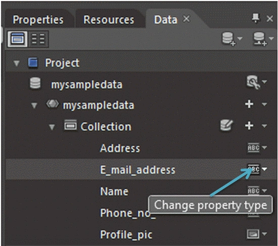
- Type : This refers to the type of
property you want to use. There are four main types of properties available
to you here.
- String : It refers to the simple collection of string of information that you want to use in your property such as biography, Project details, ingredients etc.
- Number : This refers to the integer type of numbers that you would like to add in your property such as quantity, amount, average etc.
- Boolean : This refers to data that have only two options of choice i.e. either yes or no, Check or uncheck etc.
- Image : As soon as this option
is selected Two property opens up namely Type and Image location. In
this property you can chose the images that can be assigned to other
property like String, Boolean, Number etc.
- Format : This is the option you get
when you select the change property option after the TYPE option. This
property has following list of options predefined in it.
- Liuem Ipsum
- Address
- Colors
- Company name
- Data
- Email Address
- Name
- Phone number
- Price
- Time
- Website Url
you can use these properties depending on the requirement of the data you are using.
- Max word count : This option is used to limit the total number of words in the property information
- max word length : This option limits the maximum number of words in a property information
NOTE: The option 3rd and 4th are visible only when the Format property has Lieum Ipsum slelected.
Step 7 : Now you would be thinking how to change the already defined name, address, image e-mail properties. for this.
- Go to Data panel.
- Go to Collection--> There is a option named Edit sample values in front of collection.
- Click on this option and a window opens up as shown below.
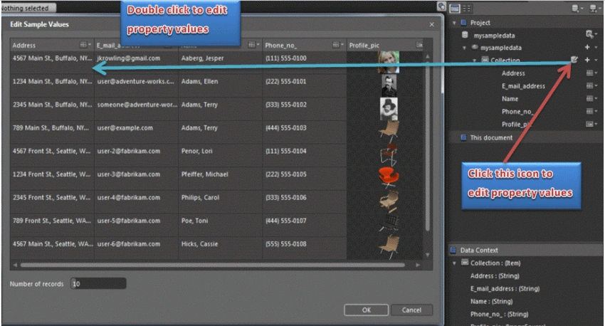
- Now in this window double click on any property and change it. That's all.
Step 8 : Now Adding the data grid.
- Go to Asset library.
- Select categories.
- Inside categories select Data.
- Now the datagrid appears in the library.
Step 9 : Now drag this datagrid onto the artboard. Resize this by selecting the selection tool from the asset library as per the need.
- Now drag the collection list from the data panel--> Sample data created.
- You will see that the properties defined in the sample data are displayed in the datagrid.
- A new column is added to the end of the Datagrid object, and displays the data in the property.
- If you want to reorder the columns in the Datagrid object, drag the columns to different locations under the Columns node in the Objects and Timeline panel.
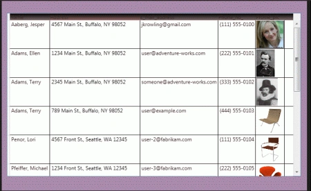
Step 10 : You can also change the look of the datagrid columns. For this.
- Go to the Object and Timeline.
- In the Objects and Timeline panel expand the datagrid .
- Select the first column object for example in my application it is [DataGridTextColumn] "Name". In order to change the heading of the list go to the property panel and change the Header property change the name.
- You may change the other columns also if you want.
- Press F5 to see how your application looks like.
Step 11 : To change the appearance of column headers do the following.
- In the Objects and Timeline panel right-click on the datagrid object, select "Edit Additional Templates", then select Edit ColumnHeaderStyle, and then click Edit a Copy.
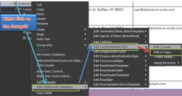
- Now a new window named Create Style Resource opens up, click OK.
-
Now you can edit template.
-
In the Objects and Timeline panel, add other objects to the template, or modify the other properties of datagrid other than header.
Step 12 : The XAML coding that generated is.
<Window xmlns="http://schemas.microsoft.com/winfx/2006/xaml/presentation"
xmlns:x="http://schemas.microsoft.com/winfx/2006/xaml"
xmlns:Microsoft_Windows_Themes="clr-namespace:Microsoft.Windows.Themes;assembly=PresentationFramework.Aero"
xmlns:d="http://schemas.microsoft.com/expression/blend/2008"
xmlns:mc="http://schemas.openxmlformats.org/markup-compatibility/2006"
mc:Ignorable="d"
x:Class="WpfApplication5.MainWindow"
x:Name="Window"
Title="MainWindow"
Width="725"
Height="483"
Background="#FFA988AB">
<Window.Resources>
<DataTemplate
x:Key="ItemTemplate">
<StackPanel>
<Image
Source="{Binding
Property2}"
HorizontalAlignment="Left"
Height="64"
Width="64"/>
</StackPanel>
</DataTemplate>
<DataTemplate
x:Key="ItemTemplate1">
<StackPanel>
<Image
Source="{Binding
Name}"
HorizontalAlignment="Left"
Height="64"
Width="64"/>
</StackPanel>
</DataTemplate>
<DataTemplate
x:Key="ItemTemplate2">
<StackPanel>
<TextBlock
Text="{Binding
Phone_no_}"/>
</StackPanel>
</DataTemplate>
<DataTemplate
x:Key="ItemTemplate3">
<StackPanel>
<Image
Source="{Binding
E_mail_address}"
HorizontalAlignment="Left"
Height="64"
Width="64"/>
</StackPanel>
</DataTemplate>
<DataTemplate
x:Key="ItemTemplate4">
<StackPanel>
<TextBlock
Text="{Binding
E_mail_address}"/>
</StackPanel>
</DataTemplate>
<DataTemplate
x:Key="ItemTemplate5">
<StackPanel>
<TextBlock
Text="{Binding
Phone_no_}"/>
</StackPanel>
</DataTemplate>
<DataTemplate
x:Key="Profile_picTemplate">
<StackPanel>
<Image
Source="{Binding
Profile_pic}"
HorizontalAlignment="Left"
Height="64"
Width="64"/>
</StackPanel>
</DataTemplate>
<Style
x:Key="ColumnHeaderGripperStyle"
TargetType="{x:Type
Thumb}">
<Setter
Property="Width"
Value="8"/>
<Setter
Property="Background"
Value="Transparent"/>
<Setter
Property="Cursor"
Value="SizeWE"/>
<Setter
Property="Template">
<Setter.Value>
<ControlTemplate
TargetType="{x:Type
Thumb}">
<Border
Background="{TemplateBinding
Background}"
Padding="{TemplateBinding
Padding}"/>
</ControlTemplate>
</Setter.Value>
</Setter>
</Style>
<Style
x:Key="DataGridColumnHeaderStyle1"
TargetType="{x:Type
DataGridColumnHeader}">
<Setter
Property="VerticalContentAlignment"
Value="Center"/>
<Setter
Property="Template"
Value="{DynamicResource
DataGridColumnHeaderControlTemplate1}"/>
</Style>
<ControlTemplate
x:Key="DataGridColumnHeaderControlTemplate1"
TargetType="{x:Type
DataGridColumnHeader}">
<Grid
Margin="0"
HorizontalAlignment="Left"
Width="383.62">
<Microsoft_Windows_Themes:DataGridHeaderBorder
BorderBrush="{TemplateBinding
BorderBrush}"
BorderThickness="{TemplateBinding
BorderThickness}"
Background="{TemplateBinding
Background}"
IsClickable="{TemplateBinding
CanUserSort}"
IsPressed="{TemplateBinding
IsPressed}
IsHovered="{TemplateBinding
IsMouseOver}"
Padding="{TemplateBinding
Padding}"
SortDirection="{TemplateBinding
SortDirection}"
SeparatorBrush="{TemplateBinding
SeparatorBrush}"
SeparatorVisibility="{TemplateBinding
SeparatorVisibility}"
Margin="0,0,0,-2"
Height="Auto"
VerticalAlignment="Stretch"
RenderTransformOrigin="0.5,0.464"
Width="189.62"
HorizontalAlignment="Left"
d:LayoutOverrides="HorizontalAlignment">
<ContentPresenter
HorizontalAlignment="{TemplateBinding
HorizontalContentAlignment}"
SnapsToDevicePixels="{TemplateBinding
SnapsToDevicePixels}"
VerticalAlignment="{TemplateBinding
VerticalContentAlignment}"/>
</Microsoft_Windows_Themes:DataGridHeaderBorder>
<Thumb
x:Name="PART_LeftHeaderGripper"
HorizontalAlignment="Left"
Style="{StaticResource
ColumnHeaderGripperStyle}"/>
<Thumb
x:Name="PART_RightHeaderGripper"
HorizontalAlignment="Right"
Style="{StaticResource
ColumnHeaderGripperStyle}"
Width="109"/>
</Grid>
</ControlTemplate>
<SolidColorBrush
x:Key="{x:Static
DataGrid.FocusBorderBrushKey}"
Color="#FF000000"/>
<Style
x:Key="DataGridCellStyle1"
TargetType="{x:Type
DataGridCell}">
<Setter
Property="Background"
Value="Transparent"/>
<Setter
Property="BorderBrush"
Value="Transparent"/>
<Setter
Property="BorderThickness"
Value="1"/>
<Setter
Property="Template">
<Setter.Value>
<ControlTemplate
TargetType="{x:Type
DataGridCell}">
<Border
BorderBrush="{TemplateBinding
BorderBrush}"
BorderThickness="{TemplateBinding
BorderThickness}"
Background="{TemplateBinding
Background}"
SnapsToDevicePixels="True">
<ContentPresenter SnapsToDevicePixels="{TemplateBinding SnapsToDevicePixels}" Margin="-135,0,0,0" HorizontalAlignment="Left" Width="124.83"/>
</Border>
</ControlTemplate>
</Setter.Value>
</Setter>
<Style.Triggers>
<Trigger
Property="IsSelected"
Value="True">
<Setter
Property="Background"
Value="{DynamicResource
{x:Static SystemColors.HighlightBrushKey}}"/>
<Setter
Property="Foreground"
Value="{DynamicResource
{x:Static SystemColors.HighlightTextBrushKey}}"/>
<Setter
Property="BorderBrush"
Value="{DynamicResource
{x:Static SystemColors.HighlightBrushKey}}"/
</Trigger>
<Trigger
Property="IsKeyboardFocusWithin"
Value="True">
<Setter
Property="BorderBrush"
Value="{DynamicResource
{x:Static DataGrid.FocusBorderBrushKey}}"/>
</Trigger>
</Style.Triggers>
</Style>
<Style
x:Key="{ComponentResourceKey
ResourceId=DataGridSelectAllButtonStyle, TypeInTargetAssembly={x:Type
DataGrid}}
TargetType="{x:Type
Button}">
<Setter
Property="Template">
<Setter.Value>
<ControlTemplate
TargetType="{x:Type
Button}">
<Grid>
<Rectangle
x:Name="Border"
Fill="{DynamicResource
{x:Static SystemColors.ControlBrushKey}}"
SnapsToDevicePixels="True"/>
<Polygon
x:Name="Arrow"
Fill="Black"
HorizontalAlignment="Right"
Margin="8,8,3,3"
Opacity="0.15"
Points="0,10
10,10 10,0"
Stretch="Uniform
VerticalAlignment="Bottom"/>
</Grid>
<ControlTemplate.Triggers>
<Trigger
Property="IsMouseOver"
Value="True">
<Setter
Property="Stroke"
TargetName="Border"
Value="{DynamicResource
{x:Static SystemColors.ControlDarkBrushKey}}"/>
</Trigger>
<Trigger
Property="IsPressed"
Value="True">
<Setter
Property="Fill"
TargetName="Border"
Value="{DynamicResource
{x:Static SystemColors.ControlDarkBrushKey}}"/>
</Trigger>
<Trigger
Property="IsEnabled"
Value="False">
<Setter
Property="Visibility"
TargetName="Arrow"
Value="Collapsed"/>
</Trigger>
</ControlTemplate.Triggers>
</ControlTemplate>
</Setter.Value>
</Setter>
</Style>
<Style
x:Key="DataGridStyle1"
TargetType="{x:Type
DataGrid}">
<Setter
Property="Background"
Value="{DynamicResource
{x:Static SystemColors.ControlBrushKey}}"/>
<Setter
Property="Foreground"
Value="{DynamicResource
{x:Static SystemColors.ControlTextBrushKey}}"/>
<Setter
Property="BorderBrush"
Value="#FF688CAF"/>
<Setter
Property="BorderThickness"
Value="1"/>
<Setter
Property="RowDetailsVisibilityMode"
Value="VisibleWhenSelected"/>
<Setter
Property="ScrollViewer.CanContentScroll"
Value="true"/>
<Setter
Property="ScrollViewer.PanningMode"
Value="Both"/>
<Setter
Property="Stylus.IsFlicksEnabled"
Value="False"/>
<Setter
Property="Template">
<Setter.Value>
<ControlTemplate
TargetType="{x:Type
DataGrid}">
<Border
BorderBrush="{TemplateBinding
BorderBrush}"
BorderThickness="{TemplateBinding
BorderThickness}"
Background="{TemplateBinding
Background}"
Padding="{TemplateBinding
Padding}"
SnapsToDevicePixels="True">
<ScrollViewer
x:Name="DG_ScrollViewer"
Focusable="false">
<ScrollViewer.Template>
<ControlTemplate
TargetType="{x:Type
ScrollViewer}">
<Grid>
<Grid.ColumnDefinitions>
<ColumnDefinition
Width="Auto"/>
<ColumnDefinition
Width="*"/>
<ColumnDefinition
Width="Auto"/>
</Grid.ColumnDefinitions>
<Grid.RowDefinitions>
<RowDefinition
Height="Auto"/>
<RowDefinition
Height="*"/>
<RowDefinition
Height="Auto"/>
</Grid.RowDefinitions>
<Button
Command="{x:Static
DataGrid.SelectAllCommand}"
Focusable="false"
Style="{DynamicResource
{ComponentResourceKey
ResourceId=DataGridSelectAllButtonStyle,
TypeInTargetAssembly={x:Type DataGrid}}}"
Visibility="{Binding
HeadersVisibility, ConverterParameter
{x:Static
DataGridHeadersVisibility.All}, Converter={x:Static
DataGrid.HeadersVisibilityConverter}, RelativeSource={RelativeSource
AncestorType={x:Type DataGrid}}}"
Width="{Binding
CellsPanelHorizontalOffset, RelativeSource={RelativeSource AncestorType={x:Type
DataGrid}}}"/>
<DataGridColumnHeadersPresenter x:Name="PART_ColumnHeadersPresenter" Grid.Column="1" Visibility="{Binding HeadersVisibility, ConverterParameter={x:Static DataGridHeadersVisibility.Column}, Converter={x:Static DataGrid.HeadersVisibilityConverter}, RelativeSource={RelativeSource AncestorType={x:Type DataGrid}}}"/>
<ScrollContentPresenter x:Name="PART_ScrollContentPresenter" CanContentScroll="{TemplateBinding CanContentScroll}" Grid.ColumnSpan="2" Grid.Row="1"/>
<ScrollBar x:Name="PART_VerticalScrollBar" Grid.Column="2" Maximum="{TemplateBinding ScrollableHeight}" Orientation="Vertical" Grid.Row="1" Visibility="{TemplateBinding ComputedVerticalScrollBarVisibility}" Value="{Binding VerticalOffset, Mode=OneWay, RelativeSource={RelativeSource TemplatedParent}}" ViewportSize="{TemplateBinding ViewportHeight}"/>
<Grid
Grid.Column="1"
Grid.Row="2">
<Grid.ColumnDefinitions>
<ColumnDefinition
Width="{Binding
NonFrozenColumnsViewportHorizontalOffset, RelativeSource={RelativeSource
AncestorType=
x:Type DataGrid}}}"/>
<ColumnDefinition
Width="*"/>
</Grid.ColumnDefinitions>
<ScrollBar
x:Name="PART_HorizontalScrollBar"
Grid.Column="1"
Maximum="{TemplateBinding
ScrollableWidth}"
Orientation="Horizontal"
Visibility="{TemplateBinding
ComputedHorizontalScrollBarVisibility}"
Value="{Binding
HorizontalOffset, Mode=OneWay, RelativeSource={RelativeSource
TemplatedParent}}"
ViewportSize="{TemplateBinding
ViewportWidth}"/>
</Grid>
</Grid>
</ControlTemplate>
</ScrollViewer.Template>
<ItemsPresenter
SnapsToDevicePixels="{TemplateBinding
SnapsToDevicePixels}"
Width="587"
Height="367.04">
<ItemsPresenter.OpacityMask>
<LinearGradientBrush
EndPoint="0.5,1"
StartPoint="0.5,0">
<GradientStop
Color="#FF1EA162"
Offset="0"/>
<GradientStop
Color="#FF2436CA"
Offset="1"/>
<GradientStop
Color="#FFB1C826"
Offset="0.33"/>
</LinearGradientBrush>
</ItemsPresenter.OpacityMask>
</ItemsPresenter>
</ScrollViewer>
</Border>
</ControlTemplate>
</Setter.Value>
</Setter>
<Style.Triggers>
<Trigger
Property="IsGrouping"
Value="true">
<Setter
Property="ScrollViewer.CanContentScroll"
Value="false"/>
</Trigger>
</Style.Triggers>
</Style>
<Style
x:Key="DataGridCellStyle2"
TargetType="{x:Type
DataGridCell}">
<Setter
Property="Background"
Value="Transparent"/>
<Setter
Property="BorderBrush"
Value="Transparent"/>
<Setter
Property="BorderThickness"
Value="1"/>
<Setter
Property="Template"
Value="{DynamicResource
DataGridCellControlTemplate1}"/>
<Style.Triggers>
<Trigger
Property="IsSelected"
Value="True">
<Setter
Property="Background"
Value="{DynamicResource
{x:Static SystemColors.HighlightBrushKey}}"/>
<Setter
Property="Foreground"
Value="{DynamicResource
{x:Static SystemColors.HighlightTextBrushKey}}"/>
<Setter
Property="BorderBrush"
Value="{DynamicResource
{x:Static SystemColors.HighlightBrushKey}}"/>
</Trigger>
<Trigger
Property="IsKeyboardFocusWithin"
Value="True">
<Setter
Property="BorderBrush"
Value="{DynamicResource
{x:Static DataGrid.FocusBorderBrushKey}}"/>
</Trigger>
</Style.Triggers>
</Style>
<ControlTemplate
x:Key="DataGridCellControlTemplate1"
TargetType="{x:Type
DataGridCell}">
<Border
BorderBrush="{TemplateBinding
BorderBrush}"
BorderThickness="{TemplateBinding
BorderThickness}"
Background="{TemplateBinding
Background}"
SnapsToDevicePixels="True">
<ContentPresenter SnapsToDevicePixels="{TemplateBinding SnapsToDevicePixels}" Width="158.62" HorizontalAlignment="Left">
<ContentPresenter.OpacityMask>
<LinearGradientBrush
EndPoint="0.5,1"
StartPoint="0.5,0">
<GradientStop
Color="#FFD62A2A"
Offset="0"/>
<GradientStop
Color="White"
Offset="1"/>
<GradientStop
Color="#FF41EB20"
Offset="0.3"/>
<GradientStop
Color="#FF344BCA"
Offset="0.643"/>
</LinearGradientBrush>
</ContentPresenter.OpacityMask>
</ContentPresenter>
</Border>
</ControlTemplate>
<Style
x:Key="DataGridCellStyle3"
TargetType="{x:Type
DataGridCell}">
<Setter
Property="Background"
Value="Transparent"/>
<Setter
Property="BorderBrush"
Value="Transparent"/>
<Setter
Property="BorderThickness"
Value="1"/>
<Setter
Property="Template">
<Setter.Value>
<ControlTemplate
TargetType="{x:Type
DataGridCell}">
<Border
BorderBrush="{TemplateBinding
BorderBrush}"
BorderThickness="{TemplateBinding
BorderThickness}"
Background="{TemplateBinding
Background}"
SnapsToDevicePixels="True"
OpacityMask="#FFDEBB19">
<ContentPresenter SnapsToDevicePixels="{TemplateBinding SnapsToDevicePixels}" Margin="-309,0,0,0" HorizontalAlignment="Left" Width="88.477"/>
</Border>
</ControlTemplate>
</Setter.Value>
</Setter>
<Style.Triggers>
<Trigger
Property="IsSelected"
Value="True">
<Setter
Property="Background"
Value="{DynamicResource
{x:Static SystemColors.HighlightBrushKey}}"/>
<Setter
Property="Foreground"
Value="{DynamicResource
{x:Static SystemColors.HighlightTextBrushKey}}"/>
<Setter
Property="BorderBrush"
Value="{DynamicResource
{x:Static SystemColors.HighlightBrushKey}}"/>
</Trigger>
<Trigger
Property="IsKeyboardFocusWithin"
Value="True">
<Setter
Property="BorderBrush"
Value="{DynamicResource
{x:Static DataGrid.FocusBorderBrushKey}}"/>
</Trigger>
</Style.Triggers>
</Style>
<Style
x:Key="TextBlockStyle1"
TargetType="{x:Type
TextBlock}">
<Setter
Property="Margin"
Value="2,0"/>
</Style>
<Style
x:Key="DataGridCellStyle4"
TargetType="{x:Type
DataGridCell}">
<Setter
Property="Background"
Value="Transparent"/>
<Setter
Property="BorderBrush"
Value="Transparent"/>
<Setter
Property="BorderThickness"
Value="1"/>
<Setter
Property="Template">
<Setter.Value>
<ControlTemplate
TargetType="{x:Type
DataGridCell}">
<Border
BorderBrush="{TemplateBinding
BorderBrush}"
BorderThickness="{TemplateBinding
BorderThickness}"
Background="{TemplateBinding
Background}"
SnapsToDevicePixels="True">
<ContentPresenter SnapsToDevicePixels="{TemplateBinding SnapsToDevicePixels}" Margin="-132,0,0,0" HorizontalAlignment="Left" Width="88.027" OpacityMask="#FF2546A9"/>
</Border>
</ControlTemplate>
</Setter.Value>
</Setter>
<Style.Triggers>
<Trigger
Property="IsSelected"
Value="True">
<Setter
Property="Background"
Value="{DynamicResource
{x:Static SystemColors.HighlightBrushKey}}"/>
<Setter
Property="Foreground"
Value="{DynamicResource
{x:Static SystemColors.HighlightTextBrushKey}}"/>
<Setter
Property="BorderBrush"
Value="{DynamicResource
{x:Static SystemColors.HighlightBrushKey}}"/>
</Trigger>
<Trigger
Property="IsKeyboardFocusWithin"
Value="True">
<Setter
Property="BorderBrush"
Value="{DynamicResource
{x:Static DataGrid.FocusBorderBrushKey}}"/>
</Trigger>
</Style.Triggers>
</Style>
<Style
x:Key="DataGridCellStyle5"
TargetType="{x:Type
DataGridCell}">
<Setter
Property="Background"
Value="Transparent"/>
<Setter
Property="BorderBrush"
Value="Transparent"/>
<Setter
Property="BorderThickness"
Value="1"/>
<Setter
Property="Template">
<Setter.Value>
<ControlTemplate
TargetType="{x:Type
DataGridCell}">
<Border
BorderBrush="{TemplateBinding
BorderBrush}"
BorderThickness="{TemplateBinding
BorderThickness}"
Background="{TemplateBinding
Background}"
SnapsToDevicePixels="True">
<ContentPresenter SnapsToDevicePixels="{TemplateBinding SnapsToDevicePixels}" Margin="-129,0,0,0" HorizontalAlignment="Left" Width="86"/>
</Border>
</ControlTemplate>
</Setter.Value>
</Setter>
<Style.Triggers>
<Trigger
Property="IsSelected"
Value="True">
<Setter
Property="Background"
Value="{DynamicResource
{x:Static SystemColors.HighlightBrushKey}}"/>
<Setter
Property="Foreground"
Value="{DynamicResource
{x:Static SystemColors.HighlightTextBrushKey}}"/>
<Setter
Property="BorderBrush"
Value="{DynamicResource
{x:Static SystemColors.HighlightBrushKey}}"/>
</Trigger>
<Trigger
Property="IsKeyboardFocusWithin"
Value="True">
<Setter
Property="BorderBrush"
Value="{DynamicResource
{x:Static DataGrid.FocusBorderBrushKey}}"/>
</Trigger>
</Style.Triggers>
</Style>
<Style
x:Key="DataGridStyle2"
TargetType="{x:Type
DataGrid}">
<Setter
Property="Background"
Value="{DynamicResource
{x:Static SystemColors.ControlBrushKey}}"/
<Setter
Property="Foreground"
Value="{DynamicResource
{x:Static SystemColors.ControlTextBrushKey}}"/>
<Setter
Property="BorderBrush"
Value="#FF688CAF"/>
<Setter
Property="BorderThickness"
Value="1"/>
<Setter
Property="RowDetailsVisibilityMode"
Value="VisibleWhenSelected"/>
<Setter
Property="ScrollViewer.CanContentScroll"
Value="true"/>
<Setter
Property="ScrollViewer.PanningMode"
Value="Both"/>
<Setter
Property="Stylus.IsFlicksEnabled"
Value="False"/>
<Setter
Property="Template">
<Setter.Value>
<ControlTemplate
TargetType="{x:Type
DataGrid}">
<Border
BorderBrush="{TemplateBinding
BorderBrush}"
BorderThickness="{TemplateBinding
BorderThickness}"
Background="{TemplateBinding
Background}"
Padding="{TemplateBinding
Padding}"
SnapsToDevicePixels="True">
<ScrollViewer
x:Name="DG_ScrollViewer"
Focusable="false">
<ScrollViewer.Template>
<ControlTemplate
TargetType="{x:Type
ScrollViewer}">
<Grid>
<Grid.ColumnDefinitions>
<ColumnDefinition
Width="Auto"/>
<ColumnDefinition
Width="*"/>
<ColumnDefinition
Width="Auto"/>
</Grid.ColumnDefinitions>
<Grid.RowDefinitions>
<RowDefinition
Height="Auto"/>
<RowDefinition
Height="*"/>
<RowDefinition
Height="Auto"/>
</Grid.RowDefinitions>
<Button Command="{x:Static DataGrid.SelectAllCommand}" Focusable="false" Style="{DynamicResource {ComponentResourceKey ResourceId=DataGridSelectAllButtonStyle, TypeInTargetAssembly={x:Type DataGrid}}}" Visibility="{Binding HeadersVisibility, ConverterParameter={x:Static DataGridHeadersVisibility.All}, Converter={x:Static DataGrid.HeadersVisibilityConverter}, RelativeSource={RelativeSource AncestorType={x:Type DataGrid}}}" Width="{Binding CellsPanelHorizontalOffset, RelativeSource={RelativeSource AncestorType={x:Type DataGrid}}}"/>
<DataGridColumnHeadersPresenter x:Name="PART_ColumnHeadersPresenter" Grid.Column="1" Visibility="{Binding HeadersVisibility, ConverterParameter={x:Static DataGridHeadersVisibility.Column}, Converter={x:Static DataGrid.HeadersVisibilityConverter}, RelativeSource={RelativeSource AncestorType={x:Type DataGrid}}}"/>
<ScrollContentPresenter x:Name="PART_ScrollContentPresenter" CanContentScroll="{TemplateBinding CanContentScroll}" Grid.ColumnSpan="2" Grid.Row="1"/>
<ScrollBar x:Name="PART_VerticalScrollBar" Grid.Column="2" Maximum="{TemplateBinding ScrollableHeight}" Orientation="Vertical" Grid.Row="1" Visibility="{TemplateBinding ComputedVerticalScrollBarVisibility}" Value="{Binding VerticalOffset, Mode=OneWay, RelativeSource={RelativeSource TemplatedParent}}" ViewportSize="{TemplateBinding ViewportHeight}"/>
<Grid
Grid.Column="1"
Grid.Row="2">
<Grid.ColumnDefinitions>
<ColumnDefinition
Width="{Binding
NonFrozenColumnsViewportHorizontalOffset, RelativeSource={RelativeSource
AncestorType
{x:Type DataGrid}}}"/>
<ColumnDefinition
Width="*"/>
</Grid.ColumnDefinitions>
<ScrollBar
x:Name="PART_HorizontalScrollBar"
Grid.Column="1"
Maximum="{TemplateBinding
ScrollableWidth}"
Orientation="Horizontal"
Visibility="{TemplateBinding
ComputedHorizontalScrollBarVisibility}"
Value="{Binding
HorizontalOffset, Mode=OneWay, RelativeSource={RelativeSource
TemplatedParent}}"
ViewportSize="{TemplateBinding
ViewportWidth}"/>
</Grid>
</Grid>
</ControlTemplate>
</ScrollViewer.Template>
<ItemsPresenter
SnapsToDevicePixels="{TemplateBinding
SnapsToDevicePixels}"
OpacityMask="#FFB63E3E"/>
</ScrollViewer>
</Border>
</ControlTemplate>
</Setter.Value>
</Setter>
<Style.Triggers>
<Trigger
Property="IsGrouping"
Value="true">
<Setter
Property="ScrollViewer.CanContentScroll"
Value="false"/>
</Trigger>
</Style.Triggers>
</Style>
<DataTemplate
x:Key="Profile_picTemplate1">
<StackPanel>
<Image
Source="{Binding
Profile_pic}"
HorizontalAlignment="Left"
Height="64"
Width="64"/>
</StackPanel>
</DataTemplate>
<Style
x:Key="DataGridColumnHeaderStyle2"
TargetType="{x:Type
DataGridColumnHeader}">
<Setter
Property="VerticalContentAlignment"
Value="Center"/>
<Setter
Property="Template">
<Setter.Value>
<ControlTemplate
TargetType="{x:Type
DataGridColumnHeader}">
<Grid>
<Microsoft_Windows_Themes:DataGridHeaderBorder
BorderBrush="{TemplateBinding
BorderBrush}"
BorderThickness="{TemplateBinding
BorderThickness}"
Background="{TemplateBinding
Background}"
IsClickable="{TemplateBinding
CanUserSort}"
IsPressed="{TemplateBinding
IsPressed}"
IsHovered="{TemplateBinding
IsMouseOver}"
Padding="{TemplateBinding
Padding}"
SortDirection="{TemplateBinding
SortDirection}"
SeparatorBrush="{TemplateBinding
SeparatorBrush}"
SeparatorVisibility="{TemplateBinding
SeparatorVisibility}">
<ContentPresenter HorizontalAlignment="{TemplateBinding HorizontalContentAlignment}" SnapsToDevicePixels="{TemplateBinding SnapsToDevicePixels}" VerticalAlignment="{TemplateBinding VerticalContentAlignment}">
<ContentPresenter.OpacityMask>
<LinearGradientBrush
EndPoint="0.5,1"
StartPoint="0.5,0">
<GradientStop
Color="#FF7E7777"
Offset="0"/>
<GradientStop
Color="White"
Offset="1"/>
<GradientStop
Color="#FFE9B6B6"
Offset="0.483"/>
</LinearGradientBrush>
</ContentPresenter.OpacityMask>
</ContentPresenter>
</Microsoft_Windows_Themes:DataGridHeaderBorder>
<Thumb
x:Name="PART_LeftHeaderGripper"
HorizontalAlignment="Left"
Style="{StaticResource
ColumnHeaderGripperStyle}
Background="#0099DC3D"/>|
<Thumb
x:Name="PART_RightHeaderGripper"
HorizontalAlignment="Right"
Style="{StaticResource
ColumnHeaderGripperStyle}
Background="#002869A5"/>
</Grid>
</ControlTemplate>
</Setter.Value>
</Setter>
</Style>
<Style
x:Key="DataGridCellStyle6"
TargetType="{x:Type
DataGridCell}">
<Setter
Property="Background"
Value="Transparent"/>
<Setter
Property="BorderBrush"
Value="Transparent"/>
<Setter
Property="BorderThickness"
Value="1"/>
<Setter
Property="Template">
<Setter.Value>
<ControlTemplate
TargetType="{x:Type
DataGridCell}">
<Border
BorderBrush="{TemplateBinding
BorderBrush}"
BorderThickness="{TemplateBinding
BorderThickness}"
Background="{TemplateBinding
Background}"
SnapsToDevicePixels="True">
<ContentPresenter
SnapsToDevicePixels="{TemplateBinding
SnapsToDevicePixels}"/>
</Border>
</ControlTemplate>
</Setter.Value>
</Setter>
<Style.Triggers>
<Trigger
Property="IsSelected"
Value="True">
<Setter
Property="Background"
Value="{DynamicResource
{x:Static SystemColors.HighlightBrushKey}}"/>
<Setter
Property="Foreground"
Value="{DynamicResource
{x:Static SystemColors.HighlightTextBrushKey}}"/>
<Setter
Property="BorderBrush"
Value="{DynamicResource
{x:Static SystemColors.HighlightBrushKey}}"/>
</Trigger>
<Trigger
Property="IsKeyboardFocusWithin"
Value="True">
<Setter
Property="BorderBrush"
Value="{DynamicResource
{x:Static DataGrid.FocusBorderBrushKey}}"/>
</Trigger>
</Style.Triggers>
</Style>
<Style
x:Key="DataGridColumnHeaderStyle3"
TargetType="{x:Type
DataGridColumnHeader}">
<Setter
Property="VerticalContentAlignment"
Value="Center"/>
<Setter
Property="Template">
<Setter.Value>
<ControlTemplate
TargetType="{x:Type
DataGridColumnHeader}">
<Grid>
<Microsoft_Windows_Themes:DataGridHeaderBorder
BorderThickness="{TemplateBinding
BorderThickness}"
IsClickable="{TemplateBinding
CanUserSort}"
IsPressed="{TemplateBinding
IsPressed}"
IsHovered="{TemplateBinding
IsMouseOver}"
Padding="{TemplateBinding
Padding}"
SortDirection="{TemplateBinding
SortDirection}"
SeparatorVisibility="{TemplateBinding
SeparatorVisibility}"
SeparatorBrush="#FFBC3F3F">
<Microsoft_Windows_Themes:DataGridHeaderBorder.Background>
<LinearGradientBrush
EndPoint="0.5,1"
StartPoint="0.5,0">
<GradientStop
Color="Black"
Offset="0"/>
<GradientStop
Color="#FF807676"
Offset="1"/>
</LinearGradientBrush>
</Microsoft_Windows_Themes:DataGridHeaderBorder.Background>
<ContentPresenter
HorizontalAlignment="{TemplateBinding
HorizontalContentAlignment}"
SnapsToDevicePixels="{TemplateBinding
SnapsToDevicePixels}"
VerticalAlignment="{TemplateBinding
VerticalContentAlignment}"/>
</Microsoft_Windows_Themes:DataGridHeaderBorder>
<Thumb
x:Name="PART_LeftHeaderGripper"
HorizontalAlignment="Left"
Style="{StaticResource
ColumnHeaderGripperStyle}"/>
<Thumb
x:Name="PART_RightHeaderGripper"
HorizontalAlignment="Right"
Style="{StaticResource
ColumnHeaderGripperStyle}"/>
</Grid>
</ControlTemplate>
</Setter.Value>
</Setter>
</Style>
<Style
x:Key="DataGridColumnHeaderStyle4"
TargetType="{x:Type
DataGridColumnHeader}">
<Setter
Property="VerticalContentAlignment"
Value="Center"/>
<Setter
Property="Template">
<Setter.Value>
<ControlTemplate
TargetType="{x:Type
DataGridColumnHeader}">
<Grid>
<Microsoft_Windows_Themes:DataGridHeaderBorder
BorderBrush="{TemplateBinding
BorderBrush}"
BorderThickness="{TemplateBinding
BorderThickness}"
Background="{TemplateBinding
Background}"
IsClickable="{TemplateBinding
CanUserSort}"
IsPressed="{TemplateBinding
IsPressed}"
IsHovered="{TemplateBinding
IsMouseOver}"
Padding="{TemplateBinding
Padding}"
SortDirection="{TemplateBinding
SortDirection}"
SeparatorBrush="{TemplateBinding
SeparatorBrush}"
SeparatorVisibility="{TemplateBinding
SeparatorVisibility}">
<ContentPresenter HorizontalAlignment="{TemplateBinding HorizontalContentAlignment}" SnapsToDevicePixels="{TemplateBinding SnapsToDevicePixels}" VerticalAlignment="{TemplateBinding VerticalContentAlignment}">
<ContentPresenter.OpacityMask>
<LinearGradientBrush
EndPoint="0.5,1"
StartPoint="0.5,0">
<GradientStop
Color="#FF7E7777"
Offset="0"/>
<GradientStop
Color="White"
Offset="1"/>
<GradientStop
Color="#FFE9B6B6"
Offset="0.483"/>
</LinearGradientBrush>
</ContentPresenter.OpacityMask>
</ContentPresenter>
</Microsoft_Windows_Themes:DataGridHeaderBorder>
<Thumb
x:Name="PART_LeftHeaderGripper"
HorizontalAlignment="Left"
Style="{StaticResource
ColumnHeaderGripperStyle}"
Background="#0099DC3D"/>
<Thumb x:Name="PART_RightHeaderGripper" HorizontalAlignment="Right" Style="{StaticResource ColumnHeaderGripperStyle}" Background="#002869A5"/>
</Grid>
</ControlTemplate>
</Setter.Value>
</Setter>
<Setter
Property="Foreground"
Value="#FF313131"/>
<Setter
Property="Background">
<Setter.Value>
<LinearGradientBrush
EndPoint="0.5,1"
StartPoint="0.5,0">
<GradientStop
Color="Black"
Offset="0"/>
<GradientStop
Color="#FF976B6B"
Offset="1"/>
</LinearGradientBrush>
</Setter.Value>
</Setter>
<Setter
Property="SeparatorBrush"
Value="#FFB82222"/>
<Setter
Property="OpacityMask"
Value="#FFD48787"/>
<Setter
Property="BorderBrush">
<Setter.Value>
<LinearGradientBrush
EndPoint="0.5,1"
StartPoint="0.5,0">
<GradientStop
Color="#FF2574BE"
Offset="0"/>
<GradientStop
Color="White"
Offset="1"/>
<GradientStop
Color="#FF5BC44C"
Offset="0.362"/>
<GradientStop
Color="#FFD2643A"
Offset="0.677"/>
</LinearGradientBrush>
</Setter.Value>
</Setter>
<Setter
Property="FontWeight"
Value="Normal"/>
<Setter
Property="FontSize"
Value="12"/>
</Style>
<Style
x:Key="DataGridColumnHeaderStyle5"
TargetType="{x:Type
DataGridColumnHeader}">
<Setter
Property="VerticalContentAlignment"
Value="Center"/>
<Setter
Property="Template">
<Setter.Value>
<ControlTemplate
TargetType="{x:Type
DataGridColumnHeader}">
<Grid>
<Microsoft_Windows_Themes:DataGridHeaderBorder
BorderThickness="{TemplateBinding
BorderThickness}"
IsClickable="{TemplateBindingCanUserSort}"
IsPressed="{TemplateBinding
IsPressed}"
IsHovered="{TemplateBinding
IsMouseOver}"
Padding="{TemplateBinding
Padding}"
SortDirection="{TemplateBinding
SortDirection}"
SeparatorVisibility="{TemplateBinding
SeparatorVisibility}"
SeparatorBrush="#FFBC3F3F"
BorderBrush="#FFC04444">
<Microsoft_Windows_Themes:DataGridHeaderBorder.Background>
<LinearGradientBrush
EndPoint="0.5,1"
StartPoint="0.5,0">
<GradientStop
Color="Black"
Offset="0"/>
<GradientStop
Color="#FF806C6C"
Offset="1"/>
</LinearGradientBrush>
</Microsoft_Windows_Themes:DataGridHeaderBorder.Background>
<ContentPresenter
HorizontalAlignment="{TemplateBinding
HorizontalContentAlignment}"
SnapsToDevicePixels="{TemplateBinding
SnapsToDevicePixels}"
VerticalAlignment="{TemplateBinding
VerticalContentAlignment}"/>
</Microsoft_Windows_Themes:DataGridHeaderBorder>
<Thumb
x:Name="PART_LeftHeaderGripper"
HorizontalAlignment="Left"
Style="{StaticResource
ColumnHeaderGripperStyle}"/>
<Thumb
x:Name="PART_RightHeaderGripper"
HorizontalAlignment="Right"
Style="{StaticResource
ColumnHeaderGripperStyle}"/>
</Grid>
</ControlTemplate>
</Setter.Value>
</Setter>
</Style>
<Style
x:Key="DataGridCellStyle7"
TargetType="{x:Type
DataGridCell}">
<Setter
Property="Background"
Value="Transparent"/>
<Setter
Property="BorderBrush"
Value="Transparent"/>
<Setter
Property="BorderThickness"
Value="1"/>
<Setter
Property="Template">
<Setter.Value>
<ControlTemplate
TargetType="{x:Type
DataGridCell}">
<Border
BorderBrush="{TemplateBinding
BorderBrush}"
BorderThickness="{TemplateBinding
BorderThickness}"
Background="{TemplateBinding
Background}"
SnapsToDevicePixels="True">
<ContentPresenter
SnapsToDevicePixels="{TemplateBinding
SnapsToDevicePixels}"/>
</Border>
</ControlTemplate>
</Setter.Value>
</Setter>
<Style.Triggers>
<Trigger
Property="IsSelected"
Value="True">
<Setter
Property="Background"
Value="{DynamicResource
{x:Static SystemColors.HighlightBrushKey}}"/>
<Setter
Property="Foreground"
Value="{DynamicResource
{x:Static SystemColors.HighlightTextBrushKey}}"/>
<Setter
Property="BorderBrush"
Value="{DynamicResource
{x:Static SystemColors.HighlightBrushKey}}"/>
</Trigger>
<Trigger
Property="IsKeyboardFocusWithin"
Value="True">
<Setter
Property="BorderBrush"
Value="{DynamicResource
{x:Static DataGrid.FocusBorderBrushKey}}"/>\
</Trigger>
</Style.Triggers>
</Style>
<Style
x:Key="DataGridCellStyle8"
TargetType="{x:Type
DataGridCell}">
<Setter
Property="Background"
Value="Transparent"/>
<Setter
Property="BorderBrush"
Value="Transparent"/>
<Setter
Property="BorderThickness"
Value="1"/>
<Setter
Property="Template">
<Setter.Value>
<ControlTemplate
TargetType="{x:Type
DataGridCell}">
<Border
BorderBrush="{TemplateBinding
BorderBrush}"
BorderThickness="{TemplateBinding
BorderThickness}"
Background="{TemplateBinding
Background}"
SnapsToDevicePixels="True">
<ContentPresenter
SnapsToDevicePixels="{TemplateBinding
SnapsToDevicePixels}"/>
</Border>
</ControlTemplate>
</Setter.Value>
</Setter>
<Style.Triggers>
<Trigger
Property="IsSelected"
Value="True">
<Setter
Property="Background"
Value="{DynamicResource
{x:Static SystemColors.HighlightBrushKey}}"/>
<Setter
Property="Foreground"
Value="{DynamicResource
{x:Static SystemColors.HighlightTextBrushKey}}"/>
<Setter
Property="BorderBrush"
Value="{DynamicResource
{x:Static SystemColors.HighlightBrushKey}}"/>
</Trigger>
<Trigger
Property="IsKeyboardFocusWithin"
Value="True">
<Setter
Property="BorderBrush"
Value="{DynamicResource
{x:Static DataGrid.FocusBorderBrushKey}}"/>
</Trigger>
</Style.Triggers>
</Style>
</Window.Resources>
<Grid
x:Name="LayoutRoot"
OpacityMask="#FF6DC8A9"
Margin="0,0,-8,0"
DataContext="{Binding
Source={StaticResource mysampledata}}">
<DataGrid
Margin="12,31.333,22,32.667"
Style="{DynamicResource
DataGridStyle2}"
AutoGenerateColumns="False"
ItemsSource="{Binding
Collection}"
ColumnHeaderStyle="{DynamicResource
DataGridColumnHeaderStyle5}"
Foreground="#FF392525"
HorizontalGridLinesBrush="#FF1B1414"
CellStyle={DynamicResource
DataGridCellStyle8}">
<DataGrid.Columns>
<DataGridTextColumn
Binding="{Binding
Name}" Header="Name"/>
<DataGridTextColumn
Binding="{Binding
Address}"
Header="Address"
HeaderStyle="{DynamicResource
DataGridColumnHeaderStyle4}"
CellStyle="{DynamicResource
DataGridCellStyle7}"
Foreground="#FF121010"/>
<DataGridTextColumn
Binding="{Binding
E_mail_address}"
Header="E_mail_address"
CellStyle="{DynamicResource
DataGridCellStyle6}"/>
<DataGridTextColumn
Binding="{Binding
Phone_no_}"
Header="Phone_no_"/>
<DataGridTemplateColumn
CellTemplate="{StaticResource
Profile_picTemplate1}"
Header="Profile_pic"/>
</DataGrid.Columns>
<DataGrid.OpacityMask>
<LinearGradientBrush
EndPoint="0.5,1"
StartPoint="0.5,0">
<GradientStop
Color="Black"
Offset="0"/>
<GradientStop
Color="#FFAF1F1F"
Offset="1"/>
</LinearGradientBrush>
</DataGrid.OpacityMask>
</DataGrid>
</Grid>
</Window>
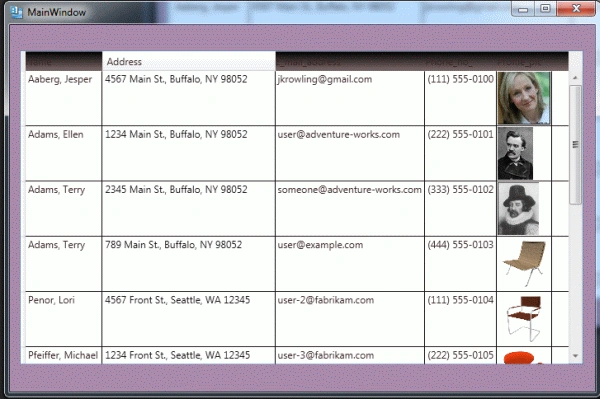
Step 13 : Press F5 and see the output.
Join the conversation! Your thoughts help the community grow.