

Before reading this article, please go through some important article links, mentioned below.
- Quick Start on Microsoft PowerApps
- To Use Template
- To Use Blank App
- To Add Excel File
- To Use Sort And SortByColumn Functions
- To Use Filter, Search, And LookUp Functions
- To Add Contacts
- To Get User Details
- Developing Camera App
- Using Radio Button
- Developing Drawing App
- Using ListBox Control
- Adding Audio And Video Control
- Using Slider Control
- Import And Export Data In Microsoft PowerApps
- Using CheckBox Control
- Using Drop Down Control
- Developing Login Page In Microsoft PowerApps
In PowerApps, we can add the Chart control.
Chart Control
A chart, also called a graph, is a graphical representation of the data. Here, the data is represented by symbols, such as bars in a bar chart, lines in a line chart or slices in a pie chart. It's a sheet of exhibiting the information in a tabular form. It allows the users to see the data to better understand it, and predict current and future data.
Types of Chart Control
- Column Chart
It displays the content in a tabular manner.
- Line Chart
It displays information as a series of data points called 'markers' connected by straight line segments.
- Pie Chart
It displays the data in a circular manner.
Now, we are going to see the Column Chart in this article.
- Column Chart
- Line Chart
- Pie Chart
Follow the steps, mentioned below to work with Chart Control in PowerApps.
Step 1
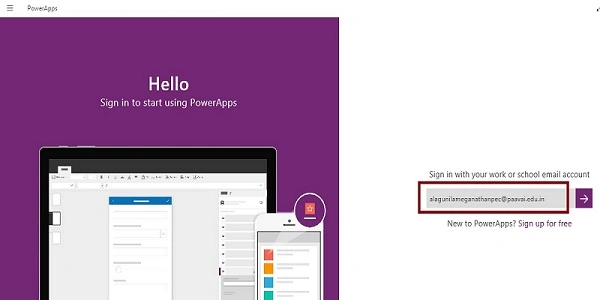
After downloading PowerApps from Window store, we need Microsoft related organization’s Office 365 ID or (MSDN, Microsoft, Skype, Office 365 etc.) to login with it.
Step 2
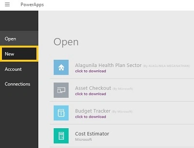
After login, we can see the Dashboard. Subsequently, we click on the New button.
Step 3
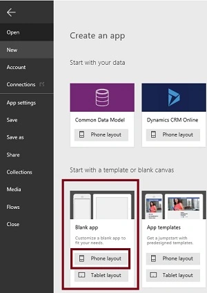
Choose the Blank app.
.
Step 4
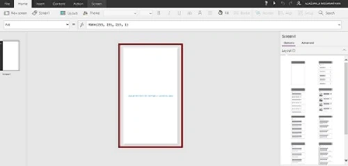
Now, let's start designing the app. On the left side, we can see the individual screens to add our data. On the right side, we see the list of layouts. On the top, we see the formula bar. There you can see the Properties of the screen, which you will select. On the right side, we see the Add DataSource to add the external data Source.
Step 5
- Go to the Insert menu followed by controls and drag the Button tool.
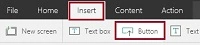
- Drop the Button tool on the screen.
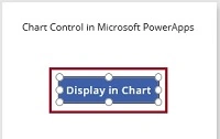
- Add the Options
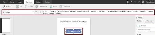
Select the Button and add the coding, mentioned below to the OnSelect property.
Coding
- ClearCollect(CityProduct, {
- City: "London",
- Country: "United Kingdom",
- Productsales: 861500,
- Percentage: 90
- }, {
- City: "Berlin",
- Country: "Germany",
- Productsales: 356200,
- Percentage: 74
- }, {
- City: "Madrid",
- Country: "Spain",
- Productsales: 316500,
- Percentage: 59
- })
Step 6
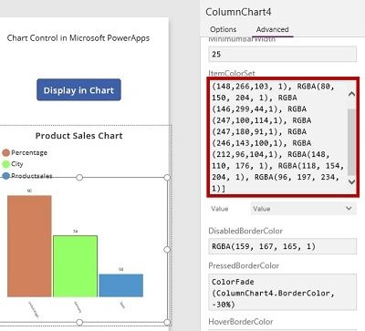
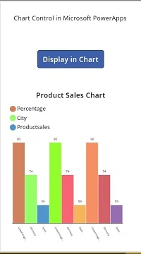
- Go to the Insert menu followed by controls and drag Column Chart tool.

- Drop the chart tool on the screen.
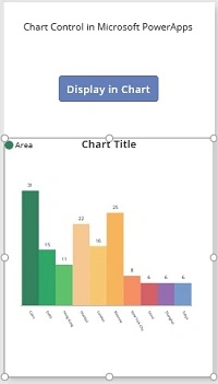
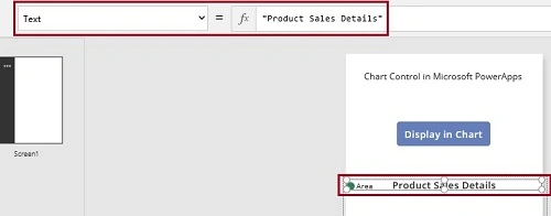
- Rename the Chart title as Product Sales Details.
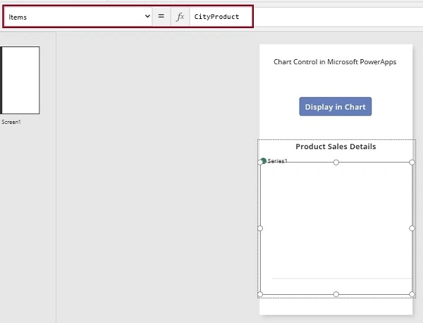
- Set the Item as City Product.
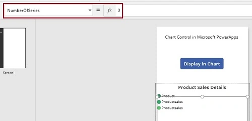
- Select the Number of Series and set as 3.
- Now, set the series values of the chart. Select the chart, go to the advanced property and set the series values
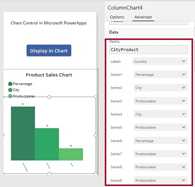
- Now, change the color of the chart.
Step 7
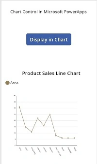
In a similar way, we can use the Line chart
- Go to the Insert menu followed by controls and drag Line Chart tool.
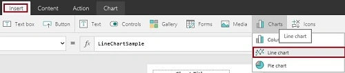
- Drop the control and change the settings
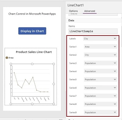
Step 8
In similar way, we can use Line chart
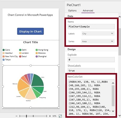
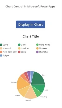
- Go to the Insert menu followed by controls and drag Pie Chart tool.

- Drop the control and change the settings.
Step 8
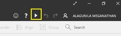
Run the app.
Output 1
Main Screen is shown below.
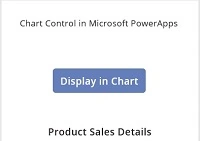
Output 2
Click the button.
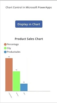
Output 3
On second click, the output is shown below.
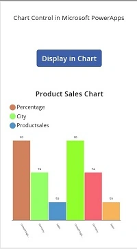
Output 4
On third click, the output will be, as shown below.
Output 5
Using Line Chart, the output will be, as shown below.
Output 6
Using Pie Chart, the output will be, as shown below
Conclusion
I hope, you understood how to add the Chart control in Microsoft PowerApps and how to run it.
Krishnaveni GanesanPosted Nov 17, 2020, 6:53 AM
How to apply filter in chart
Anu VPosted Nov 28, 2016, 11:47 PM
Nice article thanks for sharing..