

Where styles live in React?
Global CSS files: loaded once (e.g.,
index.css) and apply rules globally.CSS Modules:
.module.cssfiles that are locally scoped (unique class names at build time).CSS-in-JS libraries: e.g.,
styled-components, which generate CSS from JS and scope to components.Inline styles (style objects): React
style={{ ... }}prop.Utility-first libraries: e.g., Tailwind (class-based).
Other: CSS-in-CSS preprocessors (Sass/LESS), Shadow DOM (web components), etc.
Each approach has pros/cons. Below: detailed explanations and examples.
Various Approaches
1️. Colocate (Component-first approach)
Keep CSS files in the same folder as the component they style.
When to use: Almost always for component-specific styles.
src/
 ├─ components/
 │   ├─ Home/
 │   │   ├─ Home.tsx
 │   │   └─ Home.module.css
2️. Global / App-wide styles
Keep a single (or a few) CSS files for the entire app, often in
src/styles/.Usage:
import './styles/index.css'inindex.tsxorApp.tsx.Can accidentally create naming collisions; not scoped.
src/
 ├─ styles/
 │   ├─ index.css        <-- resets, typography
 │   ├─ variables.css    <-- CSS variables
 │   └─ theme.css
3. CSS-in-JS / Styled-components
Fully scoped, dynamic styles, supports theming.
Runtime cost, dependency on a library.
const Container = styled.div`
  padding: 20px;
  background: lightblue;
`;
4. Hybrid approach
Combine approaches:
Colocate CSS Modules for component-specific styles.
Global
styles/folder for resets, variables, themes.
src/
 ├─ components/
 │   ├─ Home/
 │   │   ├─ Home.tsx
 │   │   └─ Home.module.css
 ├─ styles/
 │   ├─ index.css
 │   ├─ variables.css
React usesclassName instead of class but why?
React uses JSX and TSX, which looks like HTML but is actually JavaScript under the hood.
In JavaScript and TypeScript,
classis a reserved keyword (used for ES6 classes).Using
classin JSX ot TSX would conflict with the JS/ TS syntax.React maps
classNamein JSX/TSX to theclassattribute in the rendered HTML.
//jsx or tsx file
<button className="btn btn-primary">Click Me</button>

Renders as:
<button class="btn btn-primary">Click Me</button>
Global styling vs Scope (Component) styling
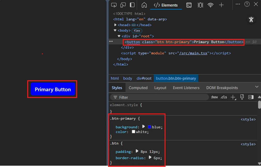
Traditional CSS files included (e.g., index.css, App.css).
Rules cascade globally.
Easy to use for resets, typography, layout, theme variables.
Can lead to naming collisions and unintended overrides unless careful (BEM, prefixing).
/* index.css */
body { font-family: Inter, system-ui; }
.btn { padding: 8px 12px; border-radius: 6px; }
.btn-primary { background: blue; color: white; }


// Home.ts
export default function Home() {
return (
        <button className="btn btn-primary">Primary Button</button>
       )
}
Scoped (component) styling
Styles limited to one component (no global leakage). Implemented by CSS Modules, styled-components, or similar.
Helps avoids collisions, improves maintainability, easier component reuse.
There is one file name rule you need to follow: The convention for scoped CSS is to name the file like this:
ComponentName.module.cssThe .module.css extension tells your build tool (Vite, Webpack, etc.) to treat that file as a CSS Module for scoping.
Ways to scope:
CSS Modules: class names become unique at build-time.
Styled-components / Emotion: components get generated unique class names; styles colocated with components.
Inline styles: inherently scoped to an element.
/* Home.module.css */
.scopedButton {
  background-color: #10b981;
  color: white;
  border: none;
  padding: 0.75rem 1.25rem;
  border-radius: 8px;
  cursor: pointer;
  font-weight: 600;
  transition: background-color 0.2s ease;
}

.scopedButton:hover {
  background-color: #059669;
}


// Home.ts
import styles from './Home.module.css';
export default function Home() {
return (
        <button className={styles.scopedButton}>Scoped Button</button>
        )
}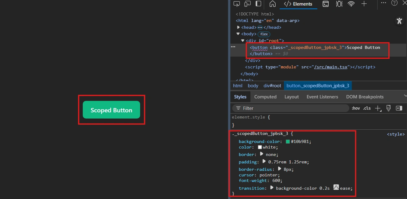
What’s that random string (like __jpbsk_3)?
When you use CSS Modules, your build tool (like Webpack, Vite, or Next.js) automatically renames your CSS class names during compilation.
That suffix __jpbsk_3 is a unique hash automatically generated to prevent class name collisions.
so, "scopedButton" become "._scopedButton_jpbsk_3"
Inline styling (style={{}})
These styles are applied directly to the element’s style attribute in the DOM.
// Home.tsx
<button style={{ backgroundColor: 'Red', color: 'white' }}>
Inline Button
</button>


which renders button as:
// Generated HTML
<button style="background-color: red; color: white;">Inline Button</button>
Use inline styles when the style is dynamic, small, and local to one element.
Dynamic styling based on props/state
//Example 1
<button style={{ backgroundColor: isActive ? 'blue' : 'gray' }}>
  Click Me
</button>


//Example 2
const style = { transform: `translateX(${x}px)` };
<div style={style}>Moving</div>
One-off tweaks
Quick temporary adjustments, debugging, or exceptions.
<div style={{ marginTop: '10px' }}>Quick margin fix</div>Avoid inline styles when you need reusable, scalable, or advanced CSS features.
Applying multiple styles
You often need to combine classes or style objects.
With plain CSS / CSS Modules
<button className={`${styles.btn} ${styles.large} ${styles.rounded}`}>Hi</button>With global CSS classes
<button className="btn large rounded">Hi</button>With styled-components: composition
const Primary = styled(Button)`background: blue; color: white;`;With inline style objects (merging)
const base = { padding: 8, borderRadius: 6 };
const red = { backgroundColor: 'red' };

<button style={{ ...base, ...red }}>Hello</button>
Conditionally applying styles
Specifically used for toggling, true/false: show/hide etc.
Ternary operator
<button className={isActive ? 'btn active' : 'btn'}>Click</button>Logical
&&(for adding a class)
<button className={`btn ${isActive && 'active'}`}>Click</button>(Be careful: false can be printed; prefer conditional expression that results in empty string when false)
Template literals with expression
<button className={`btn ${isActive ? 'active' : ''} ${size === 'lg' ? 'large' : ''}`}>Click</button>Styled-components library
The styles live next to your component code.
You can use TypeScript/ JavaScript variables and props in your styles.
It automatically creates unique class names so the styles don’t conflict with other components.
Install
npm install styled-components// Home.tsx
import styled from "styled-components";
interface ButtonProps {
primary?: boolean;
}
const Button = styled.button<ButtonProps>`
background-color: ${(props) => (props.primary ? "blue" : "gray")};
color: white;
padding: 0.5rem 1rem;
border-radius: 6px;
&:hover {
background-color: ${(props) => (props.primary ? "darkblue" : "darkgray")};
}
`;
export default function Home() {
return <Button primary>Primary Button</Button>;
}classnames / clsx library — what problem they solve
As conditional class logic grows, string concatenation becomes messy. classnames (or clsx) makes this neat.
Install
npm install classnames
# or
npm install clsx
//Home.tsx
import classNames from 'classnames';
interface HomeProps {
primary?: boolean;
disabled?: boolean;
size?: 'small' | 'medium' | 'large';
}
export default function Home({ primary = true, disabled = false, size = 'medium' }: HomeProps) {
const classes = classNames('btn', {
'btn--primary': primary,
'btn--disabled': disabled
}, `btn--${size}`);
return <button className={classes}>Click</button>;
}If I call Home component with these props:
<Home primary={false} disabled={false} size="small" />I get this dynamic css:
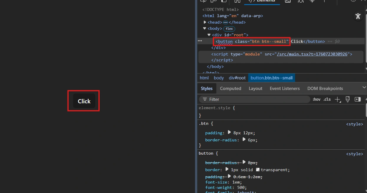
Now let's update props and call it again
<Home primary={true} disabled={true} size="large" />and see how style is updated:
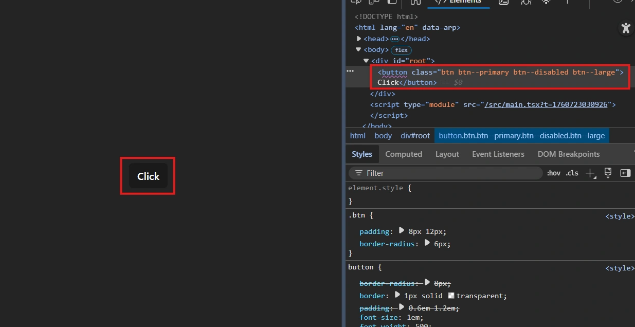
React Styling Methods
Global CSS: use quotes
className="btn" =styles from normal CSS, applies everywhere.Scoped CSS: use {}
className={styles.btn}= unique to the component.Inline Styles: use {{}}
style={{ color: 'red' }}= applies only to that element.Styled-Components, defined in variable –
styled.button\...`` = co-located, dynamic, unique class names.Combination – mix
className+style= override or combine multiple styles.
Best practices
Prefer scoped styles (CSS Modules / styled-components) for components.
Use global CSS for resets and app-level variables.
Avoid heavy use of inline styles; use them when values are dynamic and simple.
Use
classnames/clsxto manage complex conditional class logic.Use CSS variables for theming and runtime tweaks.
Keep styling colocated with component logic when it improves maintainability — but balance with team tooling and performance.
My 2 Cents
Where styles live: Global CSS, CSS Modules (scoped), CSS-in-JS (styled-components), inline styles, utility libraries (Tailwind).
Organizing CSS: Colocate component styles (
Home.tsx + Home.module.css), global styles folder, hybrid approach.Global vs Scoped: Global CSS affects everything; scoped CSS (modules/styled-components) is local to the component.
Inline styles: Quick, dynamic, element-specific; limited features.
Multiple & conditional styles: Combine classes, use ternary/logical operators, or libraries like
classnames/clsx.Styled-components: Scoped, dynamic, prop-driven, generates unique class names automatically.
Best practice: Colocate component styles for maintainability, use global CSS for resets/themes, and use inline styles sparingly.
Hold on to your glasses - article on CSS custom properties is coming up
Join the conversation! Your thoughts help the community grow.