

Introduction
Reactstrap is a component library for Reactjs. It provides in-built Bootstrap components that provide flexibility and inbuilt validations, making it easy to create a UI. Reactstrap is similar to Bootstrap, but it has self-contained components.
You can check my previous articles in which we discussed how we add Reactstrap and basic Reactstrap components in Reactjs applications from the below links.
In this article we will discuss the following Reactstrap components,
- Buttons
- Popovers
- Progress
Prerequisites
- We should have a basic knowledge of HTML and JavaScript.
- Visual Studio Code should be installed
- Node and NPM installed
- npx create-react-app reactstrapcomponent
- npm install --save reactstrap react react-dom
- npm install --save bootstrap
Now, open the index.js file and add import Bootstrap.
- import 'bootstrap/dist/css/bootstrap.min.css';
Now, in Visual Studio code, go to src folder and create a new folder and inside this folder add 3 new components,
- ProgressDemo.js
- PopoversDemo.js
- ButtonsDemo.js
Now open ProgressDemo.js file and add the following code in this component,
- import React, { Component } from 'react'
- import { Progress } from 'reactstrap';
- import { Navbar, Nav, NavItem, NavLink } from 'reactstrap';
- import './App.css';
- export class ProgressDemo extends Component {
- render() {
- return (
- <div>
- <Navbar className="btn btn-warning" light expand="md">
- <Nav color="info" navbar>
- <NavItem className="hdr">
- <NavLink style={{ "color": "white" }} >Reactstrap Progress Components</NavLink>
- </NavItem>
- </Nav>
- </Navbar>
- <div className="text-center">0%</div>
- <Progress />
- <div className="text-center">25%</div>
- <Progress value="25" />
- <div className="text-center">50%</div>
- <Progress value={50} />
- </div>
- )
- }
- }
- export default ProgressDemo
Now open App.js file and add the following code,
- import React from 'react';
- import logo from './logo.svg';
- import './App.css';
- import ProgressDemo from './ProgressDemo'
- function App() {
- return (
- <div className="App">
- <ProgressDemo></ProgressDemo>
- </div>
- );
- }
- export default App;
- .hdr{
- padding-left: 600px;
- }
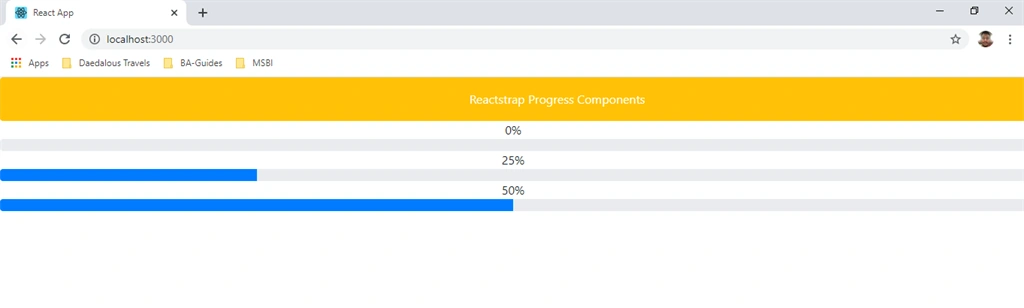
Run the project by using 'npm start' and check the result.
Now open PopoversDemo.js file and add the following code in this component,
- import React, { Component } from 'react'
- import { Navbar, Nav, NavItem, NavLink } from 'reactstrap';
- import { Button, UncontrolledPopover, PopoverHeader, PopoverBody } from 'reactstrap';
- export class PopoversDemo extends Component {
- render() {
- return (
- <div>
- <Navbar className="btn btn-warning" light expand="md">
- <Nav color="info" navbar>
- <NavItem className="hdr">
- <NavLink style={{ "color": "white" }} >Reactstrap Popover Components</NavLink>
- </NavItem>
- </Nav>
- </Navbar>
- <div>
- <Button color="primary" id="PopoverClick" type="button">
- Launch Popover
- </Button>
- <UncontrolledPopover trigger="click" placement="bottom" target="PopoverClick">
- <PopoverHeader>Click Here</PopoverHeader>
- <PopoverBody>Popover Here</PopoverBody>
- </UncontrolledPopover>
- </div>
- </div>
- )
- }
- }
- export default PopoversDemo
Now open App.js file and add the following code,
- import React from 'react';
- import logo from './logo.svg';
- import './App.css';
- import PopoversDemo from './PopoversDemo'
- function App() {
- return (
- <div className="App">
- <PopoversDemo></PopoversDemo>
- </div>
- );
- }
- export default App;
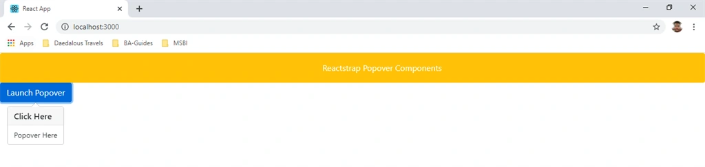
Now open ButtonsDemo.js file and add the following code in this component,
- import React, { Component } from 'react'
- import { Button } from 'reactstrap';
- import { Navbar, Nav, NavItem, NavLink } from 'reactstrap';
- export class ButtonsDemo extends Component {
- render() {
- return (
- <div>
- <Navbar className="btn btn-warning" light expand="md">
- <Nav color="info" navbar>
- <NavItem className="hdr">
- <NavLink style={{ "color": "white" }} >Reactstrap Button Components</NavLink>
- </NavItem>
- </Nav>
- </Navbar>
- <div style={{"marginTop":"20px"}}>
- <Button color="primary">primary</Button>
- <Button color="secondary">secondary</Button>
- <Button color="success">success</Button>
- <Button color="info">info</Button>
- <Button color="warning">warning</Button>
- <Button color="danger">danger</Button>
- <Button color="link">link</Button>
- </div>
- <Navbar style={{"marginTop":"20px"}} className="btn btn-warning" light expand="md">
- <Nav color="info" navbar>
- <NavItem className="hdr">
- <NavLink style={{ "color": "white" }} >Outline Button </NavLink>
- </NavItem>
- </Nav>
- </Navbar>
- <div style={{"marginTop":"20px"}}>
- <Button outline color="primary">primary</Button>
- <Button outline color="secondary">secondary</Button>
- <Button outline color="success">success</Button>
- <Button outline color="info">info</Button>
- <Button outline color="warning">warning</Button>
- <Button outline color="danger">danger</Button>
- </div>
- </div>
- )
- }
- }
- export default ButtonsDemo
- import React from 'react';
- import logo from './logo.svg';
- import './App.css';
- import ButtonsDemo from './ButtonsDemo'
- function App() {
- return (
- <div className="App">
- <ButtonsDemo></ButtonsDemo>
- </div>
- );
- }
- export default App;
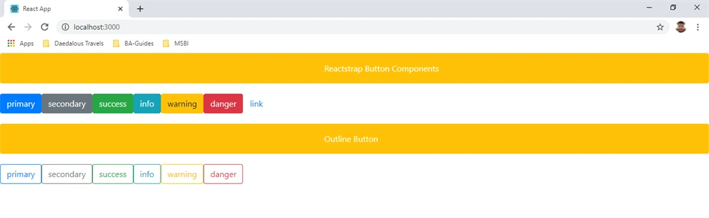
Run the project by using 'npm start' and check the result.
Summary
In this article we learned how to use Buttons, Popovers, and Progress in Reactstrap components. Reactstrap is a component library for ReactJS.
Join the conversation! Your thoughts help the community grow.