

Introduction
The react-portal-tooltip is a plugin written in React.js to initialize the React Tooltip component in React forms.
Open a command prompt. Create a directory for the SPFx solution.
md spfx-ReactTooltip
Navigate to the above-created directory.
cd spfx-ReactTooltip
Run the Yeoman SharePoint Generator to create the solution.
yo @microsoft/sharepoint
Solution Name
Hit Enter to have the default name (spfx-ReactTooltipthis case) or type in any other name for your solution.
Selected choice - Hit Enter
Target for the component
Here, we can select the target environment where we are planning to deploy the client web part; i.e., SharePoint Online or SharePoint OnPremise (SharePoint 2016 onwards).
Selected choice - SharePoint Online only (latest).
Place of files
We may choose to use the same folder or create a subfolder for our solution.
Selected choice - same folder.
Deployment option
Selecting Y will allow the app to be deployed instantly to all sites and be accessible everywhere.
Selected choice - N (install on each site explicitly).
Permissions to access web APIs
Choose if the components in the solution require permission to access web APIs that are unique and not shared with other components in the tenant.
Selected choice - N (solution contains unique permissions).
Type of client-side component to create
We can choose to create a client-side web part or an extension. Choose the web part option.
Selected choice - WebPart
Web part name
Hit Enter to select the default name or type in any other name.
Selected choice - ReactToolTip
Web part description
Hit Enter to select the default description or type in any other value.
Framework to use
Select any JavaScript framework to develop the component. Available choices are - No JavaScript Framework, React, and Knockout.
Selected choice - React
The Yeoman generator will perform a scaffolding process to generate the solution. The scaffolding process will take a significant amount of time.
Once the scaffolding process is completed, lock down the version of project dependencies by running the below command,
npm shrinkwrap
In the command prompt, type the below command to open the solution in the code editor of your choice.
NPM Packages used,
- npm i react-portal-tooltip
Necessary imports,
- import ToolTip, {StatefulToolTip }from 'react-portal-tooltip';
We can initialize Tooltip in two ways
- stateful component
- stateless component
Stateful Component using ID
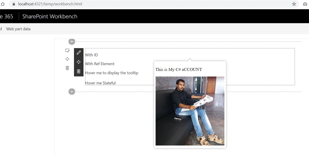
- <p id="mytext" onMouseEnter={this.showTooltip.bind(this)} onMouseLeave={this.hideTooltip.bind(this)}>With ID</p>
- <ToolTip active={true} position="bottom" arrow="center" parent="#mytext">
- <div>
- <p>This is My C# aCCOUNT</p>
- <img src="https://csharpcorner-mindcrackerinc.netdna-ssl.com/UploadFile/AuthorImage/72e1f720170620060203.jpg"/>
- </div>
- </ToolTip>
The above Intialization shows the Tooltip by using the parent id (The element id where we need to show tooltip and parent id of tooltip must be the same; i.e. stateful.)
Stateful Component using Ref
- private mytooltip = React.createRef<HTMLParagraphElement>();
- <p ref={this.mytooltip} onMouseEnter={this.showTooltip2} onMouseLeave={this.hideTooltip2}>
- Hover me!!!
- </p>
- <ToolTip active={true} position="top" arrow="center" parent={this.mytooltip.current}>
- <div>
- <p>My Content</p>
- </div>
- </ToolTip>
Stateless component
- const buttonStateful = <span className="btn btn-default">Hover me Stateful</span>;
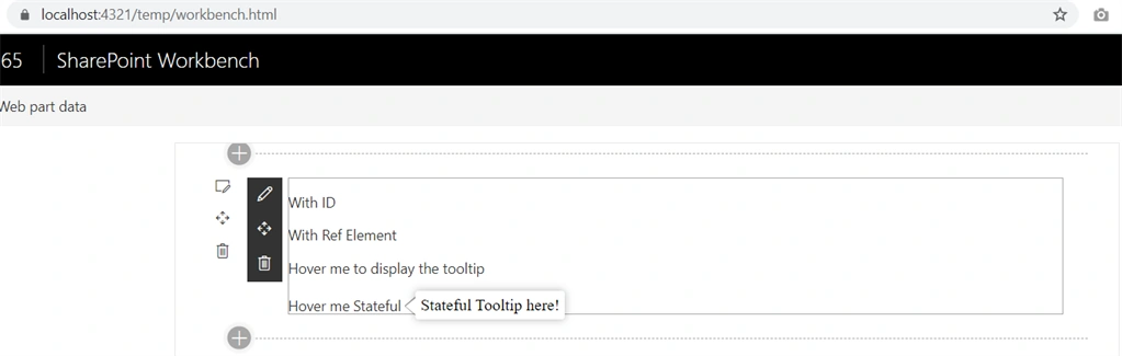
- <StatefulToolTip parent={ buttonStateful } position="right" arrow="center" className="stateful-button">Stateful Tooltip here!</StatefulToolTip>
- </div>
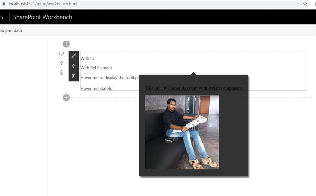
We can style the tooltip by custom css.
- let mystyle = {
- style: {
- background: 'rgba(0,0,0,.8)',
- padding: 20,
- boxShadow: '5px 5px 3px rgba(0,0,0,.5)'
- },
- arrowStyle: {
- color: 'rgba(0,0,0,.8)',
- borderColor: false
- }
- };
- <p id="mytext1" onMouseEnter={this.showTooltip3} onMouseLeave={this.hideTooltip3}>With Ref Element</p>
- <ToolTip active={this.state.is3rdTooltipActive} position="bottom" arrow="center" parent="#mytext1" style={mystyle}>
- <div>
- <p>This my c# Corner Account with styled component</p>
- <img src="https://csharpcorner-mindcrackerinc.netdna-ssl.com/UploadFile/AuthorImage/72e1f720170620060203.jpg"/>
- </div>
- </ToolTip>
Full Code
- import * as React from 'react';
- import { IReactToolTipProps } from './IReactToolTipProps';
- export interface ITooltipState {
- is1stTooltipActive?:boolean;
- is2ndTooltipActive?:boolean;
- is3rdTooltipActive?:boolean;
- }
- let mystyle = {
- style: {
- background: 'rgba(0,0,0,.8)',
- padding: 20,
- boxShadow: '5px 5px 3px rgba(0,0,0,.5)'
- },
- arrowStyle: {
- color: 'rgba(0,0,0,.8)',
- borderColor: false
- }
- };
- import ToolTip, {StatefulToolTip }from 'react-portal-tooltip';
- export default class ReactToolTip extends React.Component<IReactToolTipProps,ITooltipState> {
- private mytooltip = React.createRef<HTMLParagraphElement>();
- constructor(props) {
- super(props);
- this.state = {
- is1stTooltipActive: false,
- is2ndTooltipActive:false,
- is3rdTooltipActive:false
- };
- this.showTooltip = this.showTooltip.bind(this);
- this.hideTooltip = this.hideTooltip.bind(this);
- this.showTooltip2 = this.showTooltip2.bind(this);
- this.hideTooltip2 = this.hideTooltip2.bind(this);
- this.showTooltip3 = this.showTooltip3.bind(this);
- this.hideTooltip3 = this.hideTooltip3.bind(this);
- }
- private showTooltip() {
- this.setState({is1stTooltipActive: true});
- }
- private hideTooltip() {
- this.setState({is1stTooltipActive: false});
- }
- private showTooltip2() {
- this.setState({is2ndTooltipActive:true});
- }
- private hideTooltip2() {
- this.setState({is2ndTooltipActive:false});
- }
- private showTooltip3() {
- this.setState({is3rdTooltipActive:true});
- }
- private hideTooltip3() {
- this.setState({is3rdTooltipActive:false});
- }
- public render(): React.ReactElement<IReactToolTipProps> {
- const mymsg = <span>Hover me to display the tooltip</span>;
- const buttonStateful = <span className="btn btn-default">Hover me Stateful</span>;
- return (
- <div >
- <p id="mytext" onMouseEnter={this.showTooltip.bind(this)} onMouseLeave={this.hideTooltip.bind(this)}>With ID</p>
- <ToolTip active={this.state.is1stTooltipActive} position="bottom" arrow="center" parent="#mytext">
- <div>
- <p>This is My C# aCCOUNT</p>
- <img src="https://csharpcorner-mindcrackerinc.netdna-ssl.com/UploadFile/AuthorImage/72e1f720170620060203.jpg"/>
- </div>
- </ToolTip>
- <p ref={this.mytooltip} onMouseEnter={this.showTooltip2} onMouseLeave={this.hideTooltip2}>
- Hover me!!!
- </p>
- <ToolTip active={this.state.is2ndTooltipActive} position="top" arrow="center" parent={this.mytooltip.current}>
- <div>
- <p>My Content</p>
- </div>
- </ToolTip>
- <p id="mytext1" onMouseEnter={this.showTooltip3} onMouseLeave={this.hideTooltip3}>With Ref Element</p>
- <ToolTip active={this.state.is3rdTooltipActive} position="bottom" arrow="center" parent="#mytext1" style={mystyle}>
- <div>
- <p>This my c# Corner Account with styled component</p>
- <img src="https://csharpcorner-mindcrackerinc.netdna-ssl.com/UploadFile/AuthorImage/72e1f720170620060203.jpg"/>
- </div>
- </ToolTip>
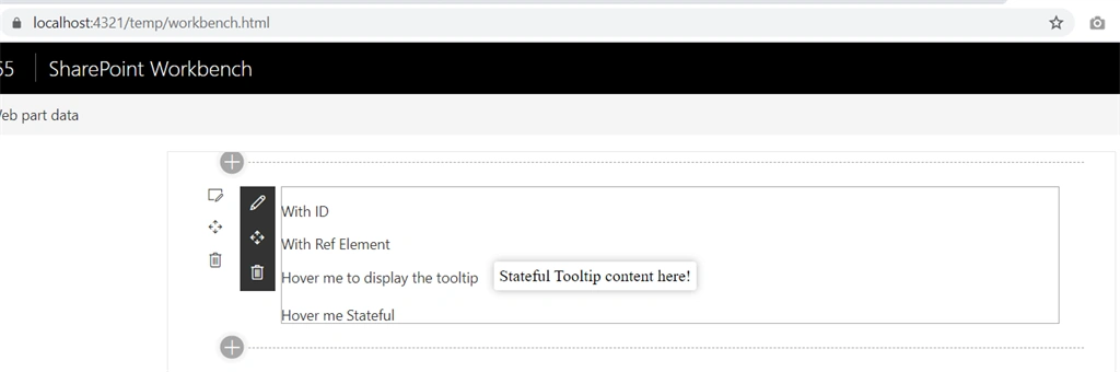
- <StatefulToolTip parent={ mymsg } >
- Stateful Tooltip content here!
- </StatefulToolTip>
- <br></br><br></br>
- <StatefulToolTip parent={ buttonStateful } position="right" arrow="center" className="stateful-button">Stateful Tooltip here!</StatefulToolTip>
- </div>
- );
- }
- }
Important Properties
- active- boolean, the tooltip will be visible if true
- position- top, right, bottom or left. Default to right
- arrow- center, right, left, top or bottom (depending on the position prop). No arrow when the prop is not sepecified
- align- the alignment of the whole tooltip relative to the parent element. possible values : center, right, left. Default to center.
- tooltipTimeout- timeout for the tooltip fade out in milliseconds. Default to 500
- parent- the tooltip will be placed next to this element. Can be the id of the parent or the ref (see example below)
- group- string, necessary if you want several independent tooltips
- style- object, allows customizing the tooltip. Check out the example for details.
- useHover -bool, default to true. If true, the tooltip will stay visible when hovered.
Output
With no style:
With custom style:
With arrow:
Without arrow:
Conclusion
Here we learned about initializing React Tooltip component in Spfx forms using react-portal-tooltip plugin. I hope this helps someone. Happy coding :)
Madhan ThuraiPosted Jul 1, 2021, 5:29 AM
What error?? without context how can i help you?
mohammed jaseefarPosted Jun 29, 2021, 10:40 AM
React.createRef<HTMLParagraphElement> IT SHOWING ERROOR FOR ME WHY>