

Introduction
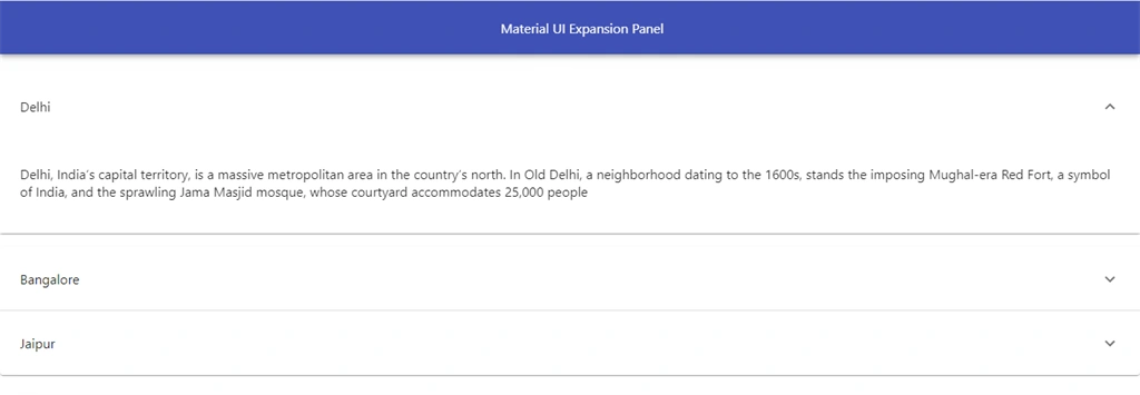
In this article we will learn how to add dialogs boxes and Expansion Panel in React applications. Expansion Panel is used to show and hide content. Expansion Panel basically manages a large amount of content and list data. Dialogs are used to show notification and alert message.
You can check my previous article in which we discussed the basics of Material UI, from the below mentioned links.
Prerequisites
- Basic Knowledge of React
- Visual Studio Code
- Node and NPM installed
- Material UI Installed
Create ReactJS project
Let's first create a React application using the following command.
- npx create-react-app matform
Install Material-UI
Now Install Material-UI by using the following command.
- npm install @material-ui/core --save
Now install Material icons by using the following command.
- npm install @material-ui/icons
Now, right click on "src" folder and add a new component named 'Panel.js
First let’s import required material UI component; add the following reference in this component.
- import AppBar from '@material-ui/core/AppBar';
- import Toolbar from '@material-ui/core/Toolbar';
- import ExpansionPanel from '@material-ui/core/ExpansionPanel';
- import ExpansionPanelSummary from '@material-ui/core/ExpansionPanelSummary';
- import ExpansionPanelDetails from '@material-ui/core/ExpansionPanelDetails';
- import ExpandMoreIcon from '@material-ui/icons/ExpandMore';
Add the following code in panel component.
- import React, { Component } from 'react'
- import AppBar from '@material-ui/core/AppBar';
- import Toolbar from '@material-ui/core/Toolbar';
- import ExpansionPanel from '@material-ui/core/ExpansionPanel';
- import ExpansionPanelSummary from '@material-ui/core/ExpansionPanelSummary';
- import ExpansionPanelDetails from '@material-ui/core/ExpansionPanelDetails';
- import ExpandMoreIcon from '@material-ui/icons/ExpandMore';
- export class Panel extends Component {
- render() {
- return (
- <div>
- <AppBar position="static">
- <Toolbar style={{ 'paddingLeft': "600px" }}>
- Material UI Expansion Panel
- </Toolbar>
- </AppBar>
- <ExpansionPanel>
- <ExpansionPanelSummary expandIcon={<ExpandMoreIcon></ExpandMoreIcon>} >
- <p>Delhi</p>
- </ExpansionPanelSummary>
- <ExpansionPanelDetails>
- <p>Delhi, India’s capital territory, is a massive metropolitan area in the country’s north. In Old Delhi, a neighborhood dating to the 1600s, stands the imposing Mughal-era Red Fort, a symbol of India, and the sprawling Jama Masjid mosque, whose courtyard accommodates 25,000 people </p>
- </ExpansionPanelDetails>
- </ExpansionPanel>
- <ExpansionPanel>
- <ExpansionPanelSummary expandIcon={<ExpandMoreIcon></ExpandMoreIcon>} >
- <p>Bangalore</p>
- </ExpansionPanelSummary>
- <ExpansionPanelDetails>
- <p> Bengaluru (also called Bangalore) is the capital of India's southern Karnataka state. The center of India's high-tech industry, the city is also known for its parks and nightlife. By Cubbon Park, Vidhana Soudha is a Neo-Dravidian legislative building. Former royal residences include 19th-century Bangalore Palace, modeled after England’s Windsor Castle, an 18th-century teak structure </p>
- </ExpansionPanelDetails>
- </ExpansionPanel>
- <ExpansionPanel >
- <ExpansionPanelSummary expandIcon={<ExpandMoreIcon></ExpandMoreIcon>} >
- <p>Jaipur</p>
- </ExpansionPanelSummary>
- <ExpansionPanelDetails>
- <p> Jaipur is the capital of India’s Rajasthan state. It evokes the royal family that once ruled the region and that, in 1727, founded what is now called the Old City, or “Pink City” for its trademark building color. At the center of its stately street grid (notable in India) stands the opulent, colonnaded City Palace comple </p>
- </ExpansionPanelDetails>
- </ExpansionPanel>
- </div>
- )
- }
- }
- export default Panel
Now run the project by using 'npm start'.
Dialog Box:Dialogs are used to show notification and alert message.
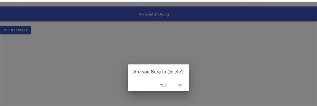
Now, right click on "src" folder and add an another component named 'Dialog.js'. In this component we add dialog boxes to show important messages and information.
Add the following code in Dialogcomponent.
- import React from 'react';
- import Button from '@material-ui/core/Button';
- import Dialog from '@material-ui/core/Dialog';
- import DialogActions from '@material-ui/core/DialogActions';
- import DialogTitle from '@material-ui/core/DialogTitle';
- import AppBar from '@material-ui/core/AppBar';
- import Toolbar from '@material-ui/core/Toolbar';
- export default function Dialogs() {
- const [state, setstate] = React.useState(false);
- const Open = () => {
- setstate(true);
- };
- const Close = () => {
- setstate(false);
- };
- return (
- <div>
- <AppBar className="mrg" position="static">
- <Toolbar style={{ 'paddingLeft': "600px" }}>
- Material UI Dialog
- </Toolbar>
- </AppBar>
- <Button variant="contained" color="primary" onClick={Open}>
- Open Dialog
- </Button>
- <Dialog
- open={state}
- onClose={Close}
- aria-labelledby="alert-dialog-title"
- aria-describedby="alert-dialog-description" >
- <DialogTitle id="alert-dialog-title">{"Are you Sure to Delete?"}</DialogTitle>
- <DialogActions>
- <Button onClick={Close} color="primary">
- Yes
- </Button>
- <Button onClick={Close} color="primary" autoFocus>
- No
- </Button>
- </DialogActions>
- </Dialog>
- </div>
- );
- }
Now open app.css file and add the following code
- .mrg{
- margin-top: 20px;
- margin-bottom: 20px;
- }
- .pding
- {
- padding-left: 500px;
- }
Now open app.js file and add the following code.
- import React from 'react';
- import logo from './logo.svg';
- import './App.css';
- import Form from './Form'
- import Dialogs from './Dialog'
- function App() {
- return (
- <div className="App">
- <Panel></Panel>
- </div>
- );
- }
- export default App;
Now run the project and check the result.

Click on the button,
Summary
In this article, we learned how we add Expansion Panel and dialogs in Reactjs applications. Expansion Panel is used to show and hide content.
Sourav Kumar DasPosted Jan 6, 2020, 11:03 PM
Nice and useful article Sir. Thanks for sharing.
Dipa MehtaPosted Jan 6, 2020, 11:36 AM
Nice Article Sanwar Ranwa