

Positioning
In CSS, positioning is the property that allows you to place an element exactly where you want it on your page.
Elements can be positioned using top, bottom, left and right properties and it will not work until and unless you set these position properties first. It can also be placed behind another or specify what should happen when the content is too big. It also depends on the positioning method you apply and it works accordingly.
The following are the six methods for positioning:
- Static positioning
- Fixed positioning
- Sticky positioning
- Relative positioning
- Absolute positioning
- Inherit positioning

Static positioning
Syntax
- .static{
- position: static;
- }
- div.p2{
- position:static;
- font-family:arial black;
- background-color:lightgreen;
- border: 3px solid #cccccc;}
Example
In the example given below, we have created two styles, in other words, one is normal or without static positioning (default) and the other has static positioning.
- <html>
- <head>
- <title>Static positioning</title>
- <style>
- div.p1{
- font-family: arial black;
- background-color: lightgreen;
- border: 3px solid #cccccc;}
- div.p2{
- position:static;
- font-family:arial black;
- background-color:lightgreen;
- border: 3px solid #cccccc;}
- </style>
- </head>
- <body>
- <div class="p1">
- <p>This is without positioning</p>
- </div>
- <br>
- <div class="p2">
- <p>This is with static positioning</p>
- </div>
- <br>
- <p><mark>You can see that there is no difference in both.</mark></p>
- </body>
- </html>
Output
 In the preceding output, you can see that both the styles specified work the same as the default.
Relative positioning for an element is calculated from the original position in the document. That means the element will move to the left, right, top or bottom. In this way, the elements still obtain a space in the document after it is positioned.
In other words, a relative positioned element is positioned relative to its normal position.
Syntax
In the preceding output, you can see that both the styles specified work the same as the default.
Relative positioning for an element is calculated from the original position in the document. That means the element will move to the left, right, top or bottom. In this way, the elements still obtain a space in the document after it is positioned.
In other words, a relative positioned element is positioned relative to its normal position.
Syntax
Relative positioning
- .relative{
- position: relative;
- }
- div.p1_left{
- position: relative;
- bottom: 10px;
- left: -10px;
- font-family: arial black;
- background-color: lightgreen;}
Example
- <html>
- <head>
- <title>Relative positioning</title>
- <style>
- div.p1_left{
- position: relative;
- bottom: -30px;
- left: -10px;
- font-family: arial black;
- background-color: lightgreen;}
- div.p2_right{
- position: relative;
- left: 10px;
- font-family: arial black;
- background-color: lightgreen;}
- img.image_top{
- position: relative;
- top: 50px;
- right: 100px;
- border: 2px solid #ff0000;}
- </style>
- </head>
- <body bgcolor="lightgrey">
- <div class="p1_left">
- <p>This paragraph is moved 10px left and 30 pixels bottom relative to its normal position</p>
- </div>
- <br>
- <h3><mark>This heading is without positioning or in normal position</mark></h3>
- <br>
- <div class="p2_right">
- <p>This paragraph is moved 10px right relative to its normal position</p>
- </div>
- <center>
- <img src="C:\Users\dddd\Pictures\danger.jpg"></img>
- <p><mark>(original position of image)</mark></p>
- </center>
- <br>
- <center><img class="image_top" src="C:\Users\dddd\Pictures\danger.jpg"></img></center>
- <br><br>
- <p><mark>(image moved 100 pixels left from its original right position and 50 pixels bottom from its original top position.)</mark></p>
- </body>
- </html>
In the preceding example,
- “left: -10px;”(similar to ”right: 10px;”) subtracts 10 pixels from the element's original left position.
- “left: 10px;”(similar to ”right: -10px;”) adds 10 pixels from the element's original left position.
- “right: 100px;”(similar to “left: -100px;”) adds 100 pixels from the element's original right position.
- “top: 50px;”(similar to “bottom: -50px;”) adds 50 pixels from the element's original top position“bottom: -30px;”(similar to “top: -30px;”) subtracts 30 pixels from the element's original bottom position.
Output
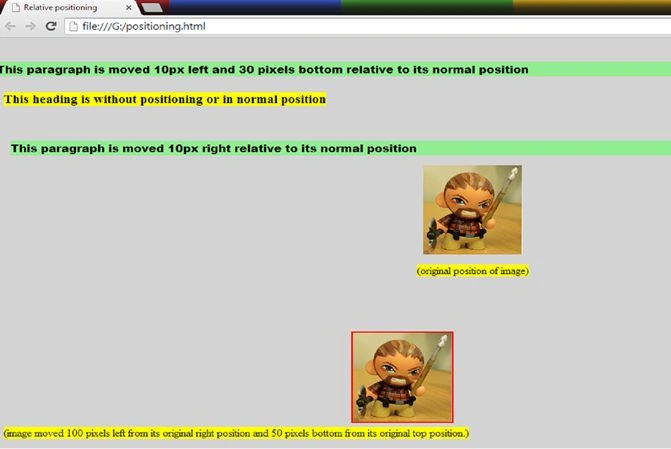 In the preceding example, you can see the positions of the elements that are changed due to relative positioning.
In fixed positioning, the elements are fixed in position according to the viewport or browser window which means the elements always stay on the same page even if the page is scrolled further. A fixed element does not leave a gap on the page where it would have been located. Fixed positioned elements can overlap other elements.
Fixed positioned elements are removed from the normal flow of the page. The document and other elements behave like fixed positioned elements do not exist.
Syntax
In the preceding example, you can see the positions of the elements that are changed due to relative positioning.
In fixed positioning, the elements are fixed in position according to the viewport or browser window which means the elements always stay on the same page even if the page is scrolled further. A fixed element does not leave a gap on the page where it would have been located. Fixed positioned elements can overlap other elements.
Fixed positioned elements are removed from the normal flow of the page. The document and other elements behave like fixed positioned elements do not exist.
Syntax
Fixed positioning
- .fixed{
- Position: fixed;
- }
- div.fixed{
- position: fixed;
- top: 0;
- left: 0;
- background-color: white;
- border: 2px solid #ff0000;
- width: 250px;}
Example
- <html>
- <head>
- <title>Fixed positioning</title>
- <style>
- div.fixed{
- position: fixed;
- top: 0;
- left: 0;
- background-color: white;
- border: 2px solid #ff0000;
- width: 250px;}
- </style>
- </head>
- <body bgcolor="lightgrey">
- <div class="fixed">
- <img src="C:\Users\dddd\Pictures\fixed.jpg"></img>
- <p><b>Hi..!!<br>I am fixed</b></p>
- </div>
- <div>
- <center>
- <p>The fixed elements are positioned according to the view port or browser window which means the elements always stay on the same page even if the page is scrolled further.<br> A fixed element does not leave a gap in the page where it would have been located.<br> Fixed positioned elements can overlap other elements.<br>
- Fixed positioned elements are removed from the normal flow of the page.<br> The document and other elements behave like fixed positioned elements do not exit.<br>
- </p>
- </center>
- <center><img src="C:\Users\dddd\Pictures\fixed11.png"></img></center>
- <center>
- <p><b>The fixed elements are positioned according to the view port or browser window which means the elements always stay on the same page even if the page is scrolled further.<br> A fixed element does not leave a gap in the page where it would have been located.<br> Fixed positioned elements can overlap other elements.<br>
- Fixed positioned elements are removed from the normal flow of the page.<br> The document and other elements behave like fixed positioned elements do not exit.<br></b>
- </p>
- </center>
- <center><img src="C:\Users\dddd\Pictures\fixed12.jpg"></img></center>
- <center>
- <h1> The fixed element is remains at its palce</h1>
- </center>
- </body>
- </html>
Output
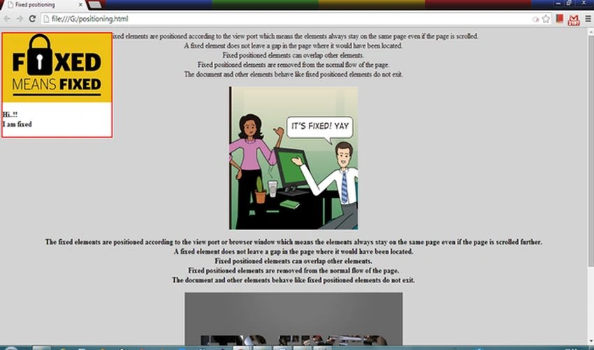 In the output, you can see the fixed element that will not move from its place even when we scroll the page.
Let's see what happens after scrolling the page.
Output
In the output, you can see the fixed element that will not move from its place even when we scroll the page.
Let's see what happens after scrolling the page.
Output
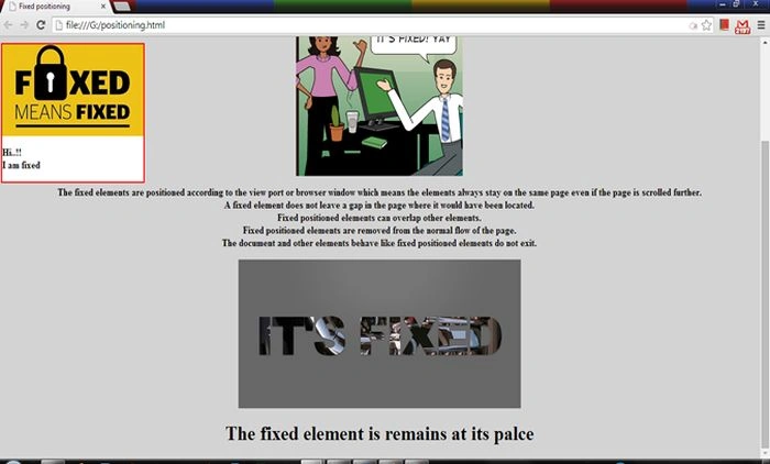 In the preceding example, you can see that the fixed positioned element remains at its place even after scrolling the page further.
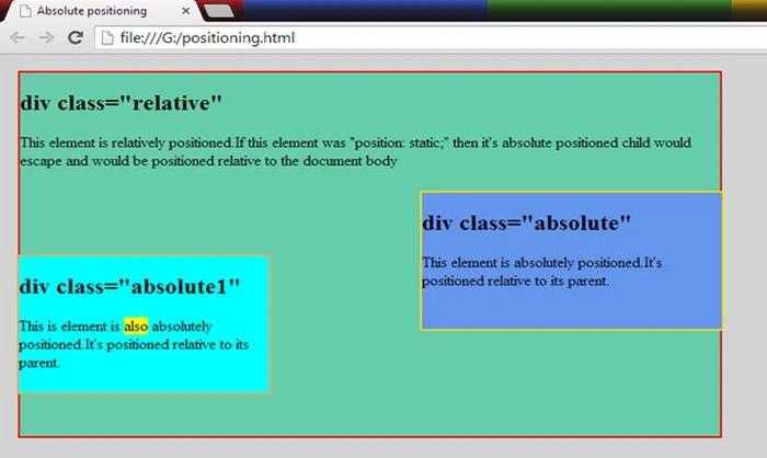
An absolute position element is positioned relative to the first ancestor (parent) element that has a position other than static. If no such element is found then it uses the document body and still moves with the page scrolling.
Absolute positioned elements are removed from the normal flow of the page. The document and other elements behave like absolute positioned elements do not exist. Absolute positioned elements can overlap other elements.
Syntax
In the preceding example, you can see that the fixed positioned element remains at its place even after scrolling the page further.
An absolute position element is positioned relative to the first ancestor (parent) element that has a position other than static. If no such element is found then it uses the document body and still moves with the page scrolling.
Absolute positioned elements are removed from the normal flow of the page. The document and other elements behave like absolute positioned elements do not exist. Absolute positioned elements can overlap other elements.
Syntax
Absolute Positioning
- div.relative{
- position: relative;
- top: 10px;
- left: 10px;
- width: 700px;
- height: 400px;}
- div.absolute{
- position: absolute;
- top: 150px;
- left: 420px;
- width: 300px;
- height: 150px;}
Example
- <html>
- <head>
- <title>Fixed positioning</title>
- <style>
- div.fixed{
- position: fixed;
- top: 0;
- left: 0;
- background-color: white;
- border: 2px solid #ff0000;
- width: 250px;}
- </style>
- </head>
- <body bgcolor="lightgrey">
- <div class="fixed">
- <img src="C:\Users\dddd\Pictures\fixed.jpg"></img>
- <p><b>Hi..!!<br>I am fixed</b></p>
- </div>
- <div>
- <center>
- <p>The fixed elements are positioned according to the view port or browser window which means the elements always stay on the same page even if the page is scrolled further.<br> A fixed element does not leave a gap in the page where it would have been located.<br> Fixed positioned elements can overlap other elements.<br>
- Fixed positioned elements are removed from the normal flow of the page.<br> The document and other elements behave like fixed positioned elements do not exit.<br>
- </p>
- </center>
- <center><img src="C:\Users\dddd\Pictures\fixed11.png"></img></center>
- <center>
- <p><b>The fixed elements are positioned according to the view port or browser window which means the elements always stay on the same page even if the page is scrolled further.<br> A fixed element does not leave a gap in the page where it would have been located.<br> Fixed positioned elements can overlap other elements.<br>
- Fixed positioned elements are removed from the normal flow of the page.<br> The document and other elements behave like fixed positioned elements do not exit.<br></b>
- </p>
- </center>
- <center><img src="C:\Users\dddd\Pictures\fixed12.jpg"></img></center>
- <center>
- <h1> The fixed element is remains at its palce</h1>
- </center>
- </body>
- </html>
Output
 Sticky positioning is the hybrid of relative and fixed positioning. The element is treated as relative positioned until it crosses a threshold value at which it is then treated as fixed positioned.
Sticky positioning
Syntax
- #sticky{
- position: sticky;
- top: 10px;
- }
The preceding style will behave like a relatively positioned element until the viewport scrolls such that the element would be less than 10px from the top. Then, it will be fixed to 10px from the top until the viewport scrolls back past this threshold value.
This positioning is generally used for the headings in an alphabetized listing where a “B” heading will appear just below the items that begin with “A” until they are scrolled further and similarly for “C” and so on.
For this type of positioning, there is a need for some JavaScript code also to make it work as expected.
Example
- <html>
- <head>
- <title>Sticky positioning</title>
- <style>
- body {
- margin: 0;
- text-align: center;
- font-family: sans-serif;
- }
- .fixed {
- position: fixed;
- top: 0;
- }
- .sticky {
- width: 100%;
- background: #F6D565;
- padding: 25px 0;
- text-transform: uppercase;
- }
- </style>
- <p style="margin-bottom:100px;">Scroll this page.</p>
- <div class="sticky"><h3>Super amazing header</h3></div>
- <p style="margin-top:300px;">Scroll more</p>
- <p style="margin-top:300px;">Still there?</p>
- <p style="margin-top:300px;">Yep!</p>
- <p style="margin-top:300px;">Scroll so hard!</p>
- <script>
- var sticky = document.querySelector('.sticky');
- var origOffsetY = sticky.offsetTop;
- function onScroll(e) {
- window.scrollY >= origOffsetY ? sticky.classList.add('fixed') :
- sticky.classList.remove('fixed');
- }
- document.addEventListener('scroll', onScroll);
- </script>
- </head>
- <body bgcolor="lightgrey">
- </body>
- </html>
Output
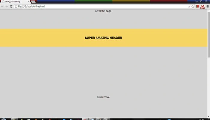 In the preceding output, you can see the orange header that is sticky positioned and it will stick to the top after scrolling and other content of the page will move on further scrolling. Hence the output:
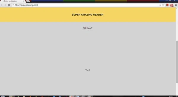 You can see that the header stuck to the top and it will return to its position if the page is scrolled back up
In this positioning, the elements inherit the values of their parent elements. Basically, the position properties do not inherit the parent's values; a static value is assigned if there is no position value given. You can type inherit or parent's element value and get the same result.
Example
You can see that the header stuck to the top and it will return to its position if the page is scrolled back up
In this positioning, the elements inherit the values of their parent elements. Basically, the position properties do not inherit the parent's values; a static value is assigned if there is no position value given. You can type inherit or parent's element value and get the same result.
Example
Inherit positioning
- <html>
- <head>
- <title>Inherit positioning</title>
- <style>
- .parent {
- background-color: white;
- color: black;
- }
- .borrow {
- background-color: inherit;
- color: inherit;
- font-weight: normal;
- }
- .par {
- background-color: #32cd32;
- color: black;
- }
- .bor {
- background-color: inherit;
- color: inherit;
- font-weight: normal;
- </style>
- </head>
- <body bgcolor="lightgrey">
- <div class="parent">
- <p class="borrow">
- In this paragraph, class-"borrrow" inherits the value (background-color: white) of its parent class-"parent".
- </p>
- </div>
- <div class="par">
- <p class="bor">
- In this paragraph also, class-"bor" inherits the value (background-color: #32cd32) of its parent class-"par".
- </p>
- </div>
- </body>
- </html>
Output
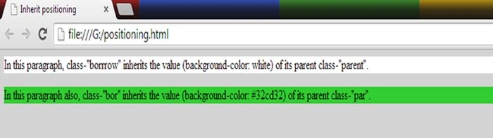 When elements are positioned outside the normal flow of the page then they can overlap other elements. The z-index property specifies the stack order of the element (which element should be placed in front of, or behind the others). An element may have a positive and negative stack order and an element with a greater stack order is always in front of an element with a lower stack order.
If two positioned elements overlap without a z-index specified then the element positioned last in HTML code will be shown on top.
Example
When elements are positioned outside the normal flow of the page then they can overlap other elements. The z-index property specifies the stack order of the element (which element should be placed in front of, or behind the others). An element may have a positive and negative stack order and an element with a greater stack order is always in front of an element with a lower stack order.
If two positioned elements overlap without a z-index specified then the element positioned last in HTML code will be shown on top.
Example
Overlapping elements
- <html>
- <head>
- <title>Overlapping elements</titlea>
- <style>
- img {
- position: absolute;
- left: 0px;
- top: 0px;
- z-index: -1;
- }
- </style>
- </head>
- <body>
- <h1>This is a heading</h1>
- <img src="C:\Users\dddd\Pictures\safe_image.jpg" width="200" height="140">
- <p><font color="red"><b>Because the image has a z-index of -1, it will be placed behind the text.</b></font></p>
- </body>
- </html>
Output

Conclusion
In this article, we studied Positioning in Cascading Style Sheets
Bertrand PERRETPosted Jul 25, 2017, 4:31 PM
Very good work indeed, i just cant find the code for absolute positioning
Upendra Pratap ShahiPosted Jun 30, 2015, 7:10 AM
nice one Gopi Chand
Vithal WadjePosted Sep 25, 2014, 2:23 PM
super keep it up
Sanjay SinghPosted Jul 24, 2014, 1:27 AM
nice article sir...
Sharad RathorePosted Jul 24, 2014, 12:07 AM
very nice article...:)