


Introduction
In this tutorial, we will learn how to handle the Placeholder issue in Xamarin.Forms for Picker Control. Xamarin.Forms Picker Control is a combination of EditText plus AlertDialog for Android and UITextField plus UIPicker for iOS. The Title property of Xamarin.Forms Picker Control is a property to set title for AlertDialog plus Hint for EditText for Android and Placeholder for UITextField.
For example, we are setting the title property of the picker control is "Title" and it has items source and selected index of the control as "-1" then the control will shows "Title" in Placeholder and title of the alert or popup. Sometimes, it is meaning less to use this control due to this.
To avoid this issue, I have created a customer render for Android and iOS to override this default behavior of picker. Without much delay, we will skip into the coding part of the article.
Steps
I have split the coding part into 5 steps as in the following.
- Step 1 - Creating new Xamarin.Forms Projects.
- Step 2 - Creating Custom Picker inherited from picker.
- Step 3 - Custom Renderer for Custom Picker in Android.
- Step 4 - Custom Renderer for Custom Picker in iOS.
- Step 5 - Implementation of the Custom Picker Control.
Step 1 - Creating new Xamarin.Forms Projects
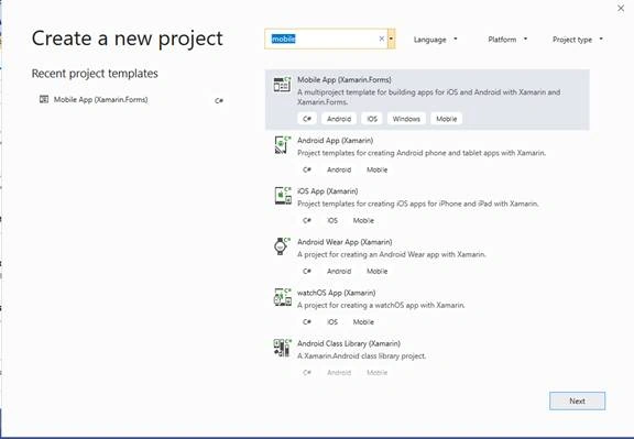
- Create new project by selecting Xamarin Cross Platform App and click OK.
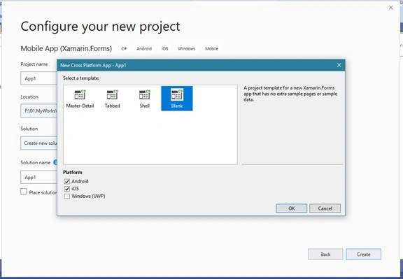
- Then select Android, iOS and UWP Platforms as shown below with Project template as "Blank" and click OK.
Step 2 - Creating Custom Picker inherited from picker
- Create a Custom Picker Control class named as “PLPicker” and it is inherited from Xamarin.Forms Picker.
- Create a property for Placeholder and is named as Placeholder like below.
- public class PLPicker : Picker
- {
- public static readonly BindableProperty PlaceholderProperty = BindableProperty.Create(
- propertyName: nameof(Placeholder),
- returnType: typeof(string),
- declaringType: typeof(string),
- defaultValue: string.Empty);
- public string Placeholder
- {
- get { return (string)GetValue(PlaceholderProperty); }
- set { SetValue(PlaceholderProperty, value); }
- }
- }
Step 3 - Custom Renderer for Custom Picker in Android
In this step, we will create a custom renderer in Android for PLPicker created in “step 2”.
- Create a class named as “PLPickerRenderer.cs” and it is inherited from “Xamarin.Forms.Platform.Android.AppCompat.PickerRenderer”.
- Then create a method “UpdatePickerPlaceholder” and copy the below code in the custom renderer class.
- void UpdatePickerPlaceholder()
- {
- if (picker == null)
- picker = Element as PLPicker;
- if (picker.Placeholder != null)
- Control.Hint = picker.Placeholder;
- }
- Call this method, in the OnElementChanged method and OnElementPropertyChanged method when the placeholder property changes.
- You can find the full coding part for “PLPickerRenderer.cs” below for Android.
- [assembly: ExportRenderer(typeof(PLPicker), typeof(PLPickerRenderer))]
- namespace PickerPlaceholder.Droid
- {
- public class PLPickerRenderer : Xamarin.Forms.Platform.Android.AppCompat.PickerRenderer
- {
- PLPicker picker = null;
- public PLPickerRenderer(Context context) : base(context)
- {
- }
- protected override void OnElementChanged(ElementChangedEventArgs<Picker> e)
- {
- base.OnElementChanged(e);
- if (e.NewElement != null)
- {
- picker = Element as PLPicker;
- UpdatePickerPlaceholder();
- if (picker.SelectedIndex <= -1)
- {
- UpdatePickerPlaceholder();
- }
- }
- }
- protected override void OnElementPropertyChanged(object sender, PropertyChangedEventArgs e)
- {
- base.OnElementPropertyChanged(sender, e);
- if (picker != null)
- {
- if (e.PropertyName.Equals(PLPicker.PlaceholderProperty.PropertyName))
- {
- UpdatePickerPlaceholder();
- }
- }
- }
- protected override void UpdatePlaceHolderText()
- {
- UpdatePickerPlaceholder();
- }
- void UpdatePickerPlaceholder()
- {
- if (picker == null)
- picker = Element as PLPicker;
- if (picker.Placeholder != null)
- Control.Hint = picker.Placeholder;
- }
- }
- }
Step 4 - Custom Renderer for Custom Picker in iOS
In this step, we will create a custom renderer in iOS for PLPicker created in “step 2”.
- Create a class named as “PLPickerRenderer.cs” and it is inherited from “Xamarin.Forms.Platform.iOS.PickerRenderer”.
- Then create a method “UpdatePickerPlaceholder” and copy the below code in the custom renderer class.
- void UpdatePickerPlaceholder()
- {
- if (picker == null)
- picker = Element as PLPicker;
- if (picker.Placeholder != null)
- Control.Placeholder = picker.Placeholder;
- }
- Call this method, in the OnElementChanged method and OnElementPropertyChanged method when the placeholder property changes.
- You can find the full coding part for “PLPickerRenderer.cs” below for iOS.
- [assembly: ExportRenderer(typeof(PLPicker), typeof(PLPickerRenderer))]
- namespace PickerPlaceholder.iOS
- {
- public class PLPickerRenderer: PickerRenderer
- {
- PLPicker picker = null;
- protected override void OnElementChanged(ElementChangedEventArgs<Picker> e)
- {
- base.OnElementChanged(e);
- if (e.NewElement != null)
- {
- picker = Element as PLPicker;
- UpdatePickerPlaceholder();
- if (picker.SelectedIndex <= -1)
- {
- UpdatePickerPlaceholder();
- }
- }
- }
- protected override void OnElementPropertyChanged(object sender, PropertyChangedEventArgs e)
- {
- base.OnElementPropertyChanged(sender, e);
- if (picker != null)
- {
- if (e.PropertyName.Equals(PLPicker.PlaceholderProperty.PropertyName))
- {
- UpdatePickerPlaceholder();
- }
- }
- }
- void UpdatePickerPlaceholder()
- {
- if (picker == null)
- picker = Element as PLPicker;
- if (picker.Placeholder != null)
- Control.Placeholder = picker.Placeholder;
- }
- }
- }
Step 5 - Implementation of Custom Picker Control
- Open created Xamarin.Forms Page, in my case “MainPage” and add the custom control picker with Placeholder property.
- Open your MainPage.xaml file and add the custom control as shown in below.
- <local:PLPicker Placeholder="Placeholder"
- Title="Title"
- TitleColor="Blue"
- x:Name="plpicker"
- Grid.Row="2"
- Grid.Column="0"
- Grid.ColumnSpan="2"/>
- Then add buttons with clicked events to change selected index as 1 and -1 for the custom picker.
- <Button Text="PLPicker:Set Index 1"
- HorizontalOptions="Center"
- VerticalOptions="Center"
- Clicked="PLPIndex1Clicked"
- Grid.Row="3"
- Grid.Column="0"/>
- <Button Text="PLPicker:Set Index -1"
- HorizontalOptions="Center"
- VerticalOptions="Center"
- Clicked="PLPIndex2Clicked"
- Grid.Row="3"
- Grid.Column="1" />
- Create an event for setting the selected index for picker as like below.
- private void PLPIndex1Clicked(object sender, EventArgs e)
- {
- plpicker.SelectedIndex = 1;
- }
- private void PLPIndex2Clicked(object sender, EventArgs e)
- {
- plpicker.SelectedIndex = -1;
- }
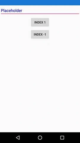
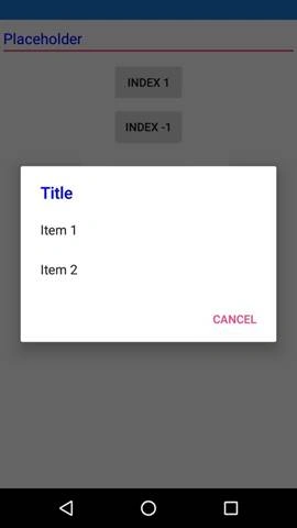
Output
Download Code
Join the conversation! Your thoughts help the community grow.