

Introduction
In this article, we will discuss React Material UI Menus. Menu is used to show a list of options. Material UI is one of the most popular UI frameworks developed by Google. The Material UI library is designed for faster, easier and developer-friendly user interface development. Now Material-UI is supported by all major browsers and platforms.
You can check my previous article in which we discussed ReactJS and its basic components from the below-mentioned links.
- Add Material UI In React Application
- Add Material-UI Table In ReactJS Application
- How To Add TreeView Component In React Application
Prerequisites
- Basic Knowledge of React
- Visual Studio Code
- Node and NPM installed
- Material UI Installed
Create ReactJS project
- npx create-react-app Matform
Install Material-UI
Now Install Material-UI by using the following command.
- npm install @material-ui/core --save
Now, right-click on the "src" folder and add a new component named 'MenuDemo.js'. Add the following code in MenuDemo component.
- import React from 'react';
- import Button from '@material-ui/core/Button';
- import Menu from '@material-ui/core/Menu';
- import MenuItem from '@material-ui/core/MenuItem';
- import AppBar from '@material-ui/core/AppBar';
- import Toolbar from '@material-ui/core/Toolbar';
- export default function MenuDemo() {
- const [anchorEl, open] = React.useState(null);
- const handleClick = event => {
- open(event.currentTarget);
- };
- const handleClose = () => {
- open(null);
- };
- return (
- <>
- <AppBar position="static">
- <Toolbar style={{ 'paddingLeft': "600px" }}>
- Material UI Menu
- </Toolbar>
- </AppBar>
- <div>
- <Button aria-controls="simple-menu" aria-haspopup="true" onClick={handleClick}>
- Open Menu
- </Button>
- <Menu
- id="Menu"
- anchorEl={anchorEl}
- keepMounted
- open={Boolean(anchorEl)}
- onClose={handleClose}
- >
- <MenuItem onClick={handleClose}>About</MenuItem>
- <MenuItem onClick={handleClose}>Contact</MenuItem>
- </Menu>
- </div>
- </>
- );
- }
Open app.js file and add the following code,
- import React from 'react';
- import logo from './logo.svg';
- import './App.css';
- import MenuDemo from './MenuDemo';
- function App() {
- return (
- <div className="App">
- <MenuDemo/>
- </div>
- );
- }
- export default App;
Run the project by using 'npm start' and check the result,
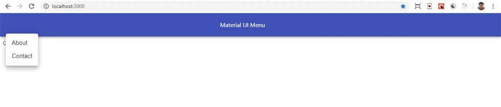
Now, right-click on the "src" folder and add a new component named 'MenuDemo1.js' and add the following code into this component.
- import React from 'react';
- import IconButton from '@material-ui/core/IconButton';
- import Menu from '@material-ui/core/Menu';
- import MenuItem from '@material-ui/core/MenuItem';
- import MoreVertIcon from '@material-ui/icons/MoreVert';
- import AppBar from '@material-ui/core/AppBar';
- import Toolbar from '@material-ui/core/Toolbar';
- const options = [
- 'About',
- 'Home',
- 'Contact',
- 'Demo',
- 'Test',
- 'React',
- ];
- const heigt = 25;
- export default function MenuDemo1() {
- const [anchorEl, setAnchorEl] = React.useState(null);
- const open = Boolean(anchorEl);
- const handleClick = event => {
- setAnchorEl(event.currentTarget);
- };
- const handleClose = () => {
- setAnchorEl(null);
- };
- return (
- <>
- <AppBar className="mrg" position="static">
- <Toolbar>
- <div style={{ 'paddingLeft': "600px" }}> Material UI Social media Icons</div>
- </Toolbar>
- </AppBar>
- <div>
- <IconButton
- aria-label="more"
- aria-controls="long-menu"
- aria-haspopup="true"
- onClick={handleClick}
- >
- <MoreVertIcon />
- </IconButton>
- <Menu
- id="long-menu"
- anchorEl={anchorEl}
- keepMounted
- open={open}
- onClose={handleClose}
- PaperProps={{
- style: {
- maxHeight: heigt * 4.5,
- width: 200,
- },
- }}
- >
- {options.map(option => (
- <MenuItem key={option} selected={option === 'Pyxis'} onClick={handleClose}>
- {option}
- </MenuItem>
- ))}
- </Menu>
- </div>
- </>
- );
- }
Run the project by using 'npm start' and check the result,
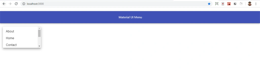
Now, right-click on the "src" folder and add a new component named 'DrawerDemo.js' and add the following code into this component,
- import React from 'react';
- import Drawer from '@material-ui/core/Drawer';
- import Button from '@material-ui/core/Button';
- import List from '@material-ui/core/List';
- import Divider from '@material-ui/core/Divider';
- import ListItem from '@material-ui/core/ListItem';
- import ListItemText from '@material-ui/core/ListItemText';
- import AppBar from '@material-ui/core/AppBar';
- import Toolbar from '@material-ui/core/Toolbar';
- export default function DrawerDemo() {
- const [state, setState] = React.useState({
- top: false,
- left: false,
- });
- const toggleDrawer = (side, open) => event => {
- if (event.type === 'keydown' && (event.key === 'Tab' || event.key === 'Shift')) {
- return;
- }
- setState({ ...state, [side]: open });
- };
- const sideList = side => (
- <div
- role="presentation"
- onClick={toggleDrawer(side, false)}
- onKeyDown={toggleDrawer(side, false)}
- >
- <List>
- {['Home', 'About', 'Contact'].map((text, index) => (
- <ListItem button key={text}>
- <ListItemText primary={text} />
- </ListItem>
- ))}
- </List>
- <Divider />
- </div>
- );
- const fullList = side => (
- <div
- role="presentation"
- onClick={toggleDrawer(side, false)}
- onKeyDown={toggleDrawer(side, false)}
- >
- <List>
- {['Home', 'About', 'Contact'].map((text, index) => (
- <ListItem button key={text}>
- <ListItemText primary={text} />
- </ListItem>
- ))}
- </List>
- <Divider />
- </div>
- );
- return (
- <>
- <AppBar className="mrg" position="static">
- <Toolbar>
- <div style={{ 'paddingLeft': "600px" }}> Material UI Social media Icons</div>
- </Toolbar>
- </AppBar>
- <div>
- <Button color="primary" onClick={toggleDrawer('left', true)}>Open Left</Button>
- <Button color="primary" onClick={toggleDrawer('top', true)}>Open Top</Button>
- <Drawer open={state.left} onClose={toggleDrawer('left', false)}>
- {sideList('left')}
- </Drawer>
- <Drawer anchor="top" open={state.top} onClose={toggleDrawer('top', false)}>
- {fullList('top')}
- </Drawer>
- </div>
- </>
- );
- }
Open app.js file and add the following code,
- import React from 'react';
- import logo from './logo.svg';
- import './App.css';
- import DrawerDemo from './DrawerDemo';
- function App() {
- return (
- <div className="App">
- <DrawerDemo/>
- </div>
- );
- }
- export default App;
Run the project by using 'npm start' and check the result,
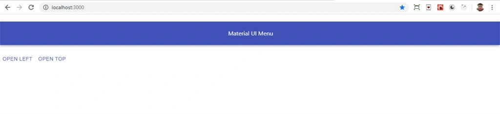
Click on Open Top button and check:
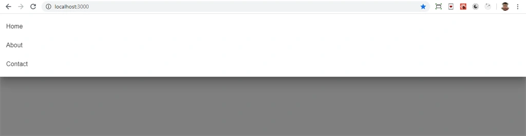
Summary
In this article, we learned how we can add Menu components in React applications using React material UI.
Join the conversation! Your thoughts help the community grow.