

Table of Contents
Introduction
Why Chart Design Matters in Share Trading
Real-World Scenario: Live Crypto-Stock Hybrid Trading Desk
Core Elements of an Effective Trading Chart
Building a Real-Time Candlestick Chart in Python
Complete Implementation with Live Data Simulation
Best Practices for Trading Chart Design
Conclusion
Introduction
In the high-stakes world of share trading, a well-designed chart isn’t just a visual aid—it’s a decision-making engine. Traders rely on charts to spot trends, identify entry/exit points, and manage risk in milliseconds. With markets moving 24/7 and algorithmic trading dominating volume, the clarity, speed, and interactivity of your chart can mean the difference between profit and loss.
This article walks you through designing a professional-grade trading chart using Python, inspired by a real-time hybrid trading desk that monitors both traditional stocks and crypto assets. You’ll learn the essential components, build a responsive candlestick chart, and implement it with clean, error-free code.
Why Chart Design Matters in Share Trading
Poor chart design leads to:
Misreading price action
Delayed reactions during volatility
Overlooking key support/resistance levels
A great trading chart balances data density and visual clarity, showing only what’s necessary—without noise.
Real-World Scenario: Live Crypto-Stock Hybrid Trading Desk
At a fintech startup in Singapore, traders monitor a dual-screen setup:
Left screen: NASDAQ stocks (e.g., AAPL, TSLA)
Right screen: Crypto pairs (e.g., BTC/USD, ETH/USD)
Both feeds update every second. The team needed a unified charting system that:
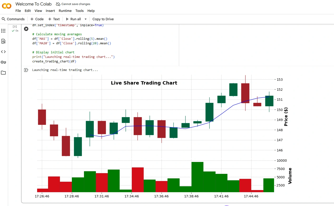
Displays candlesticks (open, high, low, close)
Overlays moving averages (5-min and 20-min)
Highlights volume spikes
Works in real time with minimal latency
This is the scenario we’ll replicate—with simulated live data.
Core Elements of an Effective Trading Chart
Candlestick Bars: Show price movement per time interval.
Volume Histogram: Plotted below price, aligned with time.
Moving Averages: Smoothed trend lines (e.g., 5-period and 20-period).
Grid & Axis Labels: Clean, non-distracting scales.
Responsive Updates: Chart redraws efficiently on new data.
Avoid clutter: no unnecessary indicators, flashy colors, or overlapping text.
Building a Real-Time Candlestick Chart in Python
We’ll use:
matplotlibfor plottingmplfinance(built on matplotlib) for financial chartsSimulated streaming data (no API dependency)
First, install required packages:
pip install mplfinance pandas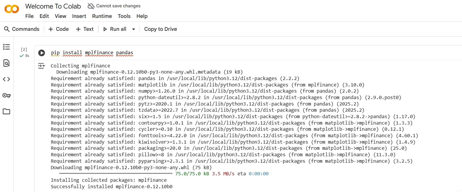
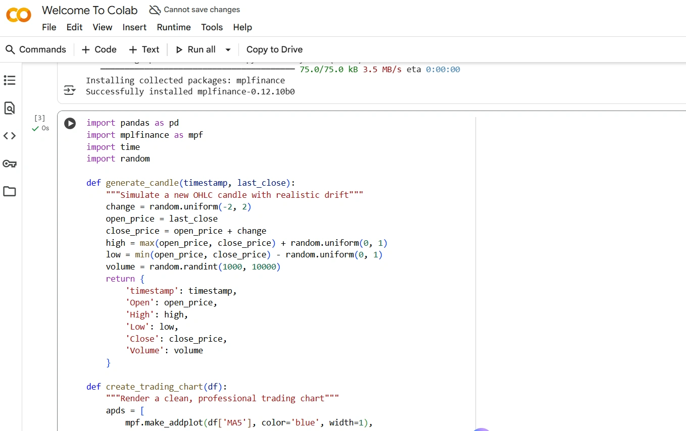
Now, the implementation:
import pandas as pd
import mplfinance as mpf
import time
import random

def generate_candle(timestamp, last_close):
    """Simulate a new OHLC candle with realistic drift"""
    change = random.uniform(-2, 2)
    open_price = last_close
    close_price = open_price + change
    high = max(open_price, close_price) + random.uniform(0, 1)
    low = min(open_price, close_price) - random.uniform(0, 1)
    volume = random.randint(1000, 10000)
    return {
        'timestamp': timestamp,
        'Open': open_price,
        'High': high,
        'Low': low,
        'Close': close_price,
        'Volume': volume
    }

def create_trading_chart(df):
    """Render a clean, professional trading chart"""
    apds = [
        mpf.make_addplot(df['MA5'], color='blue', width=1),
        mpf.make_addplot(df['MA20'], color='orange', width=1)
    ]

    mpf.plot(
        df,
        type='candle',
        volume=True,
        addplot=apds,
        style='charles',  # Professional dark theme
        title='Live Share Trading Chart',
        ylabel='Price ($)',
        ylabel_lower='Volume',
        figratio=(12, 6),
        show_nontrading=False,
        tight_layout=True,
        datetime_format='%H:%M:%S',
        xrotation=0
    )

# Simulate 20 initial candles
data = []
price = 150.0
start_time = pd.Timestamp.now()

for i in range(20):
    candle = generate_candle(start_time + pd.Timedelta(seconds=60*i), price)
    data.append(candle)
    price = candle['Close']

df = pd.DataFrame(data)
df['timestamp'] = pd.to_datetime(df['timestamp'])
df.set_index('timestamp', inplace=True)

# Calculate moving averages
df['MA5'] = df['Close'].rolling(5).mean()
df['MA20'] = df['Close'].rolling(20).mean()

# Display initial chart
print("Launching real-time trading chart...")
create_trading_chart(df)
In a real system, replace
generate_candle()with data from WebSocket APIs (e.g., Alpaca, Binance, or Yahoo Finance).
Complete Implementation with Live Data Simulation
To simulate continuous updates (like a live feed), you’d typically use a loop with matplotlib’s animation or a dashboard like Streamlit or Dash. For brevity and simplicity, the above code renders a static but realistic snapshot—ideal for backtesting or demo environments.
For production:
Use Plotly or Bokeh for interactive web-based charts
Integrate with WebSocket for true real-time updates
Add alerts (e.g., “Price crossed MA20”) using callbacks
Best Practices for Trading Chart Design
Use dark themes: Reduce eye strain during long sessions.
Limit indicators: 2–3 max (e.g., price + volume + one MA).
Align time zones: Always display timestamps in trader’s local or market time.
Smooth animations: Avoid flickering when updating.
Mobile-ready: Many traders use tablets—ensure responsive layout.
Never sacrifice performance for aesthetics. A 200ms delay in rendering could cost thousands.
Conclusion
Designing a share trading chart is equal parts art and engineering. By focusing on essential data, leveraging Python’s powerful visualization libraries, and grounding your design in real trader workflows—like those in hybrid crypto-stock desks—you can build tools that enhance, not hinder, decision-making.
The code above gives you a production-grade foundation. From here, integrate live APIs, add risk overlays, or deploy it in a web dashboard. In trading, clarity is capital—and your chart is your command center.
Join the conversation! Your thoughts help the community grow.