

In Power BI we have different types of Visualizations provided. Here we will learn about the creation of Line Chart in Power BI Desktop App.
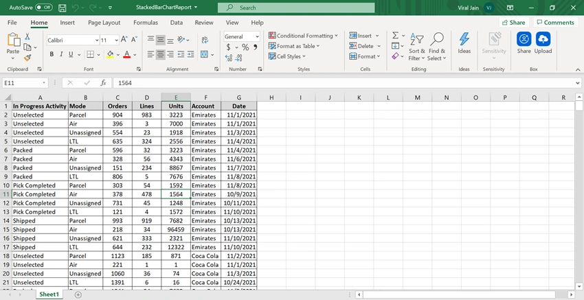
We will create a sample excel data as a data source for Line chart Report as shown below and also attached to this article.
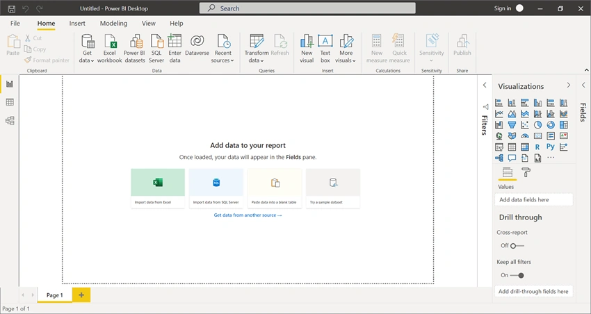
Import this above Excel in Power BI Desktop App by choosing the “Import Data from Excel “as shown in below figure
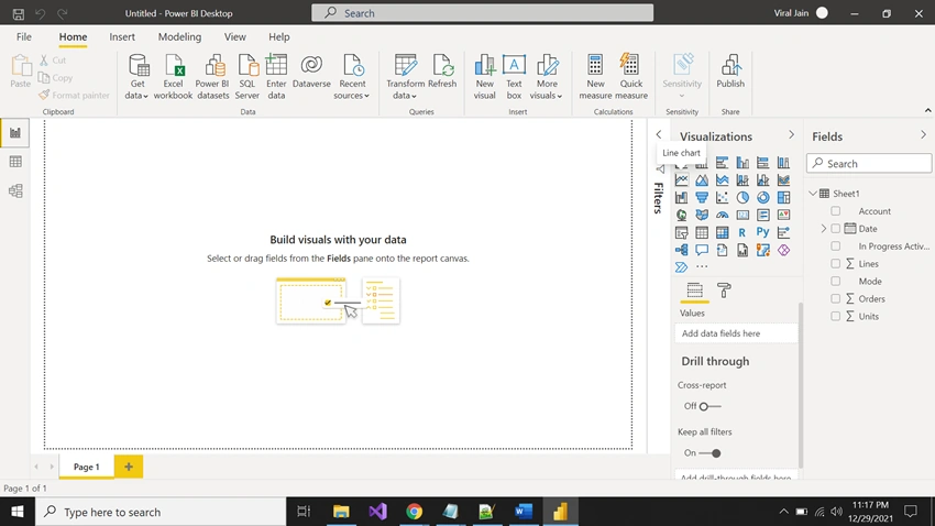
Once you successfully Import Excel choose Line chart Visualizations and select Columns from the Fields Blade as highlighted below.
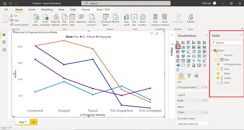
If it does not look like the above screenshot then you need to drag fields from Fields’s blade to the Axis, Legend, and Values.
Set Axis as In Progress Activity Legend as Mode, Values as Orders.
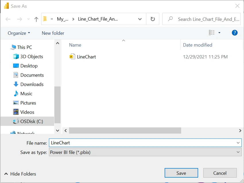
Save the Report as Name – LineChart which will save as your report extension as .PBIX file in your system.
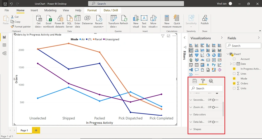
You can change the Look and Feel of the chart like setting up the Font Style, Font Size, Font Color, Properties like setting up the title, font color, etc. For these settings you must click the Chart and go in the Visualizations Blaze Then click under the second Tab you will find all the Properties Like Legend, General, Data Colors, Tooltip, etc. as highlighted below –
- Another thing which Power BI provides you is the Filtering of charts.
- All you can do is the Filter the Charts based on your column data means when you apply Filter on the charts it will refresh the chart completely and show the visual according to the Filter values.
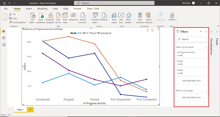
- In the Filters Blade as shown in the below diagram you can setup multiple columns (multiple data Fields) to be Filter on your visual.
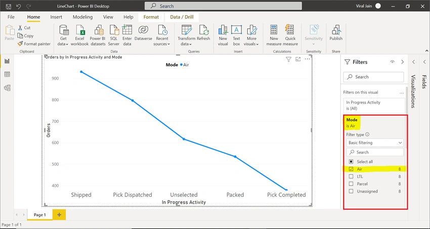
- To Apply Filter on your visual we will take One data Field Column Ex - Mode.
- Expand Mode Block and Select Air check box as a Filter Value, you will see the Chart will automatically refresh accordingly as highlighted below –
- Likewise, you can set Filter on another Data Field as well on another value.
- Once you applied Filter and Complete setting up the Properties then Publish the Report and see in the Workspace as it is.
Summary
This is how you can create Line Chart Report.
Join the conversation! Your thoughts help the community grow.