


Fluent UI Components
Fluent UI provides a set of reusable components and design patterns for building modern, responsive, and accessible user interfaces. These custom components can be used within PowerApps to create custom forms, interfaces, and data visualization.
Using Fluent UI components ensures consistency in design, reduces development time, and improves the overall user experience.
Prerequisites
- Knowledge of essential PCF components. If you need to, please take a look at the PowerApps Component Framework article.
- Please refer to PowerApps + React for more about PowerApps Components Framework with React and PowerApps + Bootstrap for how to create forms with Bootstrap in PowerApps.
Create PowerApps Solution
pac pcf init -n "name" -ns "namespace" -t [dataser field]
- "name" (-n) is a project name.
- "namespace" (-ns) is the namespace for the project.
- "type" (-t) can either be a dataset or a field.

Install Core React, React-Dom, and Fluent UI Packages
npm install react react-dom @fluentui/react

Install type definitions for the above packages as dev dependencies
npm install -–save-dev @types/react @types/react-dom
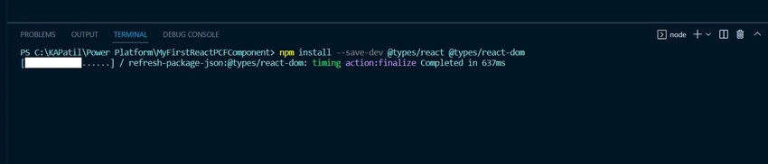
Structure for Components
I usually create a separate folder and add components to it.
- Created a new folder - Components.
- Created TSX files for components and added source code to them.
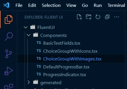
Please look at the developer Fluent UI site for Fluent UI components, its use, and guidelines (I have tried a few of them).
Render the Fluent UI Components
Import required dependencies
- On top of the file, import React and React-dom.
- Import form component
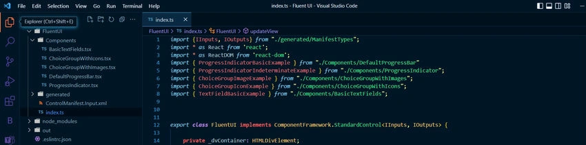
Render the components
- In the updateView function, use ReactDOM and React.createElement to create and render Fluent UI components.
- Save the changes, and it's done.
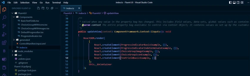
Save the changes made in the index.ts file and run the command.
npm start watch
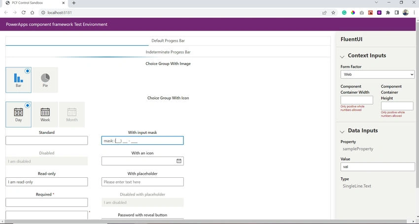
Output
Join the conversation! Your thoughts help the community grow.