

Data Science means Science that is being driven by data, by means of getting useful insights from the sets of data available, plotting the data visually, and predicting the future.
While Data Science involves knowledge of several tools and programming (Python etc.), still the most basic requirement is the knowledge of some basic maths. However, with practice and proper guidance, anyone can learn about Data Science and gain proficiency by experimenting with different sets of data.
In this article, some of the basic statistics functions will be explained. A data scientist must hone his/her skills in these functions before considering formal training in Data Science. But before we go ahead, we must have the following.
- Data (Generally normalized and cleansed)
- Tool (Excel is a boon for beginner data scientists)
To start with, open MS Excel and load the sample data. In case you do not have any sample data, you can create it as shown in the image below.
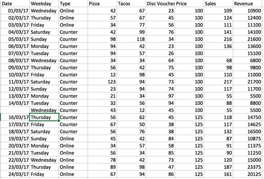
Data cleansing or data cleaning is an activity to fix the cells which could cause an error or may show a disconnect due to the incompleteness of information in the Excel sheet. You can see in the image above that two cells are empty, but because the relevant data is available, hence the missed values can be placed. A blank date in the first column can be easily filled by taking the reference of an adjacent cell. Similarly, another blank cell for sales quantity could be filled by adding the number of Pizzas and Tacos. This is the simplest way to clean the data. In case no reference point is found for the missing data or for any duplication of records, the cell can be deleted from the dataset.
Now, after data cleaning, the sheet will look proper and we are ready to learn the basic functions. In Data Science, visualization of data is important and there are different methods to see the shape of data or to see how the data is distributed. Let's get started with some common terms,
- A master set of all elements of interest is called Population.
- Individuals are people or objects included in the study for statistical purposes.
- Variables are the characteristics of an individual to be measured or observed.
- A Sample is a manageable set of data collected from a large population and the elements of a sample set are known as sample points or data points.
- Two major types of variables are Categorical (gender, religion, etc) and numerical or Quantitative (weight, height, etc).
- The values of a numerical variable are numbers. They can be further classified into discrete and continuous variables. A variable whose values are whole numbers (counts) is called discrete. For example, the number of matches played in the IPL 2017 series.
- Histogram charts are a type of bar charts and are created to represent the data distribution in different sets of data (known as bins, for example displaying the percentage of a class result in a bin size of 10 will show the distribution of the number of students among 10-20%, 20-30%.. and so on.
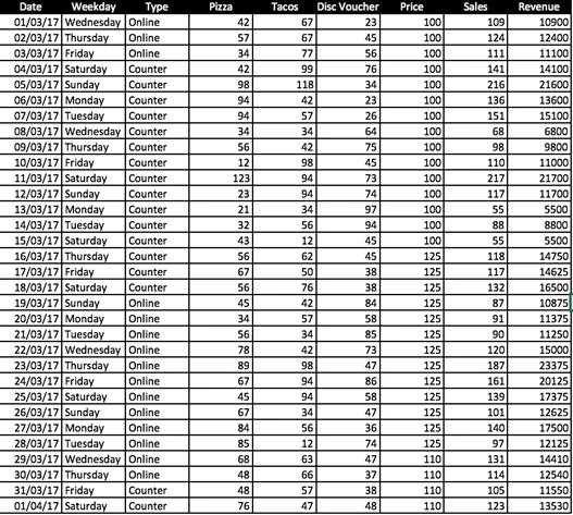
Some other information
- n: Number of observations in the sample (in the above example, n = 32 )
- N: Number of observations in the population (N = 1, as we have obtained only 1 set of data)
- x: Sample mean (the mean sales is = number of total sales / n, = 120)
- Md: Median in the middlemost value for the given variable where variables are shown in columns and individuals are shown in rows (Md for sales = (n+1)/2, = 117)
- Mo: Mode is the most frequently occurring value for a given variable (Mo for sales = 117)
- Ra: Range is the difference between the maximum and minimum value (Ra for sales = 217 -55 = 162)
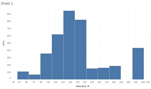
Tableau (Public) version to create the histogram above, where we see lots of bars being plotted. The bin range is 10, which represents the revenues captured for the sales from 40 to 50, 50 to 60, and so on.
A few of the observations from the above histogram are,
- The distribution of revenue is not uniform across the mean (117).
- The tallest bar represents the most recurring value (Mo) and ideally, the distribution of data should be symmetrical from this point (The mean value should be the center of a bell curve).
- The above diagram also depicts that the maximum numbers for sales transactions lie between the range of 110 to 130.
So far, we have learned the basics of statistics and data visualization. These formulas are to be practiced on the sample data (https://pastebin.com/vSu8Xk4k). To use this data, please copy the data to a new Excel file.
There are different tools you can use to play with data, but Excel is a good starting point. Please enable the Analysis Toolpak add-ins and this option will enable the Data Analytics option under File=> Data menu ribbon. Additionally, you can download the free version of Tableau (Public) and install it on your computer. I will write a separate post on how to use Tableau for data visualization and analytics.
Next, we will learn about some complex scenarios to find and plot the differential between data captured from different samples complimented by advanced statistics formulas.
Please like, share, and tell me how you feel about the article.
Hadshana KamalanathanPosted Jul 14, 2018, 2:49 AM
Thanks for sharing
Ramesh KartikPosted Jul 31, 2017, 1:08 AM
Well Explained Naveen Sharma, Right article for the beginners to get insight on Datascience perfectly.