


Jetpack Compose gives you great flexibility in creating UI components, and the Slider is no exception. While the default slider is quite functional, sometimes design specifications require a more visually tailored experience, such as a thicker track, a custom-colored thumb, or unique active and inactive colors.
In this article, we’ll break down a custom slider implementation in Jetpack Compose that meets these design needs.
Basic Idea
We're building a custom horizontal slider with.
- A green-colored track and thumb
- A thicker track (8dp)
- A white circular thumb (16dp)
- Consistent coloring for both active and inactive segments
- Value ranges from 0 to 100
- Full-width layout with a height of 32dp
Code Overview
Here's the complete code snippet.
Slider(
    value = state.sittingPercentage,
    onValueChange = viewModel::onSittingPercentageChange,
    valueRange = 0f..100f,
    modifier = Modifier
        .fillMaxWidth()
        .height(32.dp),
    colors = SliderDefaults.colors(
        thumbColor = ButtonCommonGreenColor,
        activeTrackColor = ButtonCommonGreenColor,
        inactiveTrackColor = ButtonCommonGreenColor.copy(alpha = 0.3f)
    ),
    track = { sliderPositions ->
        SliderDefaults.Track(
            sliderState = sliderPositions,
            colors = SliderDefaults.colors(
                activeTrackColor = ButtonCommonGreenColor,
                inactiveTrackColor = Color.DarkGray
            ),
            modifier = Modifier.height(8.dp),
            thumbTrackGapSize = 0.dp,
            drawStopIndicator = { null }
        )
    },
    thumb = {
        Box(
            modifier = Modifier
                .size(16.dp)
                .background(White, shape = CircleShape)
        )
    }
)
Explanation of Each Part
value and onValueChange
These handle the current value of the slider and update the view model when the user interacts with it.
value = state.sittingPercentage,
onValueChange = viewModel::onSittingPercentageChange,
valueRange = 0f..100f
Limits the slider between 0 and 100. Perfect for percentage-based values.
Colors (Top-Level)
colors = SliderDefaults.colors(
    thumbColor = ButtonCommonGreenColor,
    activeTrackColor = ButtonCommonGreenColor,
    inactiveTrackColor = ButtonCommonGreenColor.copy(alpha = 0.3f)
)
- thumbColor: Sets the color of the draggable thumb.
- activeTrackColor: Color of the line from the start to the thumb.
- inactiveTrackColor: Color from the thumb to the end.
This creates a consistent green look across all parts, with the inactive segment being a faded version.
Track
track = { sliderPositions ->
    SliderDefaults.Track(
        sliderState = sliderPositions,
        colors = SliderDefaults.colors(
            activeTrackColor = ButtonCommonGreenColor,
            inactiveTrackColor = Color.DarkGray
        ),
        modifier = Modifier.height(8.dp),
        thumbTrackGapSize = 0.dp,
        drawStopIndicator = { null }
    )
}
- This is a custom track that replaces the default.
- Uses a height of 8dp for a thicker visual appearance.
- thumbTrackGapSize = 0.dp: Ensures the track touches the thumb precisely.
- drawStopIndicator = { null }: Prevents drawing any stop indicators (used for stepped sliders).
Thumb
thumb = {
    Box(
        modifier = Modifier
            .size(16.dp)
            .background(White, shape = CircleShape)
    )
}
- This replaces the default thumb with a custom white circle.
- The size is 16dp, and it utilizes a CircleShape for a perfect round appearance.
This makes the thumb visually distinct from the track, giving a polished, tactile appearance.
Output
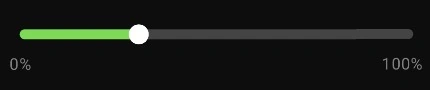
When Should You Use This?
This custom slider approach is practical when.
- You're following a strict design system.
- You want to enhance visual clarity (e.g., by increasing track thickness).
- You want your slider to stand out (e.g., as a key interaction point, such as volume or rating).
Final Thoughts
Jetpack Compose makes customizing sliders seamless. With a few tweaks, you can build a slider that feels both elegant and functional, like the one above, clean, consistent, and user-friendly.
Join the conversation! Your thoughts help the community grow.