

In this post, I want to talk about the web components (Reusable) and why they are very useful to an organization, especially a large one. Many large organizations often consolidate their front-end code to pattern library for ensuring the consistency.
A pattern library is extremely useful when a company grows and splits into multiple teams but it also comes with some challenges, like different teams working with different front-end frameworks (like Angular, React, VUE etc). Then, how do you build the pattern library that works for all?
- One can’t choose any one framework because then you would be locked and doesn’t support all frameworks.
- Writing all code to vanilla HTML/js/cs is quite difficult.
So the solution to both the problems would be a custom element.
Web components are based 4 types,
- Custom Elements
- Shadow Dom
- Html imports
- Html Template
So in this post, we will first write our very first and very basic web component which is just for increment - decrement the value. Then, we will see how we can use that newly created web component to our Angular project (In the end, it is just a JS file so you can use it in any of your favorite JavaScript frameworks, like React, Angular,v Vue.js etc.). Doesn’t it sound awesome guys!!!
Let’s dive into creating first custom component
A simple counter will look like this.
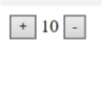
Simple-Counter component can be used like this.
- <simple-counter [min]=”settings.min” [max]=”settings.max” [step]=”settings.step” (maxReached)=”handleMaxReached()” (minReached)=”handleMinReached()”>
- </simple-counter>
We will be building one custom component which is having two buttons and one label to display the current value. We are creating four properties of that element.
- Min
- Max
- Step
- Value
And, two custom events were dispatched when trying to extends the min and max limit. And two events or callbacks for increment and decrement when + or — button is pressed. It is as simple as a normal counter which will increment the value by step by step when + button is pressed and vice versa when — button is pressed.
Now, let’s create one file inside the demo directory and name it as simple-counter.js.
- (function() {
- const template = document.createElement('template');
- template.innerHTML = `
- <div>
- <button type="button" incr>+</button>
- <span></span>
- <button type="button" decr>-</button>
- </div>
- `;
- class SimpleCounter extends HTMLElement {
- constructor() {
- super();
- this.increment = this.increment.bind(this);
- this.decrement = this.decrement.bind(this);
- this.attachShadow({ mode: 'open' });
- this.shadowRoot.appendChild(template.content.cloneNode(true));
- this.incrementBtn = this.shadowRoot.querySelector('[incr]');
- this.decrementBtn = this.shadowRoot.querySelector('[decr]');
- this.displayVal = this.shadowRoot.querySelector('span');
- this.maxReached = new CustomEvent('maxReached');
- this.minReached = new CustomEvent('minReached');
- }
- connectedCallback() {
- this.incrementBtn.addEventListener('click', this.increment);
- this.decrementBtn.addEventListener('click', this.decrement);
- if (!this.hasAttribute('value')) {
- this.setAttribute('value', 1);
- }
- }
- increment() {
- const step = +this.step || 1;
- const newValue = +this.value + step;
- if (this.max) {
- if (newValue > +this.max) {
- this.value = +this.max;
- this.dispatchEvent(this.maxReached);
- } else {
- this.value = +newValue;
- }
- } else {
- this.value = +newValue;
- }
- }
- decrement() {
- const step = +this.step || 1;
- const newValue = +this.value - step;
- if (this.min) {
- if (newValue < +this.min) {
- this.value = +this.min;
- this.dispatchEvent(this.minReached);
- } else {
- this.value = +newValue;
- }
- } else {
- this.value = +newValue;
- }
- }
- static get observedAttributes() {
- return ['value'];
- }
- attributeChangedCallback(name, oldValue, newValue) {
- this.displayVal.innerText = this.value;
- }
- get value() {
- return this.getAttribute('value');
- }
- get step() {
- return this.getAttribute('step');
- }
- get min() {
- return this.getAttribute('min');
- }
- get max() {
- return this.getAttribute('max');
- }
- set value(newValue) {
- this.setAttribute('value', newValue);
- }
- set step(newValue) {
- this.setAttribute('step', newValue);
- }
- set min(newValue) {
- this.setAttribute('min', newValue);
- }
- set max(newValue) {
- this.setAttribute('max', newValue);
- }
- disconnectedCallback() {
- this.incrementBtn.removeEventListener('click', this.increment);
- this.decrementBtn.removeEventListener('click', this.decrement);
- }
- }
- window.customElements.define('simple-counter', SimpleCounter);
- })();
Configuration
Now, for your custom element to work on every browser, you will need to add polyfills for it.
npm install @webcomponents/webcomponentsjs
Then simply add one import statement to your Angular’s polyfills.ts file as shown below.
- /***************************************************************************************************
- * Zone JS is required by Angular itself.
- */
- import‘ zone.js / dist / zone’; // Included with Angular CLI.
- import‘ @webcomponents / webcomponentsjs / webcomponents - sd - ce.js’;
- /***************************************************************************************************
Now, in app.module.ts file, import CUSTOM_ELEMENTS_SCHEMA from @angular/core and also add the schemas array in NgModule and also import the simple-counter.js file as shown below.
- import {
- BrowserModule
- } from‘ @angular / platform - browser’;
- import {
- NgModule,
- CUSTOM_ELEMENTS_SCHEMA
- } from‘ @angular / core’;
- import {
- AppComponent
- } from‘. / app.component’;
- import‘. / demo / simple - counter.js’;
- @NgModule({
- declarations: [AppComponent],
- schemas: [CUSTOM_ELEMENTS_SCHEMA],
- imports: [BrowserModule],
- providers: [],
- bootstrap: [AppComponent]
- })
- export class AppModule {}
How to Use simple-Counter
app.component.html
- <simple-counter [min]="min" [max]="max" [step]="step" (maxReached)="handleMaxReached()" (minReached)="handleMinReached()">
- </simple-counter>
app.component.ts
- import { Component } from "@angular/core";
- @Component({
- selector: "app-root",
- templateUrl: "./app.component.html",
- styleUrls: ["./app.component.css"]
- })
- export class AppComponent {
- title = "app";
- min = 0;
- max= 10;
- step = 1;
- handleMaxReached() {
- alert("max reached");
- }
- handleMinReached() {
- alert("min reached");
- }
- }
Download Source code from here
That’s it. I hope, it will be helpful to you.
Thanks for reading!!!
Sanni PrasadPosted Jul 21, 2018, 4:36 AM
I Like to follow your articles.But have been missing it since feb.Please post something interesting
Sagar Pandurang KapPosted Feb 4, 2018, 10:28 PM
Nice article.Keep sharing..