

In this article, you will learn how to create Drawer Layout using Material Design in Xamarin.Android.
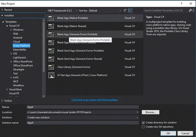
Open VS > File > Cross-Platform > Blank App (Native Portable).
Step 2- Creating required styles
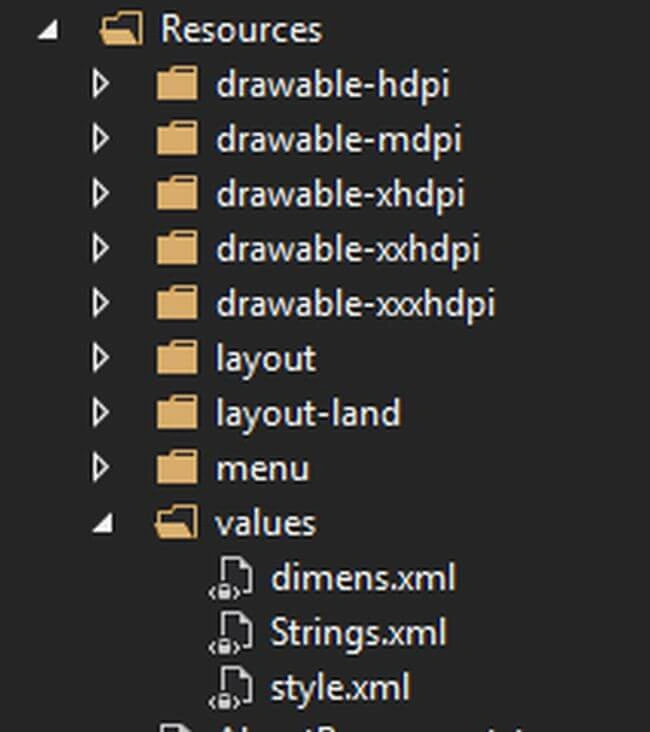
Open styles and write a custom style below. Just take a look below.
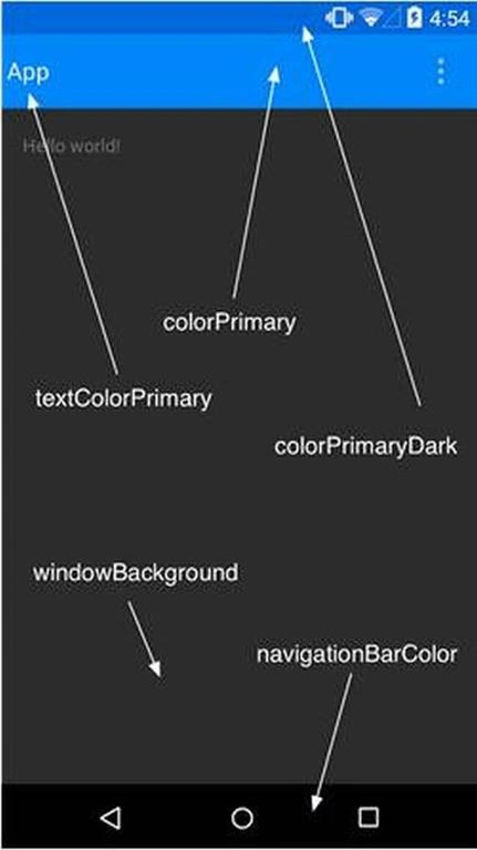
So, to customize, we need to set and create our custom theme (if you want to) in styles.
- <style name="MyTheme" parent="Theme.AppCompat.Light.NoActionBar">
- <item name="windowNoTitle">true</item>
- <item name="windowActionBar">false</item>
- <item name="colorPrimary">#16A085</item>
- <item name="colorPrimaryDark">#1976D2</item>
- <item name="colorAccent">#FF4081</item>
- <item name="drawerArrowStyle">@style/MyDrawerArrowStyle</item>
- </style>
- <style name="MyDrawerArrowStyle" parent="Widget.AppCompat.DrawerArrowToggle">
- <item name="color">#F5F5F5</item>
- <item name="spinBars">true</item>
- </style>
So, I have overriden all values which are required with my custom values.
Step 2 - Creating Drawer Layout
Now, let's add a new layout. Right click >> Add New >> Android Layout >> DrawerLayout.axml.
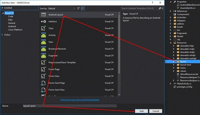
Now, we need to add the required NuGet packages before we start writing UI. So, download the following NuGet packages.
- Xamarin.Android.Support.v4 version="25.4.0.2"
- Xamarin.Android.Support.v7.AppCompat version="25.4.0.2"
- Xamarin.Android.Support.Fragment version="25.4.0.2"
- Refractored.Controls.CircleImageView( for circle image view in left drawer)
Now, open DrawerLayout.axml and write the following UI Code.
- <?xml version="1.0" encoding="utf-8"?>
- <LinearLayout xmlns:android="http://schemas.android.com/apk/res/android"
- xmlns:app="http://schemas.android.com/apk/res-auto"
- android:orientation="vertical"
- android:layout_width="fill_parent"
- android:layout_height="fill_parent">
- <android.support.v7.widget.Toolbar
- android:id="@+id/toolbar"
- android:layout_width="match_parent"
- android:layout_height="wrap_content"
- android:minHeight="?attr/actionBarSize"
- android:background="?attr/colorPrimary"
- app:theme="@style/MyTheme"
- app:layout_scrollFlags="scroll|enterAlways"
- app:popupTheme="@style/ThemeOverlay.AppCompat.Dark" />
- <android.support.v4.widget.DrawerLayout
- android:id="@+id/drawer_layout"
- android:layout_width="match_parent"
- android:layout_height="match_parent">
- <!-- The Main Content View -->
- <RelativeLayout
- android:layout_width="match_parent"
- android:layout_height="match_parent">
- <android.support.design.widget.AppBarLayout
- android:layout_height="wrap_content"
- android:layout_width="match_parent"
- android:id="@+id/toolbar_layout">
- <!-- you can create separately and use it here Like this ,but for now i am doing inline for toolbar-->
- <!--<include
- layout="@layout/toolbar" />-->
- </android.support.design.widget.AppBarLayout>
- <FrameLayout
- android:id="@+id/content_frame"
- android:layout_below="@id/toolbar_layout"
- android:layout_width="match_parent"
- android:layout_height="match_parent" />
- </RelativeLayout>
- <!-- The Left Navigation Drawer -->
- <android.support.design.widget.NavigationView
- android:id="@+id/nav_view"
- android:layout_height="match_parent"
- android:layout_width="240dp"
- android:layout_gravity="start"
- app:menu="@layout/left_menu_items"
- app:headerLayout="@layout/nav_header_main"
- android:fitsSystemWindows="true" >
- </android.support.design.widget.NavigationView>
- </android.support.v4.widget.DrawerLayout>
- </LinearLayout>
Note
Action Bar is deprecated, so we are using toolbar (which builds a new control on top of ActionBar)
So I referred to my Style for a toolbar like this
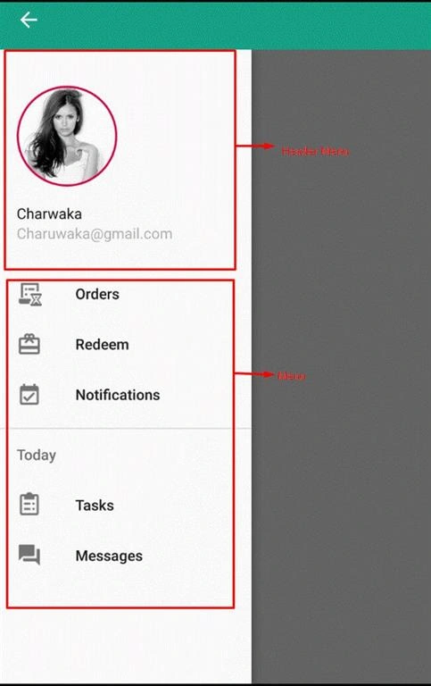
So first, we will create a UI for Header menu. Add a new layout file, say nav_header_main.
- <?xml version="1.0" encoding="utf-8"?>
- <RelativeLayout xmlns:android="http://schemas.android.com/apk/res/android"
- xmlns:app="http://schemas.android.com/apk/res-auto"
- android:id="@+id/view_container"
- android:layout_width="match_parent"
- android:layout_height="@dimen/nav_header_height"
- android:gravity="bottom"
- android:orientation="vertical"
- android:theme="@style/ThemeOverlay.AppCompat.Dark">
- <LinearLayout
- android:layout_width="220dp"
- android:layout_height="wrap_content"
- android:layout_centerVertical="true"
- android:orientation="vertical"
- android:padding="@dimen/activity_horizontal_margin">
- <refractored.controls.CircleImageView
- xmlns:app="http://schemas.android.com/apk/res-auto"
- android:id="@+id/profile_image"
- android:layout_width="96dp"
- android:layout_height="96dp"
- android:src="@drawable/profile"
- app:civ_border_width="2dp"
- app:civ_border_color="#D40047"/>
- <TextView
- android:id="@+id/name"
- android:text="Nina"
- android:textColor="#1E1E1E"
- android:layout_width="match_parent"
- android:layout_height="wrap_content"
- android:paddingTop="@dimen/nav_header_vertical_spacing"
- android:textAppearance="@style/TextAppearance.AppCompat.Body1" />
- <TextView
- android:id="@+id/names"
- android:layout_below="@id/name"
- android:text="[email protected]"
- android:textColor="#B0B0B0"
- android:layout_width="match_parent"
- android:layout_height="wrap_content"
- android:textAppearance="@style/TextAppearance.AppCompat.Body1" />
- </LinearLayout>
- </RelativeLayout>
Put all the images in Drawable folder and refer to it like this. If you're supporting multiple resolutions, put all respective scaled images in remaining Drawable folders. For now, I am adding to drawable only.
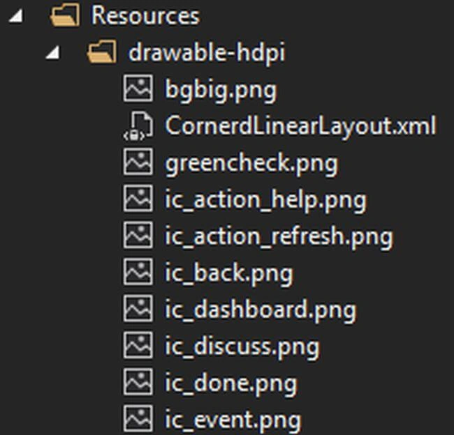
android:src="@drawable/profile"
app:headerLayout="@layout/nav_header_main"
Now, we have to create menu items. So, add another layout file and name it as left_menu_items.axml.
- <?xml version="1.0" encoding="UTF-8" ?>
- <menu xmlns:android="http://schemas.android.com/apk/res/android">
- <group android:checkableBehavior="single">
- <item
- android:id="@+id/nav_home"
- android:icon="@drawable/ic_Order"
- android:title="Orders" />
- <item
- android:id="@+id/nav_friends"
- android:icon="@drawable/ic_Redeem"
- android:title="Redeem" />
- <item
- android:id="@+id/nav_profile"
- android:icon="@drawable/ic_today"
- android:title="Notifications" />
- </group>
- <item android:title="Today">
- <menu>
- <item
- android:icon="@drawable/ic_test"
- android:title="Tasks"
- android:checkable="true" />
- <item
- android:icon="@drawable/ic_forum"
- android:title="Messages"
- android:checkable="true" />
- </menu>
- </item>
- </menu>
Note
You must place all android:icon images in Drawable folder.
group android:checkableBehavior="single" means to put a check that only one item can be selected at a time.
Now, refer to this menu in app:menu="@layout/left_menu_items" in DrawerLayout.axml
Step 3 - Creating DrawerLayout Activity file
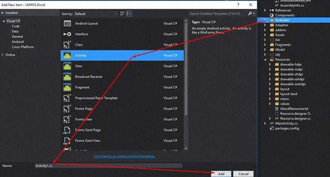
Open Drawerlayout.cs file and write the code like this -
- using System;
- using Android.App;
- using Android.Content;
- using Android.Runtime;
- using Android.Views;
- using Android.Widget;
- using Android.OS;
- using SupportToolbar = Android.Support.V7.Widget.Toolbar;
- using Android.Support.V7.App;
- using Android.Support.V4.Widget;
- using System.Collections.Generic;
- using Android.Support.V4.App;
- using Android;
- using DrawerLayout_V7_Tutorial;
- using Android.Support.V7.Widget;
- using Android.Support.Design.Widget;
- using VAMOS.Droid.Fragments;
- using Android.Support.V4.View;
- using Android.Content.Res;
- namespace DrawerSample
- {
- [Activity(Label = "SlidingPane Sample", Icon = "@drawable/icon", Theme = "@style/MyTheme")]
- public class SlidingPaneLayoutActivity : AppCompatActivity
- {
- //Declaring Variables to access throught this activity
- DrawerLayout drawerLayout;
- NavigationView navigationView;
- IMenuItem previousItem;
- Android.Support.V7.App.ActionBarDrawerToggle toggle;
- protected override void OnCreate(Bundle savedInstanceState)
- {
- base.OnCreate(savedInstanceState);
- SetContentView(VAMOS.Droid.Resource.Layout.Dashboard);
- //Finding toolbar and adding to actionbar
- var toolbar = FindViewById<Android.Support.V7.Widget.Toolbar>(VAMOS.Droid.Resource.Id.toolbar);
- SetSupportActionBar(toolbar);
- //For showing back button
- SupportActionBar.SetDisplayHomeAsUpEnabled(true);
- SupportActionBar.SetHomeButtonEnabled(true);
- SupportActionBar.SetDisplayShowTitleEnabled(false);
- //setting Hamburger icon Here
- SupportActionBar.SetHomeAsUpIndicator(VAMOS.Droid.Resource.Drawable.ic_menu);
- //Getting Drawer Layout declared in UI and handling closing and open events
- drawerLayout = FindViewById<DrawerLayout>(VAMOS.Droid.Resource.Id.drawer_layout);
- drawerLayout.DrawerOpened += DrawerLayout_DrawerOpened;
- drawerLayout.DrawerClosed += DrawerLayout_DrawerClosed;
- navigationView = FindViewById<NavigationView>(VAMOS.Droid.Resource.Id.nav_view);
- toggle = new Android.Support.V7.App.ActionBarDrawerToggle
- (
- this,
- drawerLayout,
- VAMOS.Droid.Resource.String.openDrawer,
- VAMOS.Droid.Resource.String.closeDrawer
- );
- drawerLayout.AddDrawerListener(toggle);
- //Synchronize the state of the drawer indicator/affordance with the linked DrawerLayout
- toggle.SyncState();
- //Handling click events on Menu items
- navigationView.NavigationItemSelected += (sender, e) =>
- {
- if (previousItem != null)
- previousItem.SetChecked(false);
- navigationView.SetCheckedItem(e.MenuItem.ItemId);
- previousItem = e.MenuItem;
- switch (e.MenuItem.ItemId)
- {
- case VAMOS.Droid.Resource.Id.nav_home:
- ListItemClicked(0);
- break;
- case VAMOS.Droid.Resource.Id.nav_friends:
- ListItemClicked(1);
- break;
- case VAMOS.Droid.Resource.Id.nav_profile:
- ListItemClicked(2);
- break;
- }
- drawerLayout.CloseDrawers();
- };
- }
- private void DrawerLayout_DrawerClosed(object sender, DrawerLayout.DrawerClosedEventArgs e)
- {
- //SupportActionBar.SetHomeAsUpIndicator(VAMOS.Droid.Resource.Drawable.ic_menu);
- }
- private void DrawerLayout_DrawerOpened(object sender, DrawerLayout.DrawerOpenedEventArgs e)
- {
- // SupportActionBar.SetHomeAsUpIndicator(VAMOS.Droid.Resource.Drawable.ic_back);
- }
- private void ListItemClicked(int position)
- {
- Android.Support.V4.App.Fragment fragment = null;
- switch (position)
- {
- case 0:
- fragment = new LoginFragment();
- break;
- case 1:
- fragment = new Signupfragment();
- break;
- }
- if (fragment != null)
- {
- SupportFragmentManager.BeginTransaction()
- .Replace(VAMOS.Droid.Resource.Id.content_frame, fragment)
- .Commit();
- }
- }
- //Handling Back Key Press
- public override void OnBackPressed()
- {
- if (drawerLayout.IsDrawerOpen((int)GravityFlags.Start))
- {
- drawerLayout.CloseDrawer((int)GravityFlags.Start);
- }
- else
- {
- base.OnBackPressed();
- }
- }
- public override bool OnOptionsItemSelected(IMenuItem item)
- {
- switch (item.ItemId)
- {
- case Android.Resource.Id.Home:
- drawerLayout.OpenDrawer(Android.Support.V4.View.GravityCompat.Start);
- return true;
- }
- return base.OnOptionsItemSelected(item);
- }
- //Resposnible for mainting state,suppose if you suddenly rotated screen than drawer should not losse it context so you have save drawer states like below
- protected override void OnPostCreate(Bundle savedInstanceState)
- {
- base.OnPostCreate(savedInstanceState);
- toggle.SyncState();
- }
- public override void OnConfigurationChanged(Configuration newConfig)
- {
- base.OnConfigurationChanged(newConfig);
- toggle.OnConfigurationChanged(newConfig);
- }
- }
- }
Note
The following code is used to show Back button -
SupportActionBar.SetDisplayHomeAsUpEnabled(true); SupportActionBar.SetHomeButtonEnabled(true);
Here, I am setting Hamburger menu icon -
SupportActionBar.SetHomeAsUpIndicator(VAMOS.Droid.Resource.Drawable.ic_menu);
Step 4 - Creating Fragments
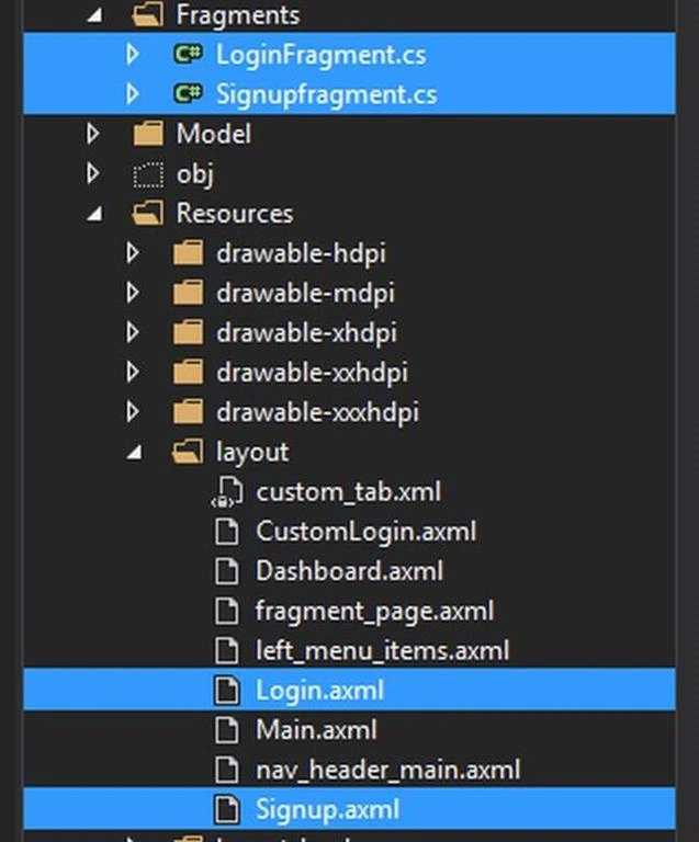
So, fragments are like reusable UI Controls. Add another two Layout files - Login.axml and SignUp.axml
For now, I am keeping this UI empty. If you want, you can go ahead and write in the UI what you want to show.
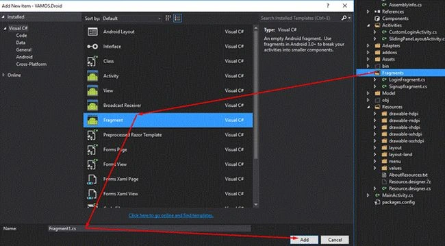
- public class LoginFragment : Fragment
- {
- public LoginFragment()
- {
- }
- public override void OnCreate(Bundle savedInstanceState)
- {
- base.OnCreate(savedInstanceState);
- }
- public override View OnCreateView(LayoutInflater inflater, ViewGroup container, Bundle savedInstanceState)
- {
- var view = inflater.Inflate(Resource.Layout.Login, container, false);
- return view;
- } }
Create the above same code for SignUpFragment and just change
- var view = inflater.Inflate(Resource.Layout.Login, container, false);
- //To
- var view = inflater.Inflate(Resource.Layout.Signup, container, false);
So, whenever you click, we pass the Fragments to Framelayout to switch like this.
- private void ListItemClicked(int position)
- {
- Android.Support.V4.App.Fragment fragment = null;
- switch (position)
- {
- case 0:
- fragment = new LoginFragment();
- break;
- case 1:
- fragment = new Signupfragment();
- break;
- }
- if (fragment != null)
- {
- SupportFragmentManager.BeginTransaction()
- .Replace(VAMOS.Droid.Resource.Id.content_frame, fragment)
- .Commit();
- }
- }
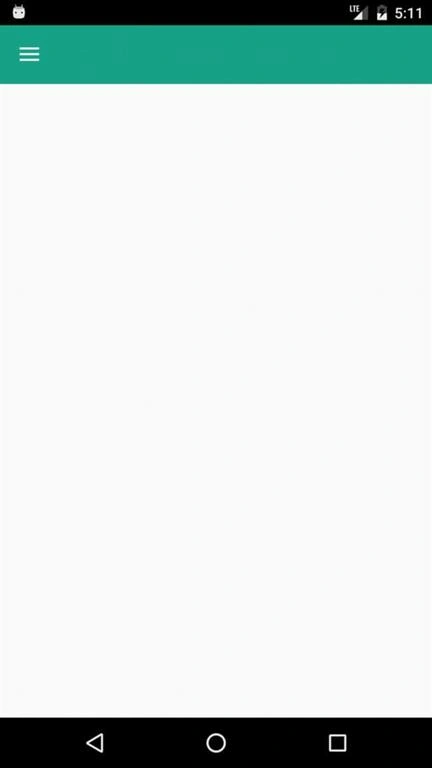
Final Result
Here, Orders and Redeem refers to Login and Signup respectively.
I hope you understood clearly. Please share your thoughts.
Bhavya JoshiPosted Jul 22, 2019, 8:11 AM
Dude, please share the code
rajesh waranPosted Jul 6, 2018, 1:49 AM
Could you share files with me?
satya mPosted Jun 11, 2018, 4:36 AM
Could you share the code?
jesus garciaPosted Mar 27, 2018, 6:21 PM
Could you share the code?
kiran patilPosted Nov 8, 2017, 1:32 PM
Can you give me project files for this article, because cannot find what is VAMOS and no file for dimen