

Let’s start,
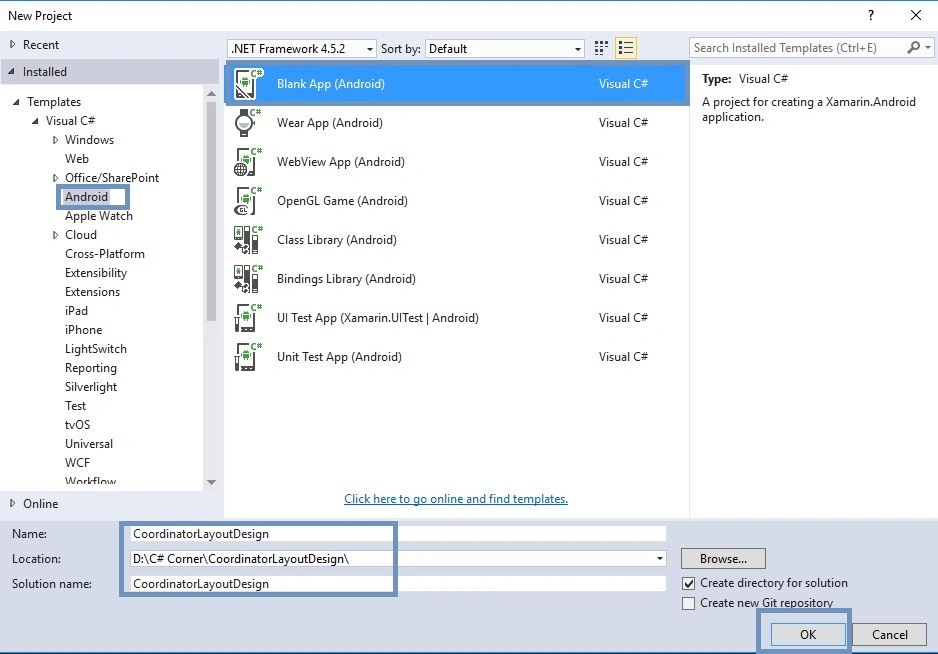
Step 1: Open Visual Studio->New Project->Templates->Visual C#->Android->Blank App
Select blank app. Give Project Name and Project Location.
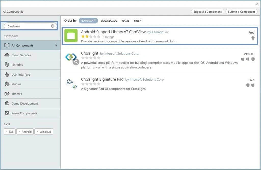
Step 2: Go to Solution Explorer-> Project Name-> Components. Right click to Get More Components, open new dialog box. This dialog box is required to search the CardView, add the Android Support Library V7 CardView Packages.
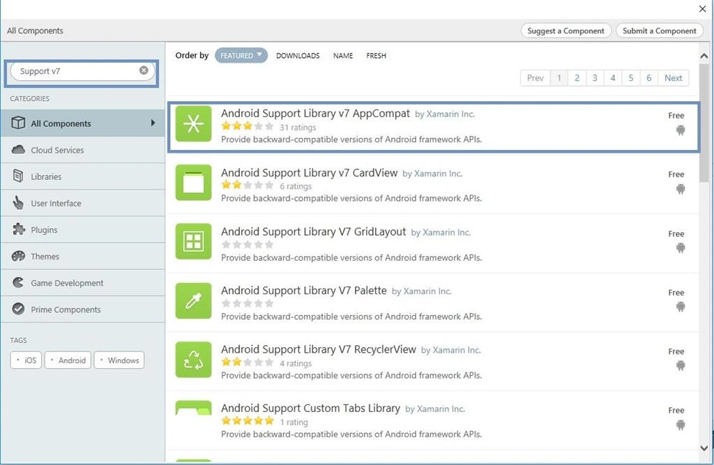
Step 3: Go to Solution Explorer-> Project Name-> Components, right click to Get More Components, open new dialog box. This dialog box is required to search the Support V7, add the Android Support v7 AppCompat Packages.
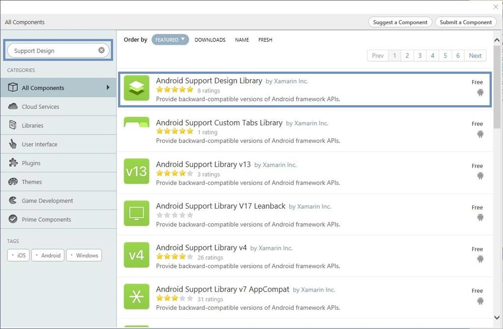
Step 4: Go to Solution Explorer-> Project Name-> Components. Right click to Get More Components, open new dialog box. This dialog box is required to search the Design, add the Android Support Design Library Packages.
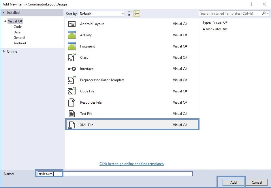
Step 5: Before starting Design view you will need Theme.AppCompat.Light.NoActionBar; create styles.xml file. Go to Solution Explorer-> Project Name->Resources->values. Right click to Add->New Item, open new dialog box. Select XML file, give the name for styles.xml.
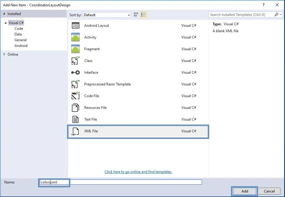
Step 6: Create colors.xml file. Go to Solution Explorer-> Project Name->Resources->values. Right click to Add->New Item. Open new dialog box. Select XML file and give the name for colors.xml.
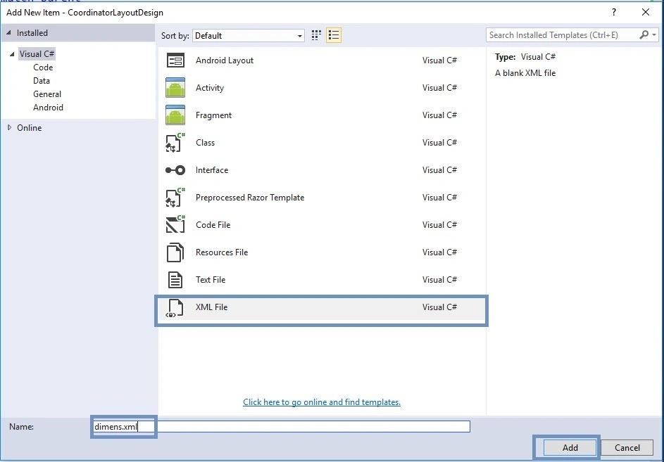
Step 7: We need dimensions for the card view margin. Thus, create dimens.xml file. Go to Solution Explorer-> Project Name->Resources->values. Right click to Add->New Item, open new dialog box. Select XML file and give the name for dimens.xml.
Step 8: Open Solution Explorer-> Project Name->Resources->values->colors.xml. Click to open Design View and the code, given below:.
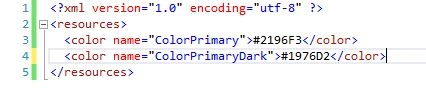
- <?xml version="1.0" encoding="utf-8" ?>
- <resources>
- <color name="ColorPrimary">#2196F3</color>
- <color name="ColorPrimaryDark">#1976D2</color>
- </resources>
Step 9: Open Solution Explorer-> Project Name->Resources->values->styles.xml. Click to open Design View and the code, given below:
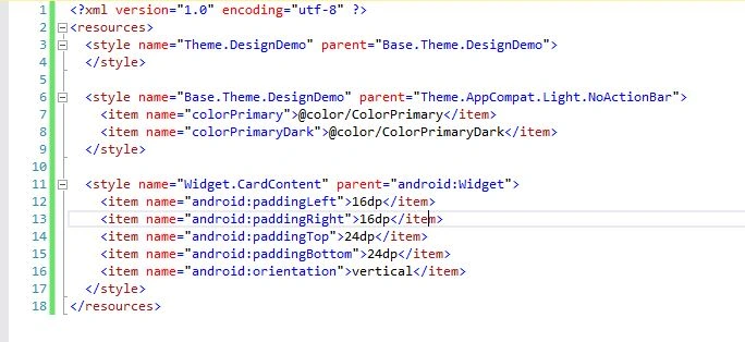
- <?xml version="1.0" encoding="utf-8" ?>
- <resources>
- <style name="Theme.DesignDemo" parent="Base.Theme.DesignDemo">
- </style>
- <style name="Base.Theme.DesignDemo" parent="Theme.AppCompat.Light.NoActionBar">
- <item name="colorPrimary">@color/ColorPrimary</item> <item name="colorPrimaryDark">@color/ColorPrimaryDark</item>
- </style>
- <style name="Widget.CardContent" parent="android:Widget">
- <item name="android:paddingLeft">16dp</item> <item name="android:paddingRight">16dp</item> <item name="android:paddingTop">24dp</item> <item name="android:paddingBottom">24dp</item> <item name="android:orientation">vertical</item>
- </style>
- </resources>
Step 10: Open Solution Explorer-> Project Name->Resources->values->dimens.xml. Click to open Design View and the code, given below:
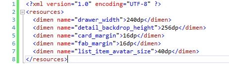
- <resources>
- <dimen name="drawer_width">240dp</dimen>
- <dimen name="detail_backdrop_height">256dp</dimen>
- <dimen name="card_margin">16dp</dimen>
- <dimen name="fab_margin">16dp</dimen>
- <dimen name="list_item_avatar_size">40dp</dimen>
- </resources>
Step 11: Open Solution Explorer-> Project Name->Resources->layout ->Main.axml. Click to open Design View and the code, given below:

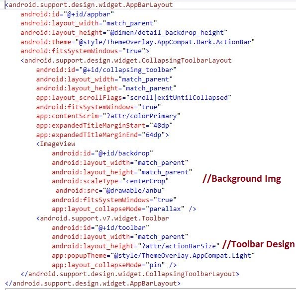
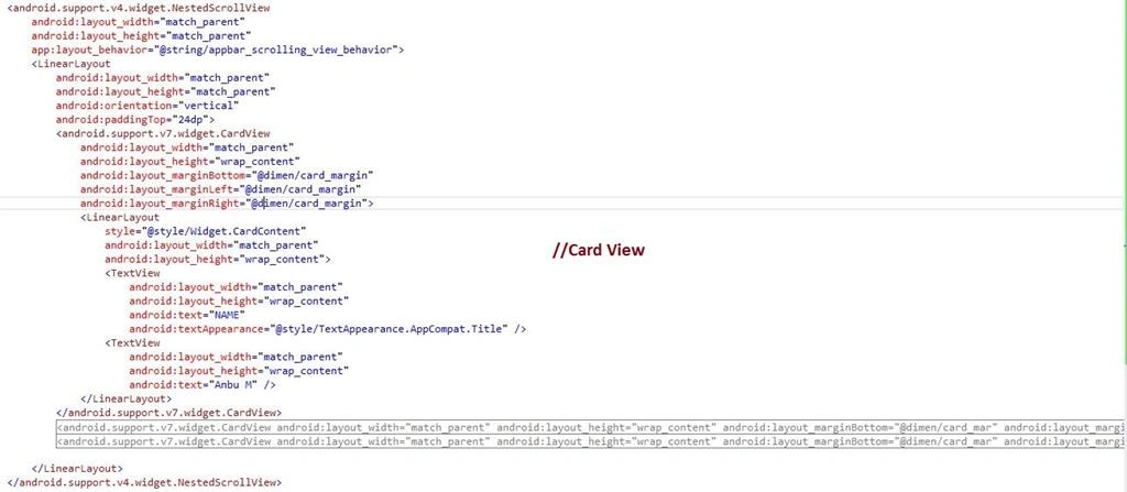
XAML CODE
- <?xml version="1.0" encoding="utf-8"?>
- <android.support.design.widget.CoordinatorLayout xmlns:android="http://schemas.android.com/apk/res/android" xmlns:app="http://schemas.android.com/apk/res-auto" android:id="@+id/main_content" android:layout_width="match_parent" android:layout_height="match_parent" android:fitsSystemWindows="true">
- <android.support.design.widget.AppBarLayout android:id="@+id/appbar" android:layout_width="match_parent" android:layout_height="@dimen/detail_backdrop_height" android:theme="@style/ThemeOverlay.AppCompat.Dark.ActionBar" android:fitsSystemWindows="true">
- <android.support.design.widget.CollapsingToolbarLayout android:id="@+id/collapsing_toolbar" android:layout_width="match_parent" android:layout_height="match_parent" app:layout_scrollFlags="scroll|exitUntilCollapsed" android:fitsSystemWindows="true" app:contentScrim="?attr/colorPrimary" app:expandedTitleMarginStart="48dp" app:expandedTitleMarginEnd="64dp">
- <ImageView android:id="@+id/backdrop" android:layout_width="match_parent" android:layout_height="match_parent" android:scaleType="centerCrop" android:src="@drawable/anbu" android:fitsSystemWindows="true" app:layout_collapseMode="parallax" />
- <android.support.v7.widget.Toolbar android:id="@+id/toolbar" android:layout_width="match_parent" android:layout_height="?attr/actionBarSize" app:popupTheme="@style/ThemeOverlay.AppCompat.Light" app:layout_collapseMode="pin" /> </android.support.design.widget.CollapsingToolbarLayout>
- </android.support.design.widget.AppBarLayout>
- <android.support.v4.widget.NestedScrollView android:layout_width="match_parent" android:layout_height="match_parent" app:layout_behavior="@string/appbar_scrolling_view_behavior">
- <LinearLayout android:layout_width="match_parent" android:layout_height="match_parent" android:orientation="vertical" android:paddingTop="24dp">
- <android.support.v7.widget.CardView android:layout_width="match_parent" android:layout_height="wrap_content" android:layout_marginBottom="@dimen/card_margin" android:layout_marginLeft="@dimen/card_margin" android:layout_marginRight="@dimen/card_margin">
- <LinearLayout style="@style/Widget.CardContent" android:layout_width="match_parent" android:layout_height="wrap_content">
- <TextView android:layout_width="match_parent" android:layout_height="wrap_content" android:text="NAME" android:textAppearance="@style/TextAppearance.AppCompat.Title" />
- <TextView android:layout_width="match_parent" android:layout_height="wrap_content" android:text="Anbu M" /> </LinearLayout>
- </android.support.v7.widget.CardView>
- <android.support.v7.widget.CardView android:layout_width="match_parent" android:layout_height="wrap_content" android:layout_marginBottom="@dimen/card_margin" android:layout_marginLeft="@dimen/card_margin" android:layout_marginRight="@dimen/card_margin">
- <LinearLayout style="@style/Widget.CardContent" android:layout_width="match_parent" android:layout_height="wrap_content">
- <TextView android:layout_width="match_parent" android:layout_height="wrap_content" android:text="PLACE" android:textAppearance="@style/TextAppearance.AppCompat.Title" />
- <TextView android:layout_width="match_parent" android:layout_height="wrap_content" android:text="India" /> </LinearLayout>
- </android.support.v7.widget.CardView>
- <android.support.v7.widget.CardView android:layout_width="match_parent" android:layout_height="wrap_content" android:layout_marginBottom="@dimen/card_margin" android:layout_marginLeft="@dimen/card_margin" android:layout_marginRight="@dimen/card_margin">
- <LinearLayout style="@style/Widget.CardContent" android:layout_width="match_parent" android:layout_height="wrap_content">
- <TextView android:layout_width="match_parent" android:layout_height="wrap_content" android:text="Profession" android:textAppearance="@style/TextAppearance.AppCompat.Title" />
- <TextView android:layout_width="match_parent" android:layout_height="wrap_content" android:text="Developer" /> </LinearLayout>
- </android.support.v7.widget.CardView>
- </LinearLayout>
- </android.support.v4.widget.NestedScrollView>
- </android.support.design.widget.CoordinatorLayout>
Step 13: Add Namespaces, given below:
- using Android.Support.V7.App;
- using Android.Support.Design.Widget;
- using V7Toolbar = Android.Support.V7.Widget.Toolbar;
Step 14: Create ViewPager variable. Declare the viewpager within the OnCreate().before to change to the Activity to AppCompatActivity.
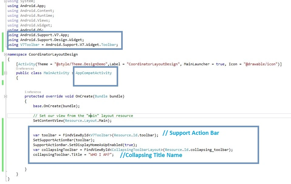
C# Code
- public class MainActivity: AppCompatActivity
- {
- protected override void OnCreate(Bundle bundle)
- {
- base.OnCreate(bundle);
- // Set our view from the "main" layout resource
- SetContentView(Resource.Layout.Main);
- var toolbar = FindViewById < V7Toolbar > (Resource.Id.toolbar);
- SetSupportActionBar(toolbar);
- SupportActionBar.SetDisplayHomeAsUpEnabled(true);
- var collapsingToolbar = FindViewById < CollapsingToolbarLayout > (Resource.Id.collapsing_toolbar);
- collapsingToolbar.Title = "WHO I AM?";
- }
- }
Step 15: Press F5 or build and run the Application.
Finally, we successfully created Xamarin Android CollapsingToolbarLayout, NestedScrollView, CardView, using XamarinAndroidSupportDesign.
Subhamoy BurmanPosted May 11, 2018, 6:47 AM
Anbu Mani Sir, how Can I get rid of the Back Button ?
Ali ZeraatkarPosted Apr 29, 2018, 11:24 AM
How can i get back button work?
kooroush ghazaiePosted Feb 13, 2017, 4:53 PM
How about using viewpager into nestedscrollview?
Bhavik PatelPosted Jul 16, 2016, 6:29 AM
Nice
Vignesh ManiPosted Jul 15, 2016, 4:36 PM
Nice
kalu singh raoPosted Jul 15, 2016, 1:49 AM
Nice...
Anu VPosted Jul 15, 2016, 12:49 AM
Nice bro