

Introduction
Radio buttons are ideal for allowing users to select one option from a group. But what if you also want to allow users to deselect their choice? That’s where a custom DeselectableRadioGroup component becomes useful.
In this article, you’ll learn how to build a DeselectableRadioGroup using React and Material UI, including full setup, usage, and code breakdown.
🛠️ Step 1. Project Setup
If you haven’t already created a React project, run:
npx create-react-app react-deselectable-radio
cd react-deselectable-radio
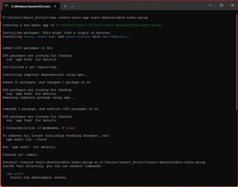
Image 1. Create React App tool.
- The command npx create-react-app react-deselectable-radio is used to create a new React application,react-deselectable-radio, using the Create React App tool.
- It creates a ready-to-use React project with all the necessary files and configurations.
- After the project is created, cd react-deselectable-radio changes the current directory to the new project folder so you can start working inside it.
- Finally, npm start launches the development server and opens the app in your default browser, allowing you to see your React application running locally.
Then install the necessary dependencies:
💿Install the Material UI
Go to the Material-UI website and get some instructions. There are several types of versions (V4, V5, V6, and V7) in Material-UI.
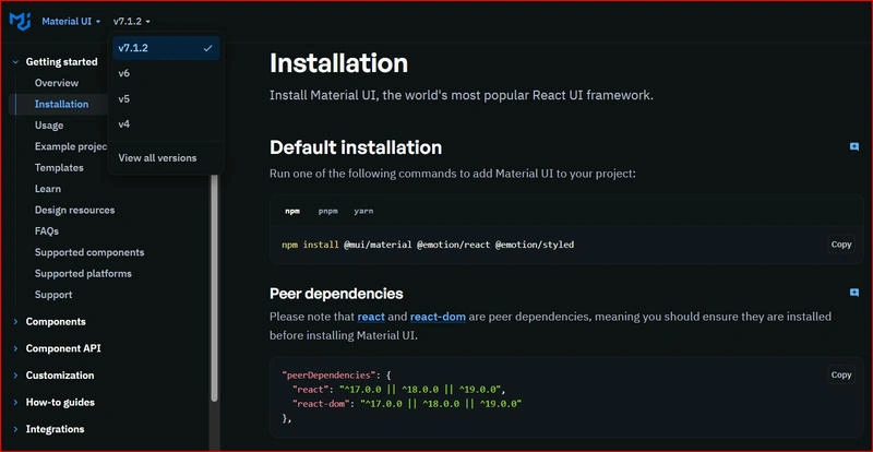
Image 2. Types of versions(V4, V5, V6, and V7) in Material-UI.
➕ Now I'm going to install the Mui and Style.
npm install @mui/material @emotion/react @emotion/styled @mui/icons-material react-icons
📦 Step 2. DeselectableRadioGroup Component Code
Create a new file at: src/Component/DeselectableRadioGroup.jsx
import React, { useState, useEffect } from 'react';
import { ToggleButton, ToggleButtonGroup } from '@mui/material';
import RadioButtonCheckedRounded from '@mui/icons-material/RadioButtonCheckedRounded';
import RadioButtonUncheckedRounded from '@mui/icons-material/RadioButtonUncheckedRounded';
import { Button, Tooltip } from '@mui/material';
import { FaUndo } from 'react-icons/fa';

const DeselectableRadioGroup = ({
  classes,
  ariaLabel,
  name,
  options,
  value,
  onChange,
  title,
  refreshDisabled,
  refreshOnClick,
  disabled,
}) => {
  let initialSelectedValue = '';

  if (value === 1 || value === 0) {
    initialSelectedValue = true;
  } else {
    initialSelectedValue = value;
  }

  const [selectedValue, setSelectedValue] = useState(initialSelectedValue);

  useEffect(() => {
    if (initialSelectedValue === undefined || initialSelectedValue === null) {
      setSelectedValue(null);
    } else {
      setSelectedValue(initialSelectedValue);
    }
  }, [initialSelectedValue]);

  const handleChange = (event, newValue) => {
    setSelectedValue(newValue);
    onChange({ target: { name, value: newValue } });
  };

  return (
    <>
      <label className={classes?.globalCreateLabel} htmlFor={title}>
        {title}
      </label>
      <span> :</span>
      <div>
        <ToggleButtonGroup
          color="primary"
          value={selectedValue}
          exclusive
          onChange={handleChange}
          aria-label={ariaLabel}
        >
          {options.map((option) => (
            <ToggleButton
              key={option.value}
              value={option.value}
              disabled={disabled}
              aria-label={option.label}
            >
              {selectedValue === option.value ? (
                <RadioButtonCheckedRounded fontSize="small" />
              ) : (
                <RadioButtonUncheckedRounded fontSize="small" />
              )}
              {option.label}
            </ToggleButton>
          ))}
        </ToggleButtonGroup>

        {!refreshDisabled && (
          <Tooltip title="Reset to default value">
            <Button
              aria-label={name}
              id={name}
              name={name}
              disabled={refreshDisabled}
              onClick={refreshOnClick}
              className={classes?.resetButton}
            >
              <FaUndo style={{ fontSize: '10px' }} />
            </Button>
          </Tooltip>
        )}
      </div>
    </>
  );
};

export default DeselectableRadioGroup;
➕ Import: Special need to import this
import { ToggleButton, ToggleButtonGroup } from "@mui/material";
import RadioButtonCheckedRounded from "@mui/icons-material/RadioButtonCheckedRounded";
import RadioButtonUncheckedRounded from "@mui/icons-material/RadioButtonUncheckedRounded";
import { Button, Tooltip } from "@mui/material";
let initialSelectedValue = '';

  if (value === 1 || value === 0) {
    initialSelectedValue = true;
  } else {
    initialSelectedValue = value;
  }
This block determines the initial value for your component's state.
- It starts by declaring initialSelectedValue as an empty string.
- Then, it checks the value prop (or a variable named value available in this scope).
- If the value is 1 or 0, it sets initialSelectedValue to true. This suggests that 1 and 0 might be used as boolean indicators (like "on" or "off").
Otherwise, it sets initialSelectedValue to whatever value it is. This handles cases where value could be a string, a number other than 0 or 1, or any other data type.
const [selectedValue, setSelectedValue] = useState(initialSelectedValue);
This line uses the useState hook from React.
- This is a function you use to update selectedValue. When you call setSelectedValue with a new value, React will re-render the component with the updated state.
  useEffect(() => {
    if (initialSelectedValue === undefined || initialSelectedValue === null) {
      setSelectedValue(null);
    } else {
      setSelectedValue(initialSelectedValue);
    }
  }, [initialSelectedValue]);
This block uses the useEffect hook, which is used for side effects in functional components (like data fetching, subscriptions, or manually changing the DOM). Here, it's used to synchronise the internal selectedValue state with changes to initialSelectedValue.
- This useEffect runs whenever initialSelectedValue changes.
- If initialSelectedValue is undefined or null, it sets selectedValue to null.
- Otherwise, it sets selectedValue to the value of initialSelectedValue.
 const handleChange = (event, newValue) => {
    setSelectedValue(newValue);
    onChange({ target: { name, value: newValue } });
  };
This handleChange function is a common pattern for handling changes in form elements.
- handleChange is called when the value changes (e.g., from a toggle or radio button).
- It updates the local state selectedValue with the new value.
- It calls the onChange function, mimicking a native event with the field name and new value.
⚙️ Step 3. Using the Component
Now let’s use this component inside your app.
import React, { useState } from "react";
import DeselectableRadioGroup from "./Component/DeselectableRadioGroup";
import "./App.css";

function App() {
  const [selectedOption, setSelectedOption] = useState(null);

  const handleOptionChange = (event) => {
    setSelectedOption(event.target.value);
  };

  const handleReset = () => {
    setSelectedOption(null);
  };

  const options = [
    { label: "Yes", value: "yes" },
    { label: "No", value: "no" },
    { label: "Maybe", value: "maybe" }
  ];
  return (
    <div className="App">
      <div style={{ padding: 30 }}>
        <DeselectableRadioGroup
          ariaLabel="choices"
          name="decision"
          title="Do you agree?"
          titleClass="title"
          options={options}
          value={selectedOption}
          onChange={handleOptionChange}
          refreshDisabled={false}
          refreshOnClick={handleReset}
          disabled={false}
        />
      </div>
    </div>
  );
}

export default App;
Describe this code
 const options = [
    { label: "Yes", value: "yes" },
    { label: "No", value: "no" },
    { label: "Maybe", value: "maybe" }
  ];
- This code creates an array called options that holds three objects.
- Each object represents a choice with a label (what the user sees) and a value (what the code uses).
Example: "Yes" is shown to the user, and "yes" is used in the backend logic.
const [selectedOption, setSelectedOption] = useState(null);

  const handleOptionChange = (event) => {
    setSelectedOption(event.target.value);
  };

  const handleReset = () => {
    setSelectedOption(null);
  };
const [selectedOption, setSelectedOption] = useState(null);
- Declares a state variable called selectedOption using React’s useState hook.
- Initially, selectedOption is set to null, meaning no option is selected.
const handleOptionChange = (event) => { setSelectedOption(event.target.value); };
- This function updates the selected option when the user chooses a new one (e.g., in a dropdown or radio button).
- It gets the value from the event and updates selectedOption.
const handleReset = () => { setSelectedOption(null); };
- This function resets the selected option back to null.
- Useful for clearing the selection (e.g., when a "Reset" button is clicked).
🎨 Optional Styling (App.css)
.label {
  font-weight: bold;
  font-size: 16px;
  margin-right: 8px;
}
.reset-button {
  margin-left: 12px;
  padding: 5px 10px;
}
📖 How It Works?
| Prop | Description |
|---|---|
| options | An array of objects { label, value } for buttons. |
| value | Currently selected value. |
| onChange | Callback when selection changes. |
| refreshOnClick | Function to reset selection. |
| disabled | Disables all buttons when true. |
| classes | Optional class styles for the label and reset button. |
The radio buttons appear as toggle buttons with icons:
- ✔️ RadioButtonCheckedRounded = selected
- ⭕ RadioButtonUncheckedRounded = unselected
🖼️ View the App
Run the application
Go ot the terminal and enter npm start.
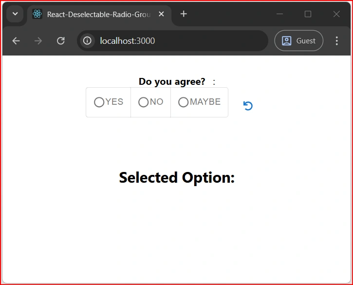
Image 3. It is an initial view.
const options = [
    { label: "Yes", value: "yes" },
    { label: "No", value: "no" },
    { label: "Maybe", value: "maybe" }
  ];
We write to the console to check what value is selected.
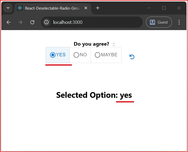
Image 4. If you select Yes, the Value is “yes”
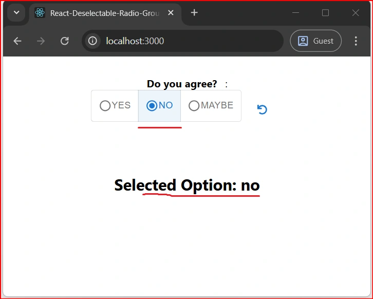
Image 5. If you select No, the Value is “no”
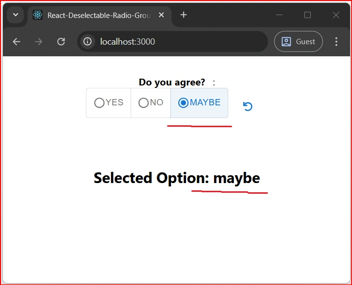
Image 6. If you select Maybe, the Value is “maybe”
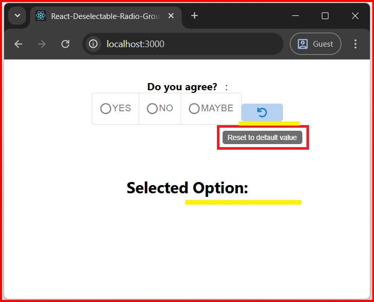
Image 7. To discard your selection, click the reset button. The value will be set to "null".
✅ Summary
With DeselectableRadioGroup, users can:
- Select one radio option.
- Deselect by clicking the same button again.
- Reset to default using a refresh icon.
Join the conversation! Your thoughts help the community grow.