

Introduction
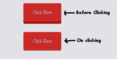
In this article, we are going to create a button and give it feeling like 3D
using HTML5 and CSS3.
Starting from HTML Document
- <body>
- <a href="#" class="red">Click Here</a>
- </body>
Preview

Styling it using CSS
- .box {
- background-color: #e1e1e6;
- width: 400px;
- height: 100px;
- border: 1px solid black;
- border-radius: 5px;
- }
- /*for styling box inside which button is placed*/
- .red {
- position: relative;
- top: 36px;
- left: 35%;
- text-decoration: none;
- color: #fff;
- background: #cb2727;
- text-align: center;
- padding: 20px 30px;
- width: 115px;
- border-radius: 5px;
- border: solid 1px #ec3838;
- transition: all 0.1s;
- -webkit-box-shadow: 0px 9px 0px #a81515;
- /*for opera and safari*/
- -moz-box-shadow: 0px 9px 0px #a81515;
- /*for mozilla*/
- -o-box-shadow: 0px 9px 0px #a81515;
- /*for opera*/
- -ms-box-shadow: 0px 9px 0px #a81515;
- /*for I.E.*/
- }

Final step (Adding CSS for :active)
- .red:active {
- -webkit-box-shadow: 0px 2px 0px #a81515;
- position: relative;
- top: 43px;
- }
The main trick behind this button's working is that decrease box-shadow and move
the position slightly down so that appears pressing down
Join the conversation! Your thoughts help the community grow.