

Introduction

In this article, we are going to create a Chrome-like circular loading animation control that can be used to beautify our User Interface. Whenever we have to do some long task or processing, it needs some time to do it, in the meanwhile for better user experience and user engagement with our application, we have to show something while the task is going on.
Let's see how it looks.
Requirements
- Visual Studio (or Blend for Visual Studio)
- Basic knowledge of WPF
Let's proceed with the following steps by creating a WPF Control Library in Visual Studio 2019
- Open Visual Studio and click on Create New Project.
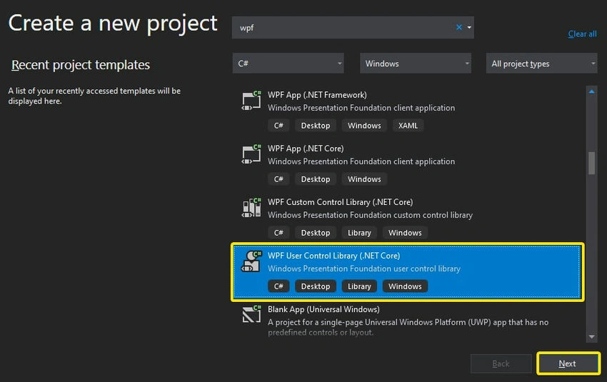
- In the Create New Project dialog box, select WPF User Control Library (.NET Core), you can also choose .NET Framework, then click on the Next button
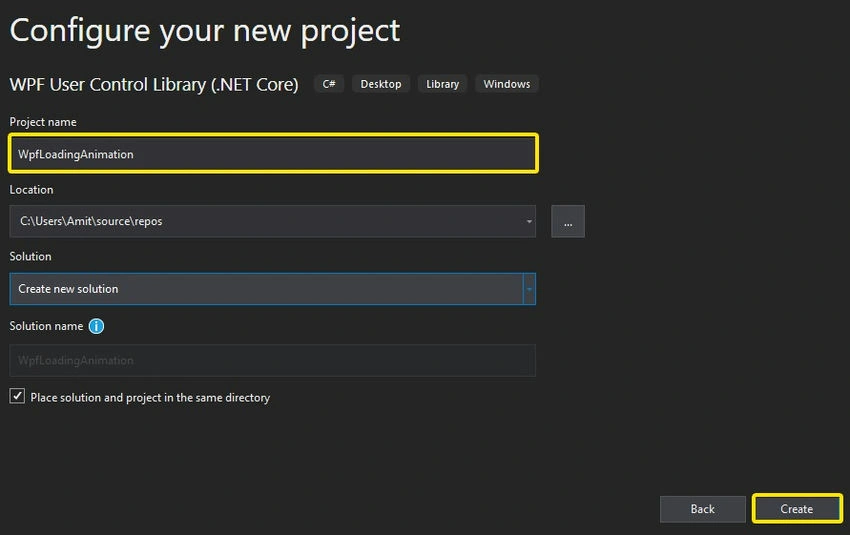
- In the Configure your new project give it a meaningful project name like WpfLoadingAnimation and then click on the Create button.
- Open Solution Explorer, navigate to UserControl1.xaml rename it to CircularAnimation.xaml, and then open that file.
- Then click on the project file and then click Add Reference of Microsoft.Expression.Drawing.dll (it can be found at C:\Program Files (x86)\Microsoft SDKs\Expression\Blend\.NETFramework\v4.5\Libraries)
Designing user control
Include the namespace in the XAML designer window and set the DesignWidth/DesignHeight to 80 (Default size of control).
<UserControl x:Class="WpfLoadingAnimation.CircularAnimation"
             xmlns="http://schemas.microsoft.com/winfx/2006/xaml/presentation"
             xmlns:x="http://schemas.microsoft.com/winfx/2006/xaml"
             xmlns:mc="http://schemas.openxmlformats.org/markup-compatibility/2006"
             xmlns:d="http://schemas.microsoft.com/expression/blend/2008"
             xmlns:ed="http://schemas.microsoft.com/expression/2010/drawing"
             mc:Ignorable="d"
             d:DesignHeight="80" d:DesignWidth="80">
We will use Arc control to make Circular Animation control, let's design it.
<Viewbox Stretch="Fill">
    <Grid x:Name="grid" Height="300" Width="300">
        <ed:Arc x:Name="arc" ArcThickness="30" EndAngle="-350" Fill="#FF27D1D1" HorizontalAlignment="Left" Height="280" Margin="10,10,0,0" Stretch="None" Stroke="Black" StartAngle="-360" VerticalAlignment="Top" Width="280" RenderTransformOrigin="0.5,0.5" StrokeThickness="0">
            <ed:Arc.RenderTransform>
                <TransformGroup>
                    <ScaleTransform/>
                    <SkewTransform/>
                    <RotateTransform/>
                    <TranslateTransform/>
                </TransformGroup>
            </ed:Arc.RenderTransform>
        </ed:Arc>
    </Grid>
</Viewbox>
We are using the Viewbox control of WPF, it is used to zoom/unzoom any control.
Note. We are using StartAngle as -360 so it will give us a smooth rotation experience
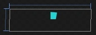
Now we will see the below design from the above code
Create some properties (better called Dependency Properties), so it will allow the developer/user to customize its properties
In classic Windows Form, we created properties like the one below.
public double ArcThickness { get; set; }
But in WPF, we will use Dependency Properties. This enables animation, styling, binding, etc... (Learn more about Dependency Property)
Go to Solution Explorer and navigate to CircularAnimation.cs (Under CircularAnimation.xaml) or press F7 (it will navigate you to the code behind the file).
public double ArcThickness
{
    get { return (double)GetValue(ArcThicknessProperty); }
    set { SetValue(ArcThicknessProperty, value); }
}
// Using a DependencyProperty as the backing store for ArcThickness. This enables animation, styling, binding, etc...
public static readonly DependencyProperty ArcThicknessProperty =
    DependencyProperty.Register("ArcThickness", typeof(double),
    typeof(CircularAnimation),
    new PropertyMetadata(30D,
        new PropertyChangedCallback(ThicknessChange)));
private static void ThicknessChange(DependencyObject d, DependencyPropertyChangedEventArgs e)
{
    (d as CircularAnimation).arc.ArcThickness = (double)e.NewValue;
}
Let's understand what the above code does (Not to worry, you don't have to memorize the code for preparing Dependency Property, we will do it expertly)
- ArcThickness property will enable us to modify the thickness of the Arc control that we have used for the design.
- ArcThickness Property (Line no 8) will create DependencyProperty to register the values
The first argument in the DependencyProperty.Registerspecifies the property name to register > Second argument specifies the datatype of the property > Third argument specifies the owner of the property, it will be the class name > Fourth argument determines the metadata of the property, (at Line 11) we will provide the default value of the Arc and we will specify the PropertyChangeCallback (when the value of that property changed, it will invoke a function)
ThicknessChange (Line no 14) will be invoked when the value is changed, we will change the thickness of the Arc control with the new value.
We will create one more property that will allow us to change the color of the control according to the Look and Feel (UI)
public Brush Fill
{
    get { return (Brush)GetValue(FillProperty); }
    set { SetValue(FillProperty, value); }
}
// Using a DependencyProperty as the backing store for Fill. This enables animation, styling, binding, etc...
public static readonly DependencyProperty FillProperty =
    DependencyProperty.Register("Fill", typeof(Brush),
    typeof(CircularAnimation),
    new PropertyMetadata(new SolidColorBrush(DefaultColor),
        new PropertyChangedCallback(ArcFill)));
private static void ArcFill(DependencyObject d, DependencyPropertyChangedEventArgs e)
{
    (d as CircularAnimation).arc.Fill = (Brush)e.NewValue;
}
private static Color DefaultColor => (Color)ColorConverter.ConvertFromString("#FF27B2D1"); // nearby cyan color
We will use the expert way to create the Dependency Property
Type pro pdf and press the tab twice, it will generate the Dependency Property for us, let's see this in action
The basic design of the control has been completed, now we will create animation and for this, WPF has a Storyboard (a timeline-based animation).
- Move back to the design view (Press SHIFT + F7)
- We will add Storyboard animation to our control
If we look carefully there were two scenarios (one is the completion of the arc and the second is rotation).
Creating Storyboard for completion of an Arc
<Storyboard x:Key="Progress" RepeatBehavior="Forever" SpeedRatio="1.5">
    <DoubleAnimationUsingKeyFrames Storyboard.TargetProperty="(ed:Arc.EndAngle)" Storyboard.TargetName="arc">
        <EasingDoubleKeyFrame KeyTime="0:0:1" Value="-10">
            <EasingDoubleKeyFrame.EasingFunction>
                <CircleEase EasingMode="EaseInOut"/>
            </EasingDoubleKeyFrame.EasingFunction>
        </EasingDoubleKeyFrame>
        <EasingDoubleKeyFrame KeyTime="0:0:2" Value="-1">
            <EasingDoubleKeyFrame.EasingFunction>
                <CircleEase EasingMode="EaseInOut"/>
            </EasingDoubleKeyFrame.EasingFunction>
        </EasingDoubleKeyFrame>
    </DoubleAnimationUsingKeyFrames>
    <DoubleAnimationUsingKeyFrames Storyboard.TargetProperty="(ed:Arc.StartAngle)" Storyboard.TargetName="arc">
        <EasingDoubleKeyFrame KeyTime="0:0:1" Value="-360"/>
        <EasingDoubleKeyFrame KeyTime="0:0:2" Value="-11">
            <EasingDoubleKeyFrame.EasingFunction>
                <CircleEase EasingMode="EaseInOut"/>
            </EasingDoubleKeyFrame.EasingFunction>
        </EasingDoubleKeyFrame>
    </DoubleAnimationUsingKeyFrames>
</Storyboard>
From Lines no 2 to 13 we used Easing animation (smooth elastic animation) and from Lines no 16 to 23 we changed the value of the Arc from -360 to -11 (-11 is used to keep the tale of the Arc behind, so it will look smooth start and end)
Creating a Storyboard for the rotation of an Arc
<Storyboard x:Key="rotate" RepeatBehavior="Forever">
    <DoubleAnimationUsingKeyFrames Storyboard.TargetProperty="(UIElement.RenderTransform).(TransformGroup.Children)[2].(RotateTransform.Angle)" Storyboard.TargetName="arc">
        <EasingDoubleKeyFrame KeyTime="0" Value="0"/>
        <EasingDoubleKeyFrame KeyTime="0:0:1.8" Value="360"/>
    </DoubleAnimationUsingKeyFrames>
</Storyboard>
We are rotating the Arc with a KeyTime of 1.8 sec of 360°.
The above Storyboard resides under the Resource tag (i.e. ControlName.Resources), the whole storyboard looks like the below.
<UserControl.Resources>
    <Storyboard x:Key="Progress" RepeatBehavior="Forever" SpeedRatio="1.5">
        <DoubleAnimationUsingKeyFrames Storyboard.TargetProperty="(ed:Arc.EndAngle)" Storyboard.TargetName="arc">
            <EasingDoubleKeyFrame KeyTime="0:0:1" Value="-10">
                <EasingDoubleKeyFrame.EasingFunction>
                    <CircleEase EasingMode="EaseInOut"/>
                </EasingDoubleKeyFrame.EasingFunction>
            </EasingDoubleKeyFrame>
            <EasingDoubleKeyFrame KeyTime="0:0:2" Value="-1">
                <EasingDoubleKeyFrame.EasingFunction>
                    <CircleEase EasingMode="EaseInOut"/>
                </EasingDoubleKeyFrame.EasingFunction>
            </EasingDoubleKeyFrame>
        </DoubleAnimationUsingKeyFrames>
        <DoubleAnimationUsingKeyFrames Storyboard.TargetProperty="(ed:Arc.StartAngle)" Storyboard.TargetName="arc">
            <EasingDoubleKeyFrame KeyTime="0:0:1" Value="-360"/>
            <EasingDoubleKeyFrame KeyTime="0:0:2" Value="-11">
                <EasingDoubleKeyFrame.EasingFunction>
                    <CircleEase EasingMode="EaseInOut"/>
                </EasingDoubleKeyFrame.EasingFunction>
            </EasingDoubleKeyFrame>
        </DoubleAnimationUsingKeyFrames>
    </Storyboard>
    <Storyboard x:Key="rotate" RepeatBehavior="Forever">
        <DoubleAnimationUsingKeyFrames Storyboard.TargetProperty="(UIElement.RenderTransform).(TransformGroup.Children)[2].(RotateTransform.Angle)" Storyboard.TargetName="arc">
            <EasingDoubleKeyFrame KeyTime="0" Value="0"/>
            <EasingDoubleKeyFrame KeyTime="0:0:1.8" Value="360"/>
        </DoubleAnimationUsingKeyFrames>
    </Storyboard>
</UserControl.Resources>
Create a Trigger to start the animation at the Element Load event
We will start both of our Storyboards when the owner of the element is loaded.
<UserControl.Triggers>
    <EventTrigger RoutedEvent="FrameworkElement.Loaded">
        <BeginStoryboard x:Name="rotate_BeginStoryboard" Storyboard="{StaticResource Progress}"/>
        <BeginStoryboard x:Name="rotate_BeginStoryboard1" Storyboard="{StaticResource rotate}"/>
    </EventTrigger>
</UserControl.Triggers>
Our Chrome-like loading animated User Control has been completed. Now let's build our project, and we will test our control. For this follow the below steps.
- Create another WPF project by right-clicking on the Solution in Solution Explorer.
- Choose WPF (.NET Framework/.NET Core).
- Add Reference to the User Control Project/ or the output dll.
- You will find the control in the Toolbox, just drag it into the Window as usual.
Here is the output in Light Theme and Dark Theme (with different Fill color and ArcThickness Property).

Conclusion
By using simple techniques like storyboard and shapes we created our own customized loading animation. It will not only beautify the UI but it will keep the user enjoying the application and help their productivity too.
I hope you enjoyed reading the article and learned to create beautiful controls. Any suggestions/queries related to this article are most welcome. Stay tuned with C# Corner for more updates.
Join the conversation! Your thoughts help the community grow.