

Introduction
In today's article, you will learn about Box-Shadow. The Box-Shadow property allows designers to implement multiple drop shadows on a box element (<div>,<li> etc), specifying the color of a value, blur, offset and size.
Box-Shadow
Y-axis X-axis blur spread color inset
There are two types of shadows, they are:
- Outer shadow
- Inset shadow

The Box-Shadow property by default supports an outer shadow and background color.
Browser Support
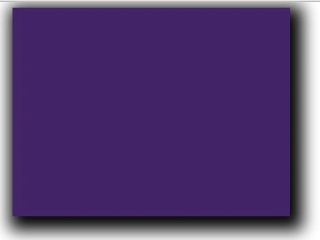
Here's a basic example of a div:
- <!DOCTYPE html>
- <head>
- <title></title>
- <style>
- #main {
- height: 800px;
- width: 100%;
- }
- #shadow {
- margin: 0 auto;
- height: 300px;
- width: 400px;
- background: #432567;
- box-shadow: 7px 9px 37px 11px;
- }
- </style>
- </head>
- <body>
- <div id="main">
- <div id="shadow"></div>
- </div>
- </body>
- </html>
- <style>
- #main {
- height: 800px;
- width: 100%;
- }
- #shadow {
- margin: 0 auto;
- height: 300px;
- width: 400px;
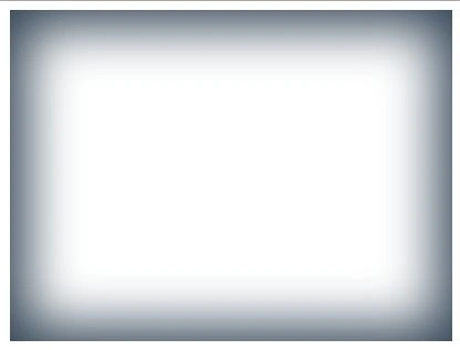
- box-shadow: 1px 1px 77px 15px #345 inset;
- }
- </style>
Here's a basic example of <ul> and <li>:
- <head>
- <style>
- #main {
- height: 800px;
- width: 100%;
- }
- #shadow {
- margin: 0 auto;
- height: 300px;
- width: 1024px;
- }
- ul {list-style:none;
- }
- ul li {float:left;
- width:100px;
- text-align:center;
- padding:23px;
- font-weight:bold;
- font-family:Arial;
- font-size:20px;
- margin:21px;
- box-shadow:-11px -3px 29px 4px;
- border-radius:30px;
- }
- </style>
- </head>
- <body>
- <div id="main">
- <div id="shadow">
- <ul>
- <li>Home </li>
- <li>AboutUs</li>
- <li> Contact</li>
- <li> placement</li>
- </ul>
- </div>
- </div>
- </body>
- </html>

If you will change only:
box-shadow:-11px -3px 29px 4px inset;//You can give any color
This type:

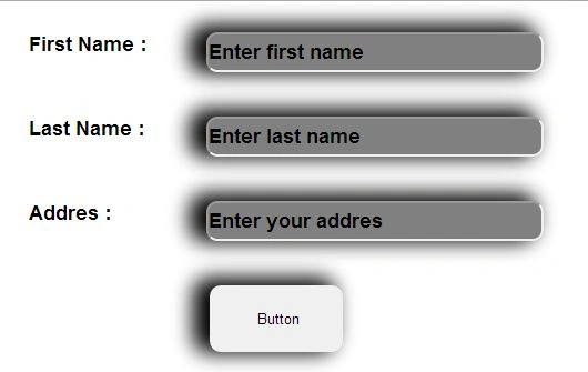
Here's a basic example of Input types showing a button and three text boxes:
- <style>
- #main {
- height: 800px;
- width: 100%;
- }
- #shadow {
- margin: 0 auto;
- height: 300px;
- width: 1024px;
- }
- label {width:120px;
- float:left;
- font-weight:bold;
- font-family:Arial;
- font-size:18px;
- margin:20px;
- }
- input.button {
- box-shadow:-11px -3px 29px 4px ;
- height:60px; width:120px;
- border:none;
- border-radius:10px;
- margin-left:170px;
- }
- input.text {height:30px;
- width:300px;
- box-shadow:-11px -3px 29px 4px;
- font-weight:bold;
- font-family:Arial;
- font-size:18px;
- border-radius:10px;
- margin:20px;
- background:#808080;
- }
- </style>
- </head>
- <body>
- <div id="main">
- <div id="shadow">
- <label> First Name :</label><input type="text" class="text" value="Enter first name" /><br />
- <label> Last Name :</label><input type="text" class="text" value="Enter last name" /><br />
- <label> Addres :</label><input type="text" class="text" value="Enter your addres" /><br /><br />
- <input type="button" class="button" value=" Button" />
- </div>
- </div>
- </body>
- </html>
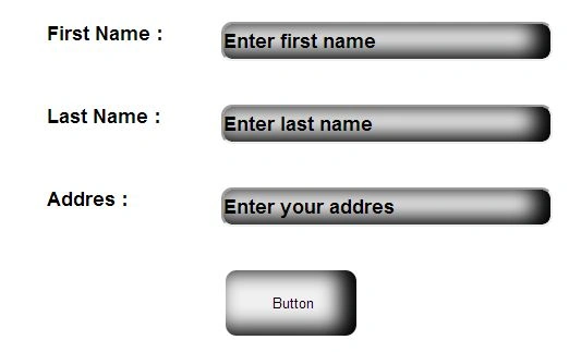
If you change the style in Box-shadow like:
- box-shadow:-11px -3px 29px 4px inset;
- background:none;
Then you will find this type:
Join the conversation! Your thoughts help the community grow.