

What is Table?
- The HTML tables are used to present data in a grid style, such as row and columns
- Basically we want to create a table which means we must use <table>tag
Bootstrap Tables
- Simple padding
- Horizontal line
Bootstrap Tables class
- Table
- Table-striped
- Table-bordered
- Table-hover
- Table-condensed
Contextual classes
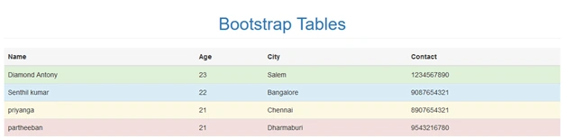
- Active - applies the hover color to the table row or table cell
- Success - successful or positive action
- Info - natural action or informative changes
- Warning - that might need attention
- Danger - dangerous or negative action
Bootstrap has a clean layout for building tables; some of the table elements are supported by bootstrap. Those classes are given below,
| TAG | Description |
| <table> | Wrapping element for displaying in a tabular format |
| <thead> | Container element for table header rows<tr> to lable table columns |
| <tbody> | Container element for table rows <tr> in the body of table |
| <tr> | Container element for a set of table cell <td> or <th> that appears on a single row |
| <td> | Default table cell |
| <th> | Special table cell for column tables must be used with in a<thead> |
| <caption> | Description of summery of what the table holds |
Creating a Simple Table with Bootstrap
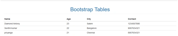
- The table with basic styling has horizontal divided mode
- The small cell padding 8px by default
- <table> element are use
Simple Program for Table
- <!DOCTYPE html>
- <html>
- <head>
- <meta charset="utf-8">
- <meta name="viewport" content="width=device-width, initial scale=1">
- <link rel="stylesheet" type="text/css" href="css/bootstrap.min.css">
- </head>
- <body>
- <div class="container">
- <div class="row">
- <h1 class="text-center page-header text-primary">
- Bootstrap Tables
- </h1>
- </div>
- <div class="row">
- <table class="table">
- <thead>
- <tr>
- <th>Name</th>
- <th>Age</th>
- <th>City</th>
- <th>Contact</th>
- </tr>
- </thead>
- <tbody>
- <tr>
- <td>Diamond Antony</td>
- <td>23</td>
- <td>Salem</td>
- <td>1234567890</td>
- </tr>
- <tr>
- <td>Senthil kumar</td>
- <td>22</td>
- <td>Bangalore</td>
- <td>9087654321</td>
- </tr>
- <tr>
- <td>priyanga</td>
- <td>21</td>
- <td>Chennai</td>
- <td>8907654321</td>
- </tr>
- </tbody>
- </table>
- </div>
- </div>
- <script type="text/javascript" src="js/bootstrap.min.js"></script>
- <script type="text/css" src="js/jquery"></script>
- </body>
- </html>
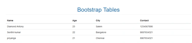
That is the output for basic Bootstrap table
Creating a Table-striped with Bootstrap
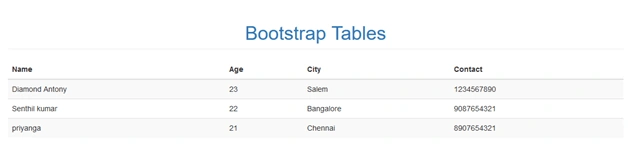
- In this Table-striped class is called as a zebra-striped
- Using .table-striped class
- In this table-striped class generate the black and white color
- The striped on rows with in the <tbody>
Sample program for table-striped
- <!DOCTYPE html>
- <html>
- <head>
- <meta charset="utf-8">
- <meta name="viewport" content="width=device-width, initial scale=1">
- <link rel="stylesheet" type="text/css" href="css/bootstrap.min.css">
- </head>
- <body>
- <div class="container">
- <div class="row">
- <h1 class="text-center page-header text-primary">
- Bootstrap Tables
- </h1>
- </div>
- <div class="row">
- <table class="table table-striped">
- <thead>
- <tr>
- <th>Name</th>
- <th>Age</th>
- <th>City</th>
- <th>Contact</th>
- </tr>
- </thead>
- <tbody>
- <tr>
- <td>Diamond Antony</td>
- <td>23</td>
- <td>Salem</td>
- <td>1234567890</td>
- </tr>
- <tr>
- <td>Senthil kumar</td>
- <td>22</td>
- <td>Bangalore</td>
- <td>9087654321</td>
- </tr>
- <tr>
- <td>priyanga</td>
- <td>21</td>
- <td>Chennai</td>
- <td>8907654321</td>
- </tr>
- </tbody>
- </table>
- </div>
- </div>
- <script type="text/javascript" src="js/bootstrap.min.js"></script>
- <script type="text/css" src="js/jquery"></script>
- </body>
- </html>
Output
Creating a table-bordered with Bootstrap
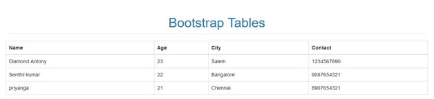
- All table contents come with box or border
- All tables and cells are covered to the borders
- .table –bordered class is using
- The rounded corners are around the entire table
Sample program for table-bordered
- <!DOCTYPE html>
- <html>
- <head>
- <meta charset="utf-8">
- <meta name="viewport" content="width=device-width, initial scale=1">
- <link rel="stylesheet" type="text/css" href="css/bootstrap.min.css">
- </head>
- <body>
- <div class="container">
- <div class="row">
- <h1 class="text-center page-header text-primary">
- Bootstrap Tables
- </h1>
- </div>
- <div class="row">
- <table class="table table-bordered">
- <thead>
- <tr>
- <th>Name</th>
- <th>Age</th>
- <th>City</th>
- <th>Contact</th>
- </tr>
- </thead>
- <tbody>
- <tr>
- <td>Diamond Antony</td>
- <td>23</td>
- <td>Salem</td>
- <td>1234567890</td>
- </tr>
- <tr>
- <td>Senthil kumar</td>
- <td>22</td>
- <td>Bangalore</td>
- <td>9087654321</td>
- </tr>
- <tr>
- <td>priyanga</td>
- <td>21</td>
- <td>Chennai</td>
- <td>8907654321</td>
- </tr>
- </tbody>
- </table>
- </div>
- </div>
- <script type="text/javascript" src="js/bootstrap.min.js"></script>
- <script type="text/css" src="js/jquery"></script>
- </body>
- </html>
Output
Creating a Table-hover with Bootstrap
Creating a Table-hover with Bootstrap
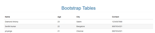
- Gray color background is generated on hover effect
- .table-hover class is using
- The cursor is hovering over the table row when the hover effect is generated
Sample program for table-hover
- <!DOCTYPE html>
- <html>
- <head>
- <meta charset="utf-8">
- <meta name="viewport" content="width=device-width, initial scale=1">
- <link rel="stylesheet" type="text/css" href="css/bootstrap.min.css">
- </head>
- <body>
- <div class="container">
- <div class="row">
- <h1 class="text-center page-header text-primary">
- Bootstrap Tables
- </h1>
- </div>
- <div class="row">
- <table class="table table-hover">
- <thead>
- <tr>
- <th>Name</th>
- <th>Age</th>
- <th>City</th>
- <th>Contact</th>
- </tr>
- </thead>
- <tbody>
- <tr>
- <td>Diamond Antony</td>
- <td>23</td>
- <td>Salem</td>
- <td>1234567890</td>
- </tr>
- <tr>
- <td>Senthil kumar</td>
- <td>22</td>
- <td>Bangalore</td>
- <td>9087654321</td>
- </tr>
- <tr>
- <td>priyanga</td>
- <td>21</td>
- <td>Chennai</td>
- <td>8907654321</td>
- </tr>
- </tbody>
- </table>
- </div>
- </div>
- <script type="text/javascript" src="js/bootstrap.min.js"></script>
- <script type="text/css" src="js/jquery"></script>
- </body>
- </html>
Creating a table-condensed with Bootstrap
- Using this class makes table more compact by cutting cell padding in half
- Large number of columns are in your table means that class will be of help
- .table-condensed class is used
Sample program for table-hover
- <!DOCTYPE html>
- <html>
- <head>
- <meta charset="utf-8">
- <meta name="viewport" content="width=device-width, initial scale=1">
- <link rel="stylesheet" type="text/css" href="css/bootstrap.min.css">
- </head>
- <body>
- <div class="container">
- <div class="row">
- <h1 class="text-center page-header text-primary">
- Bootstrap Tables
- </h1>
- </div>
- <div class="row">
- <table class="table table-condensed">
- <thead>
- <tr>
- <th>Name</th>
- <th>Age</th>
- <th>City</th>
- <th>Contact</th>
- </tr>
- </thead>
- <tbody>
- <tr>
- <td>Diamond Antony</td>
- <td>23</td>
- <td>Salem</td>
- <td>1234567890</td>
- </tr>
- <tr>
- <td>Senthil kumar</td>
- <td>22</td>
- <td>Bangalore</td>
- <td>9087654321</td>
- </tr>
- <tr>
- <td>priyanga</td>
- <td>21</td>
- <td>Chennai</td>
- <td>8907654321</td>
- </tr>
- </tbody>
- </table>
- </div>
- </div>
- <script type="text/javascript" src="js/bootstrap.min.js"></script>
- <script type="text/css" src="js/jquery"></script>
- </body>
- </html>
Output
Contextual classes
- Contextual classes are used in table row <tr> or table cells<td>
- Each color indicates some reaction
- The colors are used to identify the particular locations
Using Contextual classes
- .active
- .success
- .info
- .warning
- .danger
Sample program for contextual classes
- <!DOCTYPE html>
- <html>
- <head>
- <meta charset="utf-8">
- <meta name="viewport" content="width=device-width, initial scale=1">
- <link rel="stylesheet" type="text/css" href="css/bootstrap.min.css">
- </head>
- <body>
- <div class="container">
- <div class="row">
- <h1 class="text-center page-header text-primary">
- Bootstrap Tables
- </h1>
- </div>
- <div class="row">
- <table class="table">
- <thead>
- <tr class="active">
- <th>Name</th>
- <th>Age</th>
- <th>City</th>
- <th>Contact</th>
- </tr>
- </thead>
- <tbody>
- <tr class="success">
- <td>Diamond Antony</td>
- <td>23</td>
- <td>Salem</td>
- <td>1234567890</td>
- </tr>
- <tr class="info">
- <td>Senthil kumar</td>
- <td>22</td>
- <td>Bangalore</td>
- <td>9087654321</td>
- </tr>
- <tr class="warning">
- <td>priyanga</td>
- <td>21</td>
- <td>Chennai</td>
- <td>8907654321</td>
- </tr>
- <tr class="danger">
- <td>partheeban</td>
- <td>21</td>
- <td>Dharmaburi</td>
- <td>9543216780</td>
- </tr>
- </tbody>
- </table>
- </div>
- </div>
- <script type="text/javascript" src="js/bootstrap.min.js"></script>
- <script type="text/css" src="js/jquery"></script>
- </body>
- </html>
Responsive Table
- The table has a horizontal scroll on small devices under 768px
- When viewing on anything larger than 768px wide you will not see any difference in these tables
- .table-responsive class is used
Sample program for responsive table
- <!DOCTYPE html>
- <html>
- <head>
- <meta charset="utf-8">
- <meta name="viewport" content="width=device-width, initial scale=1">
- <link rel="stylesheet" type="text/css" href="css/bootstrap.min.css">
- </head>
- <body>
- <div class="container">
- <div class="row">
- <h1 class="text-center page-header text-primary">
- Bootstrap Tables
- </h1>
- </div>
- <div class="row">
- <div class="table-responsive">
- <caption>responsive table layout</caption>
- <table class="table ">
- <thead>
- <tr class="active">
- <th>Name</th>
- <th>Age</th>
- <th>City</th>
- <th>Contact</th>
- </tr>
- </thead>
- <tbody>
- <tr class="success">
- <td>Diamond Antony</td>
- <td>23</td>
- <td>Salem</td>
- <td>1234567890</td>
- </tr>
- <tr class="info">
- <td>Senthil kumar</td>
- <td>22</td>
- <td>Bangalore</td>
- <td>9087654321</td>
- </tr>
- <tr class="warning">
- <td>priyanga</td>
- <td>21</td>
- <td>Chennai</td>
- <td>8907654321</td>
- </tr>
- <tr class="danger">
- <td>partheeban</td>
- <td>21</td>
- <td>Dharmaburi</td>
- <td>9543216780</td>
- </tr>
- </tbody>
- </table>
- </div>
- </div>
- <script type="text/javascript" src="js/bootstrap.min.js"></script>
- <script type="text/css" src="js/jquery"></script>
- </body>
- </html>
Output
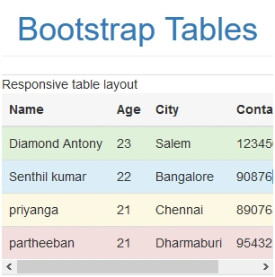
This output has the horizontal scroll bar that is the output for responsive table
Conclusion
I hope now you can understand how to use and create the Bootstrap Tables. In the future we can learn about the Bootstrap techniques step by step. Stay tuned.
Join the conversation! Your thoughts help the community grow.