

Progress Bars
- The purpose of progress bars is to show that assets are loading, in progress, or that there is action taking place regarding elements on the page.
- These features are not supported in Internet Explorer 9 and below or older versions of Firefox.
- Opera 12 does not support animations
Default Progress Bar
- Use <div> tag with class of .progress
- Inside the empty <div> tag to create another <div> tag with a class of .progress-bar
- To define the style attributes with the width expressed as a percentage(for example style=”60%”)
- That 60% indicates the progress bar level
- <!DOCTYPE html>
- <html>
- <head>
- <meta charset="utf-8">
- <meta name="viewport" content="width=device-width, initial scale=1">
- <link rel="stylesheet" type="text/css" href="css/bootstrap.min.css">
- </head>
- <body>
- <div class="container">
- <div class="row">
- <h1 class="text-center page-header text-info">
- Bootstrap Progress Bar
- </h1>
- </div>
- <div class="row">
- <div class = "progress">
- <div class = "progress-bar" role = "progressbar" aria-valuenow = "60"
- aria-valuemin = "0" aria-valuemax = "100" style = "width: 40%;">
- <span class = "sr-only">40% Complete</span>
- </div>
- </div>
- </div>
- </div>
- <script type="text/javascript" src="js/bootstrap.min.js"></script>
- <script type="text/css" src="js/jquery"></script>
- </body>
- </html>
Output
Colored Progress Bar
There are four different colors using what is given below,
- .progress-bar-success
- .progress-bar-info
- .progress-bar-warning
- .progress-bar-danger
Alternate Progress Bar
- This alternative progress bar is used to indicate different types in different style and various levels
- Use <div> tag with class of .progress
- Inside the empty <div> tag create another <div> tag with a class of .progress-bar where could be success,info,warning,danger
- To define the style attributes with the width expressed as a percentage(for example style=”60%”)
- That 60% indicates the progress bar level
Sample program for alternate progress bar
- <!DOCTYPE html>
- <html>
- <head>
- <meta charset="utf-8">
- <meta name="viewport" content="width=device-width, initial scale=1">
- <link rel="stylesheet" type="text/css" href="css/bootstrap.min.css">
- </head>
- <body>
- <div class="container">
- <div class="row">
- <h1 class="text-center page-header text-info">
- Bootstrap Progress Bar
- </h1>
- </div>
- <div class="row"> Alternateprogress-bar
- <div class = "progress">
- <div class = "progress-bar progress-bar-success"
- aria-valuenow = "60" aria-valuemin = "0" aria-valuemax = "100" style = "width: 90%;">
- <span class = "sr-only">90% Complete (Sucess)</span>
- </div>
- </div>
- <div class = "progress">
- <div class = "progress-bar progress-bar-info"
- aria-valuenow = "60" aria-valuemin = "0" aria-valuemax = "100" style = "width: 30%;">
- <span class = "sr-only">30% Complete (info)</span>
- </div>
- </div>
- <div class = "progress">
- <div class = "progress-bar progress-bar-warning"
- aria-valuenow = "60" aria-valuemin = "0" aria-valuemax = "100" style = "width: 20%;">
- <span class = "sr-only">20%Complete (warning)</span>
- </div>
- </div>
- <div class = "progress">
- <div class = "progress-bar progress-bar-danger"
- aria-valuenow = "60" aria-valuemin = "0" aria-valuemax = "100" style = "width: 10%;">
- <span class = "sr-only">10% Complete (danger)</span>
- </div>
- </div>
- </div>
- </div>
- <script type="text/javascript" src="js/bootstrap.min.js"></script>
- <script type="text/css" src="js/jquery"></script>
- </body>
- </html>
Output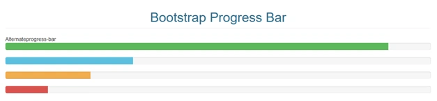
Striped Progress Bar
- This striped progress bar is comes with zebra striper
- If we have success,info,warning,danger color progress bars inside the progress bar zebra designed lines are generated
- Thai is used for some advanced progress bars
Sample program for Striped Progress Bar
- <!DOCTYPE html>
- <html>
- <head>
- <meta charset="utf-8">
- <meta name="viewport" content="width=device-width, initial scale=1">
- <link rel="stylesheet" type="text/css" href="css/bootstrap.min.css">
- </head>
- <body>
- <div class="container">
- <div class="row">
- <h1 class="text-center page-header text-info">
- Bootstrap Progress Bar
- </h1>
- </div>
- <div class="row"> Striped progress-bar
- <div class = "progress progress-striped">
- <div class = "progress-bar progress-bar-success"
- aria-valuenow = "60" aria-valuemin = "0" aria-valuemax = "100" style = "width: 90%;">
- <span class = "sr-only">90% Complete (Sucess)</span>
- </div>
- </div>
- <div class = "progress progress-striped">
- <div class = "progress-bar progress-bar-info"
- aria-valuenow = "60" aria-valuemin = "0" aria-valuemax = "100" style = "width: 30%;">
- <span class = "sr-only">30% Complete (info)</span>
- </div>
- </div>
- <div class = "progress progress-striped">
- <div class = "progress-bar progress-bar-warning"
- aria-valuenow = "60" aria-valuemin = "0" aria-valuemax = "100" style="width: 20%;">
- <span class = "sr-only">20%Complete (warning)</span>
- </div>
- </div>
- <div class = "progress progress-striped">
- <div class = "progress-bar progress-bar-danger" role = "progressbar"
- aria-valuenow = "60" aria-valuemin = "0" aria-valuemax = "100" style = "width: 10%;">
- <span class = "sr-only">10% Complete (danger)</span>
- </div>
- </div>
- </div>
- </div>
- <script type="text/javascript" src="js/bootstrap.min.js"></script>
- <script type="text/css" src="js/jquery"></script>
- </body>
- </html>
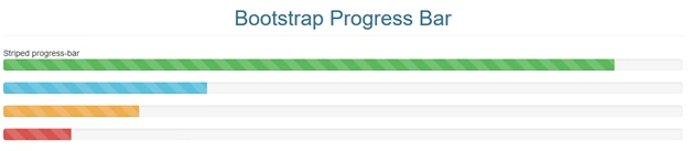
Animated Progress Bar
- This progress bar animates the strips from the right to left side
- It looks like the strips are moving
- The animated progress bar is continuously moving from the right to left side
Sample program for Animated Progress Bar
- <!DOCTYPE html>
- <html>
- <head>
- <meta charset="utf-8">
- <meta name="viewport" content="width=device-width, initial scale=1">
- <link rel="stylesheet" type="text/css" href="css/bootstrap.min.css">
- </head>
- <body>
- <div class="container">
- <div class="row">
- <h1 class="text-center page-header text-info">
- Bootstrap Progress Bar
- </h1>
- </div>
- <div class="row"> Animated progress-bar
- <div class = "progress progress-striped active">
- <div class = "progress-bar progress-bar-success"
- aria-valuenow = "60" aria-valuemin = "0" aria-valuemax = "100" style = "width: 40%;">
- <span class = "sr-only">40% Complete</span>
- </div>
- </div>
- </div>
- </div>
- <script type="text/javascript" src="js/bootstrap.min.js"></script>
- <script type="text/css" src="js/jquery"></script>
- </body>
- </html>

Stacked Progress Bar
- Stacked multiple progress bar
- Place the multiple progress bars into the same .progress to stack
- Single strip has multiple stacked bars
Sample program for stacked progress bar
- <!DOCTYPE html>
- <html>
- <head>
- <meta charset="utf-8">
- <meta name="viewport" content="width=device-width, initial scale=1">
- <link rel="stylesheet" type="text/css" href="css/bootstrap.min.css">
- </head>
- <body>
- <div class="container">
- <div class="row">
- <h1 class="text-center page-header text-info">
- Bootstrap Progress Bar
- </h1>
- </div>
- <div class="row"> Stacked progress-bar
- <div class = "progress">
- <div class = "progress-bar progress-bar-success"
- aria-valuenow = "60" aria-valuemin = "0" aria-valuemax = "100" style = "width: 40%;">
- <span class = "sr-only">40% Complete</span>
- </div>
- <div class = "progress-bar progress-bar-info"
- aria-valuenow = "60" aria-valuemin = "0" aria-valuemax = "100" style = "width: 30%;">
- <span class = "sr-only">30% Complete (info)</span>
- </div>
- <div class = "progress-bar progress-bar-warning"
- aria-valuenow = "60" aria-valuemin = "0" aria-valuemax = "100" style = "width: 20%;">
- <span class = "sr-only">20%Complete (warning)</span>
- </div>
- </div>
- </div>
- </div>
- <script type="text/javascript" src="js/bootstrap.min.js"></script>
- <script type="text/css" src="js/jquery"></script>
- </body>
- </html>

Bootstrap Alerts
- Bootstrap provides an easy way to create predefined alert messages
- Success - successful or positive action.
- Info - neutral informative change or action.
- Warning - warning that might need attention.
- Danger - dangerous or potentially negative action.
Bootstrap Alerts classes
The alert creates the .alert class,
- Alert-success
- Alert-info
- Alert-warning
- Alert-danger
Sample program for bootstrap alert classes
- <!DOCTYPE html>
- <html>
- <head>
- <meta charset="utf-8">
- <meta name="viewport" content="width=device-width, initial scale=1">
- <link rel="stylesheet" type="text/css" href="css/bootstrap.min.css">
- </head>
- <body>
- <div class="container">
- <div class="row">
- <h1 class="text-center page-header text-info">
- Bootstrap Alert
- </h1>
- </div>
- <div class="row">
- <div class="alert alert-success">
- <strong>Success-</strong> successful or positive action.
- </div>
- <div class="alert alert-info">
- <strong>Info-</strong> neutral informative change or action.
- </div>
- <div class="alert alert-warning">
- <strong>Warning-</strong>warning that might need attention.
- </div>
- <div class="alert alert-danger">
- <strong>Danger-</strong>dangerous or potentially negative action.
- </div>
- </div>
- </div>
- <script type="text/javascript" src="js/bootstrap.min.js"></script>
- <script type="text/css" src="js/jquery"></script>
- </body>
- </html>
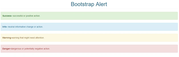
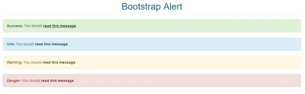
Alert link
- .alert-link to any links inside the alert box to create matching colored link
- In the alert message a link is included
Sample program for alert link
- <!DOCTYPE html>
- <html>
- <head>
- <meta charset="utf-8">
- <meta name="viewport" content="width=device-width, initial scale=1">
- <link rel="stylesheet" type="text/css" href="css/bootstrap.min.css">
- </head>
- <body>
- <div class="container">
- <div class="row">
- <h1 class="text-center page-header text-info">
- Bootstrap Alert
- </h1>
- </div>
- <div class="row">
- <div class="alert alert-success">
- <strong>Success-</strong> You should <a href="#" class="alert-link">read this message</a>.
- </div>
- <div class="alert alert-info">
- <strong>info-</strong> You should <a href="#" class="alert-link">read this message</a>.
- </div>
- <div class="alert alert-warning">
- <strong>Warning-</strong> You should <a href="#" class="alert-link">read this message</a>.
- </div>
- <div class="alert alert-danger">
- <strong>Danger-</strong> You should <a href="#" class="alert-link">read this message</a>.
- </div>
- </div>
- </div>
- <script type="text/javascript" src="js/bootstrap.min.js"></script>
- <script type="text/css" src="js/jquery"></script>
- </body>
- </html>
Closing Alert
- The right side of the alert container has X symbol
- .alert-dismissable class in to the alert container
- Add class=”close” and data-dismiss=”alert” to a link or button element
Sample program for closing alert
- <!DOCTYPE html>
- <html>
- <head>
- <meta charset="utf-8">
- <meta name="viewport" content="width=device-width, initial scale=1">
- <link rel="stylesheet" type="text/css" href="css/bootstrap.min.css">
- </head>
- <body>
- <div class="container">
- <div class="row">
- <h1 class="text-center page-header text-info">
- Bootstrap Alert
- </h1>
- </div>
- <div class="row">
- Example
- <div class="alert alert-success alert-dismissable">
- <a href="#" class="close" data-dismiss="alert" aria-label="close">×</a>
- <strong>Success!</strong> Indicates a successful or positive action.
- </div>
- </div>
- </div>
- <script type="text/javascript" src="js/bootstrap.min.js"></script>
- <script type="text/css" src="js/jquery"></script>
- </body>
- </html>

Animated alert
- The X symbol to the right will ”fade” out
- The .fade and .in class adds a fading effect when closing the alert message
Sample program for animated alert
- <!DOCTYPE html>
- <html>
- <head>
- <meta charset="utf-8">
- <meta name="viewport" content="width=device-width, initial scale=1">
- <link rel="stylesheet" type="text/css" href="css/bootstrap.min.css">
- </head>
- <body>
- <div class="container">
- <div class="row">
- <h1 class="text-center page-header text-info">
- Bootstrap Alert
- </h1>
- </div>
- <div class="row">
- <div class="alert alert-danger fade in">
- </div>
- </div>
- <script type="text/javascript" src="js/bootstrap.min.js"></script>
- <script type="text/css" src="js/jquery"></script>
- </body>
- </html>

Bootstrap Labels
- Labels are used to provide additional information about something
- Use .label class
Sample program for labels
- <!DOCTYPE html>
- <html>
- <head>
- <meta charset="utf-8">
- <meta name="viewport" content="width=device-width, initial scale=1">
- <link rel="stylesheet" type="text/css" href="css/bootstrap.min.css">
- </head>
- <body>
- <div class="container">
- <div class="row">
- <h1 class="text-center page-header text-info">
- Bootstrap Labels
- </h1>
- <h1>Diamond<span class="label label-default">Stone</span></h1>
- <h2>Gold <span class="label label-default">metal</span></h2>
- <h3>Silver<span class="label label-default">metal</span></h3>
- <h4>Platinum <span class="label label-default">metal</span></h4>
- <h5>Pearl <span class="label label-default">non-metal</span></h5>
- <h6>Ruby <span class="label label-default">metal</span></h6>
- </div>
- </div>
- <script type="text/javascript" src="js/bootstrap.min.js"></script>
- <script type="text/css" src="js/jquery"></script>
- </body>
- </html>
Output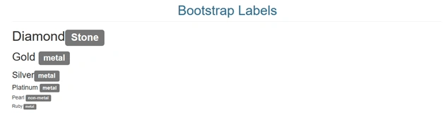
Contextual label classes
There are six contextual label classes available which are given below with a span element to create a lable,
- .label-default
- .label-primary
- .label-success
- .label-info
- .label-warning
- .label-danger
Sample program for Contextual label classes
- <!DOCTYPE html>
- <html>
- <head>
- <meta charset="utf-8">
- <meta name="viewport" content="width=device-width, initial scale=1">
- <link rel="stylesheet" type="text/css" href="css/bootstrap.min.css">
- </head>
- <body>
- <div class="container">
- <div class="row">
- <h1 class="text-center page-header text-info">
- Bootstrap Labels
- </h1>
- <span class="label label-default">Default</span>
- <span class="label label-primary">Primary</span>
- <span class="label label-success">Success</span>
- <span class="label label-info">Info</span>
- <span class="label label-warning">Warning</span>
- <span class="label label-danger">Danger</span>
- </div>
- </div>
- <script type="text/javascript" src="js/bootstrap.min.js"></script>
- <script type="text/css" src="js/jquery"></script>
- </body>
- </html>

Conclusion
I hope now you can understand how to use and create the Bootstrap - Progress Bars, Alert, Labels. In the future we can learn about the Bootstrap techniques step by step. Stay tuned.
Join the conversation! Your thoughts help the community grow.