

I am here to continue the discussion around AngularJS. Today, we will discuss how to create mobile device related animation using angular js. Also in case you have not had a look at our previous articles of this series, go through the following links:
- Learn AngularJS From Beginning: Basic - Part One
- Learn AngularJS From Beginning: Filter - Part Two
- Learn AngularJS From Beginning: Service - Part Three
- Learn AngularJS From Beginning: Directive - Part Four
- Learn AngularJS From Beginning: Form Data Binding - Part Five
- Learn AngularJS From Beginning: Global Object Service - Part Six
- Learn AngularJS From Beginning: Http Request or Ajax - Part Seven
- Learn AngularJS From Beginning: Rest API - Part Eight
- Learn AngularJS From Beginning: Route Url - Part Nine
- Learn AngularJS From Beginning: Animation - Part Ten
- Learn AngularJS From Beginning: Injection - Part Eleven
- Learn AngularJS From Beginning: Localisation - Part Twelve
- Learn AngularJS From Beginning: Unit Test of AngularJS Controller - Part Thirteen
- Learn AngularJS From Beginning: Unit Test of AngularJS Component - Part Fourteen
- Learn AngularJS From Beginning: Automatic Workflow (Grunt) - Part Fifteen
- Learn AngularJS From Beginning: Lazy Loading of Angular Files - Part Sixteen
- Learn AngularJS From Beginning: Google Map API - Part Seventeen
- Learn AngularJS From Beginning: Custom Animation - Part Eighteen
In the previous articles, we already discussed how to create animations using both JavaScript and CSS in the AngularJS context for native and custom directives. Now, in this article, we will learn how to enhance the user experience of our AngularJS web app, especially on mobile devices and tablets.
Enhance UX on mobile devices with animations
With the increasing use of smartphones and tablet devices, more people have started to visit websites via smartphones and other devices, so not optimizing a web app for small devices is not an option anymore. Nowadays, we create a single web app that is responsive to the device width using CSS3 media queries. So, we are able to define different styles for each device width size. We can provide a better experience based on the screen size. Currently, web apps are run on small screens of devices such as smartphones and also on screens as big as that of TVs. It's impossible to create a CSS style for each device width in the world, so usually, we work with different ranges of screen widths: smartphones, tablets and small desktops, and big desktops monitors. As we usually use CSS animations to animate in the AngularJS context, we are able to define animations in a specific media query. So, we might disable some heavy-processing animations and enable other GPU-accelerated animations for small screens.
The motion created by animations on web apps is better delivered when it seems more realistic. One of the material design guidelines is to avoid linear animations as it's a more mechanical and artificial movement than animations with acceleration and deceleration at the beginning and ending of an animation curve. This guideline is called authentic motion. Another important guideline is meaningful transitions, the next section's subject.
Transition between views
The Google material design website explains transitioning as follows:
"Transitioning between two visual states should be smooth, appear effortless, and above all, provide clarity to the user, not confusion. A well-designed transition does the heavy lifting and enables the user to clearly understand where their attention should be focused. A transition has three categories of elements."
- <!DOCTYPE html>
- <html ng-app="myApp">
- <head>
- <title>AngularJS Swipe Slider animation</title>
- <meta name="viewport" content="width=device-width,height=deviceheight,user-scalable=no">
- <link href="mobile.css" rel="stylesheet" />
- <link href="bootstrap.css" rel="stylesheet" />
- <script src="angular.min.js"></script>
- <script src="angular-touch.min.js"></script>
- <script src="angular-animate.min.js"></script>
- <script src="tabsSwipeCtrl.js"></script>
- </head>
- <body>
- <div ng-controller="tabsSwipeCtrl as responsive">
- <div class="btn-group btn-group-justified">
- <div class="btn-group">
- <button type="button" class="btn btn-default" ngclick="responsive.selectPage(0)" ng-class="{'active': responsive.ngIncludeSelected.index == 0}">
- First
- </button>
- </div>
- <div class="btn-group">
- <button type="button" class="btn btn-default" ngclick="responsive.selectPage(1)" ng-class="{'active': responsive.ngIncludeSelected.index == 1}">
- Second
- </button>
- </div>
- <div class="btn-group">
- <button type="button" class="btn btn-default" ngclick="responsive.selectPage(2)" ng-class="{'active': responsive.ngIncludeSelected.index == 2}">
- Third
- </button>
- </div>
- <div class="btn-group">
- <button type="button" class="btn btn-default" ngclick="responsive.selectPage(3)" ng-class="{'active': responsive.ngIncludeSelected.index == 3}">
- Fourth
- </button>
- </div>
- </div>
- <div class="ngIncludeRelative">
- <div class="ngIncludeItem" ng-include="responsive.ngIncludeSelected.url" ng-class="{'moveToLeft' : responsive.moveToLeft}"></div>
- </div>
- </div>
- </body>
- </html>
We added the ngSwipeLeft and ngSwipeRight directives from the ngTouch module to the partial view, so the user can change between views by swiping gestures.
FirstSwipe.html- <div class="firstPage page" ng-swipe-left="responsive.selectPage(1)">
- <h2>First page</h2>
- <p>Swipe to the left to go to second page</p>
- </div>
- <div class="secondPage page" ng-swipe-left="responsive.selectPage(2)"
- ng-swipe-right="responsive.selectPage(0)">
- <h2>Second page</h2>
- <p>Swipe to the right to go to first page</p>
- <p>Swipe to the left to go to third page</p>
- </div>
- <div class="thirdPage page" ng-swipe-left="responsive.selectPage(3)"
- ng-swipe-right="responsive.selectPage(1)">
- <h2>Third page</h2>
- <p>Swipe to the left to go to fourth page</p>
- <p>Swipe to the right to go to second page</p>
- </div>
- <div class="page" ng-swipe-right="responsive.selectPage(2)">
- <h2>Fourth page</h2>
- <p>Swipe to the right to go to third page</p>
- </div>
To create the desired animation effect, we will use a combination of ngInclude and ngClass. The ngClass directive will be used to learn the direction of the animation on the enter and leave events of the pages.
Mobile.css- body {
- overflow-x: hidden;
- }
- .ngIncludeItem {
- position: absolute;
- top: 35px;
- bottom: 0;
- right: 0;
- left: 0;
- animation-duration: 0.30s;
- animation-timing-function: ease-in-out;
- }
- .page {
- position: inherit;
- top: 0;
- right: inherit;
- bottom: inherit;
- left: inherit;
- }
- .firstPage {
- background-color: blue;
- }
- .secondPage {
- background-color: red;
- }
- .thirdPage {
- background-color: green;
- }
- /* When the page enters, slide it from the right */
- .ngIncludeItem.ng-enter {
- animation-name: slideFromRight;
- -webkit-animation-name: slideFromRight;
- }
- /* When the page enters and moveToLeft is true, slide it from the
- left(out of the user view) to the right (left corner) */
- .ngIncludeItem.moveToLeft.ng-enter {
- animation-name: slideFromLeft;
- -webkit-animation-name: slideFromLeft;
- }
- /* When the page leaves, slide it to left(out of the user view) from
- the left corner,
- in other words slide it from the left(out of the view) to the left
- corner but in reverse order */
- .ngIncludeItem.ng-leave {
- animation-name: slideFromLeft;
- animation-direction: reverse;
- -webkit-animation-name: slideFromLeft;
- -webkit-animation-direction: reverse;
- }
- /* When the page leaves, slide it to the right(out of the user view)
- from the the left corner,
- in other words, slide it from the right but in reverse order */
- .ngIncludeItem.moveToLeft.ng-leave {
- animation-name: slideFromRight;
- animation-direction: reverse;
- -webkit-animation-name: slideFromRight;
- -webkit-animation-direction: reverse;
- }
- @keyframes slideFromRight {
- 0% {
- transform: translateX(100%);
- }
- 100% {
- transform: translateX(0);
- }
- }
- @keyframes slideFromLeft {
- 0% {
- transform: translateX(-100%);
- }
- 100% {
- transform: translateX(0);
- }
- }
This combination of the moveToLeft, ng-enter, and ng-leave classes are used to trigger the animations in the mobile.css file using the direction based on the current page and the tab page the user will navigate to:
- function tabsSwipeCtrlFn() {
- var responsive = this;
- responsive.ngIncludeTemplates = [
- { index: 0, name: 'first', url: 'firstSwipe.html' },
- { index: 1, name: 'second', url: 'secondSwipe. html' },
- { index: 2, name: 'third', url: 'thirdSwipe.html' },
- { index: 3, name: 'fourth', url: 'fourthSwipe.html' }];
- responsive.selectPage = selectPage;
- responsiveresponsive.ngIncludeSelected =
- responsive.ngIncludeTemplates[0];
- function selectPage(indexSelected) {
- if (responsive.ngIncludeTemplates[indexSelected].index >
- responsive.ngIncludeSelected.index) {
- responsive.moveToLeft = false;
- } else {
- responsive.moveToLeft = true;
- }
- responsiveresponsive.ngIncludeSelected =
- responsive.ngIncludeTemplates[indexSelected];
- }
- }
- var app = angular.module('myApp', ['ngAnimate', 'ngTouch']).controller('tabsSwipeCtrl', tabsSwipeCtrlFn);
AngularJS 2.0 Touch Animations is currently being drafted, and its focus is to provide better solutions for mobile devices, the same focus as that of AngularJS 2.0. This draft includes better handling of scrolling through a list using a finger, circling through pictures in a carousel, removing of items on swipe, and more native app features. We can expect improvements for the future on AngularJS core, so things such as the infinite scrolling core will be standardized and not spread to many third-party AngularJS modules.
Mobile AngularJS frameworks
Nowadays, mobile features can be added to AngularJS web apps using external frameworks such as. It provides some great directives that uses the ngAnimate module behind the scenes to create those touch animations features. The Ionic framework is a framework for hybrid mobile apps with HTML5. In other words, the framework is focused on the use of native apps, not for responsive web apps. This is a good choice if you want to create native apps using HTML, CSS, and JavaScript together with Apache Cordova or PhoneGap.
The output of the above code is,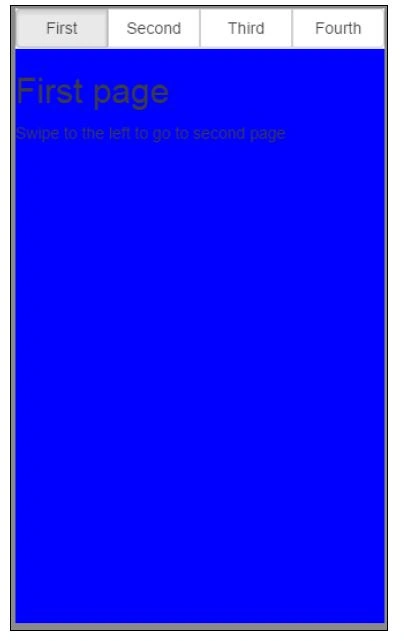
Vignesh ManiPosted May 27, 2016, 4:21 PM
nice
Sonu ChaudharyPosted May 27, 2016, 4:12 PM
good one
Munesh SharmaPosted May 27, 2016, 2:01 PM
nice work