

Introduction
Let’s start understanding how Angular Material works.
Step 1
Let’s create a new app using the following commands.
Note
Please make sure that you have the latest Node.js version already installed , and if not, go through the following link to download the latest version. Click Here To Download Latest Version Of Node.js
To check its versions, try the following command
- ng –v
- node –v
- npm –v
Now, create a new directory and our app inside it.
- Ng new angularmaterialform
And then, open it to VS Code editor by writing the following command.
- Code
And you can see that the following structure is created.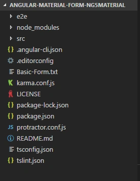
Step 2
Now, you have the app created with you. Serve it using following command.
- Ng serve
Step 3
So, let’s get started by configuring our app for Material design. Execute the following commands to install Angular Material.
- Npm install –-save –g @angular/material
- Npm install –-save –g @angular/cdk
- Npm install –-save –g @angular/animations
Note
We have installed animations because some of the Angular Material components are based on animation, like - swipe , zoom-in , zoom out etc .
So now, we have completely configured our app.
Step 4
In the next step, we use imports in our main module file [installed packages] , so that we can use it globally.
Here, I have pasted my module.ts file code.
- import { BrowserModule } from '@angular/platform-browser';
- import { NgModule } from '@angular/core';
- import { FormsModule,ReactiveFormsModule } from '@angular/forms';
- import {
- MatButtonModule,
- MatMenuModule,
- MatToolbarModule,
- MatIconModule,
- MatCardModule,
- MatFormFieldModule,
- MatInputModule,
- MatDatepickerModule,
- MatDatepicker,
- MatNativeDateModule,
- MatRadioModule,
- MatSelectModule,
- MatOptionModule,
- MatSlideToggleModule,ErrorStateMatcher,ShowOnDirtyErrorStateMatcher
- } from '@angular/material';
- import { BrowserAnimationsModule } from '@angular/platform-browser/animations';
- import { AppComponent } from './app.component';
- @NgModule({
- declarations: [
- AppComponent
- ],
- imports: [
- BrowserModule,
- FormsModule,
- ReactiveFormsModule,
- MatButtonModule,
- MatMenuModule,
- MatToolbarModule,
- MatIconModule,
- MatCardModule,
- BrowserAnimationsModule,
- MatFormFieldModule,
- MatInputModule,
- MatDatepickerModule,
- MatNativeDateModule,
- MatRadioModule,
- MatSelectModule,
- MatOptionModule,
- MatSlideToggleModule
- ],
- exports: [
- MatButtonModule,
- MatMenuModule,
- MatToolbarModule,
- MatIconModule,
- MatCardModule,
- BrowserAnimationsModule,
- MatFormFieldModule,
- MatInputModule,
- MatDatepickerModule,
- MatNativeDateModule,
- MatRadioModule,
- MatSelectModule,
- MatOptionModule,
- MatSlideToggleModule
- ],
- providers: [
- {provide: ErrorStateMatcher, useClass: ShowOnDirtyErrorStateMatcher}
- ],
- bootstrap: [AppComponent]
- })
- export class AppModule { }
Note
It is a best practice to create a separate module file for all Material Components that you are going to use.
- MatButtonModule
- MatMenuModule
- MatToolbarModule
- MatIconModule
- MatCardModule
- MatFormFieldModule
- MatInputModule
- MatDatepickerModule
- MatDatepicker
- MatNativeDateModule
- MatRadioModule
- MatSelectModule
- MatOptionModule
- MatSlideToggleModule
So far, we have set up module.ts file with necessary components.
Step 5
Next step is to provide some look and feel to our Material Design app theme.
There are some pre-defined themes available. You can choose anyone from below.
- Indigo-pink.css
- Pink-bluegrey.css
- Deeppurple-amber.css [I'm using this one]
- Purple-green.css
Following is my styles.css [root src directory] code.
- @import '~https://fonts.googleapis.com/icon?family=Material+Icons';
- @import '~@angular/material/prebuilt-themes/deeppurple-amber.css';
- .mat-card {
- text-align: -webkit-center;
- }
- .demo-toolbar {
- display: flex;
- align-items: center;
- width: 100%;
- }
- .demo-form {
- min-width: 150px;
- max-width: 500px;
- width: 100%;
- }
- .demo-full-width {
- width: 100%;
- }
- body {
- margin: 0;
- font-family: Roboto, sans-serif;
- }
- mat-card {
- max-width: 80%;
- margin: 2em auto;
- text-align: center;
- }
- mat-toolbar-row {
- justify-content: space-between;
- }
- .done {
- position: fixed;
- bottom: 20px;
- right: 20px;
- color: white;
- }
- .content-center {
- text-align: -webkit-center;
- }
Step 6
In addition to this, we can add gesture support to our app using HammerJS.
Why we need HammerJS ?
HammerJS is used mainly for adding gesture kind of effects support, like - Swipe, Zoom, rotate.
Execute the following command,
- Npm install --save hammerjs
So, hammer.js will be installed on your machine successfully.
Like - import ‘hammerjs’;
Step 7
- <!-- Main Toolbar of an App -->
- <mat-toolbar color="accent">
- <span>Manav Pandya - C#Corner</span>
- <span class="demo-toolbar"></span>
- <button mat-button href="asp-dotnet-mvc-tutorials.blogspot.in">Go To My Blog</button>
- </mat-toolbar>
- <mat-card>
- <!-- Title of an Card -->
- <mat-card-title>
- Angular Material Component With Angular 5
- </mat-card-title>
- <mat-card-content>
- <form>
- <table>
- <tr>
- <td>
- <mat-form-field class="demo-full-width">
- <input matInput placeholder="First Name">
- </mat-form-field>
- </td>
- <td>
- <mat-form-field class="demo-full-width">
- <input matInput placeholder="Last Name">
- </mat-form-field>
- </td>
- </tr>
- <tr>
- <td colspan="2">
- <mat-form-field class="demo-full-width">
- <textarea matInput placeholder="Address" matTextareaAutosize matAutosizeMinRows="2" matAutosizeMaxRows="5"></textarea>
- </mat-form-field>
- </td>
- </tr>
- <tr>
- <td colspan="2">
- <mat-form-field class="demo-full-width">
- <input matInput [matDatepicker]="picker" placeholder="Date of birth">
- <mat-datepicker-toggle matSuffix [for]="picker"></mat-datepicker-toggle>
- <mat-datepicker touchUi="true" #picker></mat-datepicker>
- </mat-form-field>
- </td>
- </tr>
- <tr>
- <td>
- <span>Gender</span><br><br>
- <mat-radio-group>
- <mat-radio-button value="1">Male</mat-radio-button>
- <mat-radio-button value="2">Female</mat-radio-button>
- </mat-radio-group>
- </td>
- <td><br>
- <mat-form-field>
- <mat-select placeholder="Select Blog" [(value)]="selected">
- <mat-option>-- Select Any --</mat-option>
- <mat-option value="1">C#Corner</mat-option>
- <mat-option value="2">C#Corner</mat-option>
- <mat-option value="3">C#Corner</mat-option>
- </mat-select>
- </mat-form-field>
- </td>
- </tr>
- <tr>
- <td colspan="2">
- <mat-form-field class="demo-full-width">
- <input matInput placeholder="Email">
- </mat-form-field>
- </td>
- </tr>
- <tr>
- <td colspan="2">
- </td>
- </tr>
- <tr>
- <td colspan="2" class="content-center">
- <button mat-raised-button color="accent">Submit</button>
- <button mat-raised-button color="accent">Clear</button>
- </td>
- </tr>
- </table>
- </form>
- </mat-card-content>
- </mat-card>
- <mat-form-field>
This tag of Material component is container of html control , with the help of this we can define theme of an control, Like : accent , primary , warn etc . - <mat-toolbar>
In this part of the form, I have used Angular material toolbar module, it contains the title of the toolbar and a material button. - <mat-card>
In this section our actual form is contained, where I have used most of the Material Components. - <mat-card-title>
Provides the title of the card for display purpose. - <mat-card-content>
It contains actual content of an card element. And other controls as well like,
- <mat-radio-button> - For using radio button option
- <mat-datepicker> -To use Datepicker
- <mat-select> - To use Dropdown list of values
- <mat-option> - To provide different values to <mat-select>
So far we have created a complete form using Angular material components
Let's try and run following command :
- ng serve -o
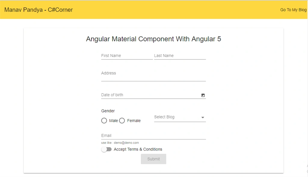
As you can see, the above form looks good but till now, it's just an HTML form, and on submitting the form, nothing is going to happen.
Conclusion
So far, we have learned how to install and configure Angular Material Component and configure it. At last, we have created a basic form with many controls within it. In my upcoming article, we will learn the following.
- Reactive Form Introduction
- Implementation Of Reactive Form
- Validations & Form Submission
Shariq SaadPosted Oct 6, 2018, 8:54 AM
Can we resize mat-datepicker display size. Also can we change its font size and reduce padding
Ken PerregauxPosted Jul 16, 2018, 11:10 AM
Great example Manav, however, my styling does not look the same as yours. The placeholder is not light grey and there is no underline. Did I forget a step or am I missing some CSS?
sai kumarPosted Jun 24, 2018, 5:53 AM
Hai this seems nice tutorial i want to ask you a question i generated myprofile component and i placed your html and css but each textbox seems to be very small large screen.so i want to increase width and increase padding of side by side textbox's .Can anyone help with this.
Ben HalversonPosted Jun 1, 2018, 3:41 PM
You dont need -g to install npm dependences. This is the more common way of installing npm modules `npm install -S @angular/cdk @angular/material @angular/animations`
Mohammad MalikPosted Mar 16, 2018, 6:59 AM
Thank you. Very helpful.
Tridip BhattacharjeePosted Mar 14, 2018, 3:24 AM
What is the meaning of Reactive Form...please share some background. thanks
Bikash SahuPosted Feb 26, 2018, 10:46 PM
Good example.well done!
RakeshPosted Jan 10, 2018, 2:12 PM
Good one...........
Manav PandyaPosted Jan 10, 2018, 4:50 AM
Thanks Mangesh Gaherwar sir ........
Mangesh GPosted Jan 10, 2018, 4:11 AM
good one manav !!!! well done
Manav PandyaPosted Jan 10, 2018, 3:19 AM
Glad you liked it Sir Akshay Arora ....
Akshay AroraPosted Jan 10, 2018, 3:12 AM
This is a Nice one . .
Dharmraj ThakurPosted Jan 10, 2018, 12:07 AM
Awesome manav sir... well done
Manav PandyaPosted Jan 9, 2018, 11:39 PM
Thanks sir Hiten Pandya ........
Hiten PandyaPosted Jan 9, 2018, 11:31 PM
Good one Manav.... Thanks for this simple explanation
Manav PandyaPosted Jan 9, 2018, 11:27 PM
Glad you liked it !!!!! Naresh Singhal
Naresh SinghalPosted Jan 9, 2018, 11:25 PM
Very good and explained deeply with good example...Sir Manav Pandya