

Introduction
I will be starting straight off with how to create colorful backgrounds for Android buttons. To do that you should be familiar with the basics of Android and how to create a project. You can always refer to articles on this website for how to start Android development.
This is what we will be making just by using XML:
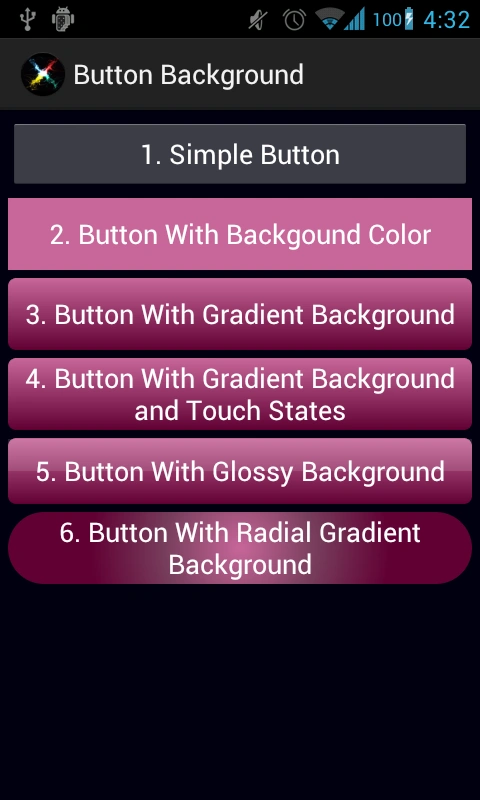
Let's start by doing the following:
-
Open Eclipse and create a new Android project
-
Modify your main layout file and add the following layout
activity_main.xml
- <LinearLayout xmlns:android="http://schemas.android.com/apk/res/android"
- xmlns:tools="http://schemas.android.com/tools"
- android:layout_width="match_parent"
- android:layout_height="match_parent"
- android:background="#000011"
- android:orientation="vertical"
- tools:context=".MainActivity"
- android:padding="5dp">
- <Button
- android:layout_height="wrap_content"
- android:layout_width="fill_parent"
- android:text="@string/button1"
- android:textColor="#ffffff"
- android:layout_marginBottom="5dp"
- />
- <Button
- android:layout_height="wrap_content"
- android:layout_width="fill_parent"
- android:text="@string/button2"
- android:textColor="#ffffff"
- android:background="@drawable/button2_background"
- android:layout_marginBottom="5dp"
- />
- <Button
- android:layout_height="wrap_content"
- android:layout_width="fill_parent"
- android:text="@string/button3"
- android:textColor="#ffffff"
- android:background="@drawable/button3_background"
- android:layout_marginBottom="5dp"
- />
- <Button
- android:layout_height="wrap_content"
- android:layout_width="fill_parent"
- android:text="@string/button4"
- android:textColor="#ffffff"
- android:background="@drawable/button4_background"
- android:layout_marginBottom="5dp"
- />
- <Button
- android:layout_height="44dp"
- android:layout_width="fill_parent"
- android:text="@string/button5"
- android:textColor="#ffffff"
- android:layout_marginBottom="5dp"
- android:background="@drawable/button5_background"
- />
- <Button
- android:layout_height="wrap_content"
- android:layout_width="fill_parent"
- android:text="@string/button6"
- android:textColor="#ffffff"
- android:background="@drawable/button6_background"
- />
- </LinearLayout>
3. Create 5 XML files (button2_background.xml, button3_background.xml, ... button6_background.xml) in the gen/drawable folder (create a drawable folder if not present)
3.a: Button 1 is simple and is a plain default Android button that everyone is familiar with
3.b: Button 2, on the other hand, has a background named button2_background.xml
Now if you look at the XML you will find "tags selector" -> "item" -> "shape". Item is the graphic/drawing that is inside a single selector element and shape is the custom graphic.
We have used a single rectangular shape and 1 solid color.
button2_background.xml
- <?xml version="1.0" encoding="utf-8"?>
- lt;selector xmlns:android="http://schemas.android.com/apk/res/android" >
- <item>
- <shape android:shape="rectangle">
- <solid android:color="#C76699"/>
- </shape>
- </item>
- lt;/selector>
button3_background.xml
- <?xml version="1.0" encoding="utf-8"?>
- <selector xmlns:android="http://schemas.android.com/apk/res/android" >
- <item>
- <shape android:shape="rectangle">
- <gradient
- android:startColor="#C76699"
- android:endColor="#610033"
- android:angle="-90"
- android:type="linear"
- />
- <corners android:radius="5dp" />
- </shape>
- </item>
- </selector>
3.d: Button 4: If you touch button 2 or 3 you will see that it doesn't change its color i.e. we don't know whether the button is pressed. For that we add the states to button 4.
We will need to define various items for various states like android:state_enabled="false" for a disabled button and android:state_pressed="true" for a pressed button and so on.
button4_background.xml
- <?xml version="1.0" encoding="utf-8"?>
- lt;selector xmlns:android="http://schemas.android.com/apk/res/android" >
- <!-- disabled -->
- <item android:state_enabled="false" >
- <shape android:shape="rectangle">
- <gradient
- android:startColor="#454545"
- android:endColor="#454545"
- android:angle="-90"
- android:type="linear"
- />
- <corners android:radius="5dp" />
- </shape>
- </item>
- <!-- pressed -->
- <item android:state_pressed="true" android:state_enabled="true" >
- <shape android:shape="rectangle">
- <gradient
- android:startColor="#64334C"
- android:endColor="#300019"
- android:angle="-90"
- android:type="linear"
- />
- <corners android:radius="5dp" />
- </shape>
- </item>
- <!-- focused -->
- <item android:state_focused="true">
- <shape android:shape="rectangle">
- <gradient
- android:startColor="#C76699"
- android:endColor="#610033"
- android:angle="-90"
- android:type="linear"
- />
- <corners android:radius="5dp" />
- <stroke android:width="2dp" android:color="#dddddd"/>
- </shape>
- </item>
- <!-- default -->
- <item>
- <shape android:shape="rectangle">
- <gradient
- android:startColor="#C76699"
- android:endColor="#610033"
- android:angle="-90"
- android:type="linear"
- />
- <corners android:radius="5dp" />
- </shape>
- </item>
- </selector>
button5_background.xml
- <?xml version="1.0" encoding="utf-8"?>
- <selector xmlns:android="http://schemas.android.com/apk/res/android" >
- <!-- default -->
- <item>
- <layer-list >
- <item>
- <shape android:shape="rectangle">
- <gradient
- android:startColor="#C76699"
- android:endColor="#610033"
- android:angle="-90"
- android:type="linear"
- />
- <corners android:radius="5dp" />
- </shape>
- </item>
- <item android:top="1dp" android:bottom="22dp" >
- <shape android:shape="rectangle">
- <solid android:color="#20ffffff"/>
- </shape>
- </item>
- </layer-list>
- </item>
- </selector>
3.f: Button 6: Here we changed the type of the gradient to radial to get a totally different look.
button6_background.xml
- <?xml version="1.0" encoding="utf-8"?>
- <selector xmlns:android="http://schemas.android.com/apk/res/android" >
- <item>
- <shape android:shape="rectangle">
- <gradient
- android:startColor="#C76699"
- android:centerColor="#773D5C"
- android:endColor="#610033"
- android:angle="-90"
- android:type="radial"
- android:gradientRadius="150"
- />
- <corners android:radius="50dp" />
- </shape>
- </item>
- </selector>
The purpose of this article was to help you to create awesome buttons without Photoshop and also the big additi0onal point of using XML is that instead of pngs/jpgs, we can easily modify the color whenever we want to.
Link for Google documentation: developer.android.com/guide/topics/resources/drawable-resource.html
Play around with all the attributes to get what you need or maybe accidentally you can stumble upon something better.
I hope this article will help you to make awesome designs.
Pedro LlanesPosted Dec 1, 2015, 7:13 AM
Perfect but when I generate the apk and install it in a mobile only appears the endColor, not the gradient. Any solution? Thanks
Sazid MauhammadPosted Feb 19, 2013, 11:25 PM
nice article man