

Introduction
This is a simple application for beginners that shows how to rotate a button using HTML 5 and CSS 3 tools. We know that CSS is the acronym for Cascading Style Sheet that helps to design a form in a web application. CSS has three levels; they are level 1, level 2 and level 3. CSS level 3 is alway used to develop an animated application with the help of HTML 5 tools. CSS 3 provides an advanced module used in web applications that include selectors, box models, 2D, and 3D transformation, animation and user interface.
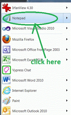
Step 1: First open an HTML editor such as Notepad.
- Open start->Notepad.
- The name of the editor is "Sam".
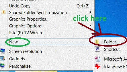
Step 2: Add a Folder on Desktop.
- Right-click on desktop.
- new->add folder.
- The name of the folder is own choice there is "Jeen".
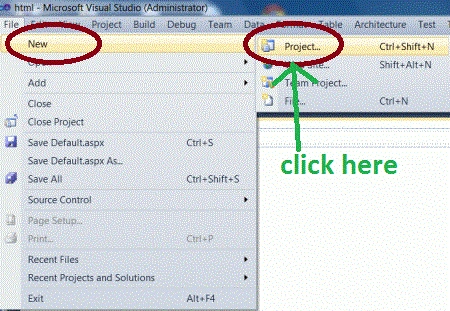
- Go to file -> New->Projects.
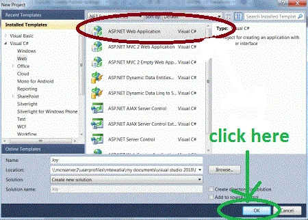
- Create an ASP. NET Web Application.
- Name of "Joy.aspx".
- Right-click of Solution Explorer.
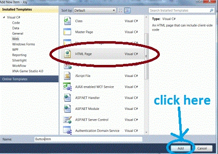
- Add->add new item->HTML form.
- Name of HTML form is "Rotate.html".
Code
- .button
- {
- border-style: none;
- border-color: inherit;
- border-width: medium;
- background:#008080;
- color:Navy;
- font-weight:lighter;
- font-size:10px;
- padding:40px 15px;
- cursor:progress;
- txt-transition:-Rot-transform 1s,opacity 1s,background 1s,width 1s,height 1s,font-size 1s
- transition-property:width,height,transform,background,font-size,opacity,color;
- transition-duration:1s,1s,1s,1s,1s,1s,1s;
- transition-property:width, height, txt, background, font-size, opacity, color;
- transition-duration:1s,1s,1s,1s,1s,1s,1s;
- tran-property:width,height,transform,background,font-size,opacity;
- tran-duration:1s,1s,1s,1s,1s,1s;
- txt-border-radius:5px;
- border-radius:5px;
- txt-box-shadow:0 0 2px rgba(0,0,0,0.5);
- moz-box-shadow:0 0 2px rgba(0,0,0,0.5);
- box-shadow:0 0 2px rgba(0,0,0,0.5);
- text-shadow:0 0 5px rgba(255,255,255,0.5);
- display:inline-block;
- height: 300px;
- width: 300px;
- }
Step 6: Set the rotation properties of a button.
Code :
- .clockwise:hover
- {
- txt: rotate(360deg);
- txt-transform: rotate(360deg);
- transform: rotate(360deg);
- transform: rotate(360deg);
- }
- .anticlockwise:hover
- {
- txt: rotate(-360deg);
- txt-transform: rotate(-360deg);
- transform: rotate(-360deg);
- transform: rotate(-360deg);
- }
- .orange:hover
- {
- background:#FFB112;
- font-size:50px;
- color:Fuchsia;
- }
- .green:hover
- {
- background:#FFB112;
- font-size:50px;
- color:Navy;
- }
- .red:hover
- {
- background:#D03603;
- font-size:50px;
- color:Purple;
- }
Step 7: The complete code of the application is a given below:
Code
- <html>
- <title>Tom application </title>
- <style>
- span
- {
- width:350px;
- float:left;
- margin:100px 0 0 50px;
- height: 200px;
- .button
- {
- border-style: none;
- border-color: inherit;
- border-width: medium;
- background:#008080;
- color:Navy;
- font-weight:lighter;
- font-size:10px;
- padding:40px 15px;
- cursor:progress;
- txt-transition:-Rot-transform 1s,opacity 1s,background 1s,width 1s,height 1s,font-size 1s
- transition-property:width,height,transform,background,font-size,opacity,color;
- transition-duration:1s,1s,1s,1s,1s,1s,1s;
- transition-property:width, height, txt, background, font-size, opacity, color;
- transition-duration:1s,1s,1s,1s,1s,1s,1s;
- tran-property:width,height,transform,background,font-size,opacity;
- tran-duration:1s,1s,1s,1s,1s,1s;
- txt-border-radius:5px;
- border-radius:5px;
- txt-box-shadow:0 0 2px rgba(0,0,0,0.5);
- moz-box-shadow:0 0 2px rgba(0,0,0,0.5);
- box-shadow:0 0 2px rgba(0,0,0,0.5);
- text-shadow:0 0 5px rgba(255,255,255,0.5);
- display:inline-block;
- height: 300px;
- width: 300px;
- }
- .clockwise:hover
- {
- txt: rotate(360deg);
- txt-transform: rotate(360deg);
- transform: rotate(360deg);
- transform: rotate(360deg);
- }
- .anticlockwise:hover
- {
- txt: rotate(-360deg);
- txt-transform: rotate(-360deg);
- transform: rotate(-360deg);
- transform: rotate(-360deg);
- }
- .orange:hover
- {
- background:#FFB112;
- font-size:50px;
- color:Fuchsia;
- }
- .green:hover
- {
- background:#FFB112;
- font-size:50px;
- color:Navy;
- }
- .red:hover
- {
- background:#D03603;
- font-size:50px;
- color:Purple;
- }
- </style>
- </head>
- <body>
- <div>
- <span>
- <a class=" button anticlockwise green" shape="circle">csharpcorner</a>
- </span>
- <span>
- <a class="button clockwise red" shape="poly">MCN Solutions Home Page</a>
- </span>
- <span>
- <a class="button clockwise orange ">MCN professionals</a>
- </span>
- </div>
- </body>undefined</html>
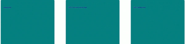
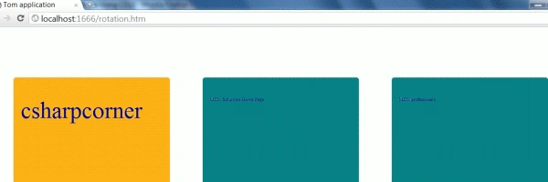
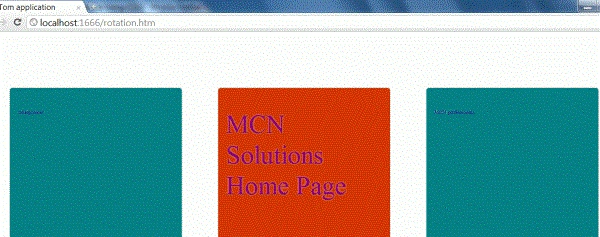
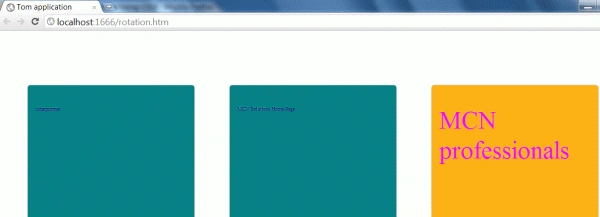
Step 8: Run application on a browser.
Output
Resources
Gowtham RajamanickamPosted Apr 11, 2015, 1:12 PM
Good one
Sam HobbsPosted Jan 28, 2012, 1:41 PM
Thank you, Manish. This is interesting. I am Sam and yes I editied your article a little bit. I tried your code and it works for me, I think, except when I hover over the divs I do not see a square background like in your sample but the backgound does change for the text. Also I do not understand what I need to do using Notepad, so if anyone else is confused then it is understandable to be unsure what that means.